The world of productivity and project management just got a major upgrade with the launch of ClickUp 3.0. ClickUp has been a game-changer for individuals and teams looking to streamline their work processes, and this latest update takes it to the next level. In this blog post, we have selected some of the most exciting new features that ClickUp 3.0 brings to the table. Let's dig in!
Stunning new design
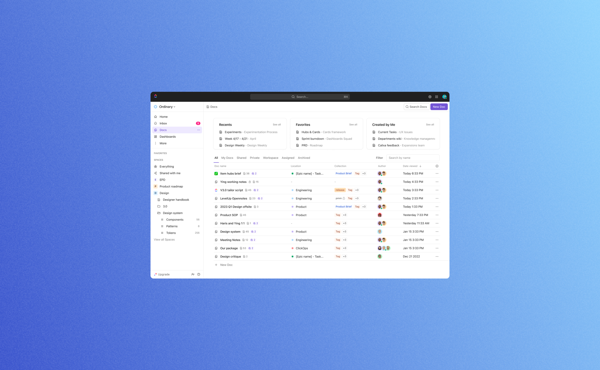
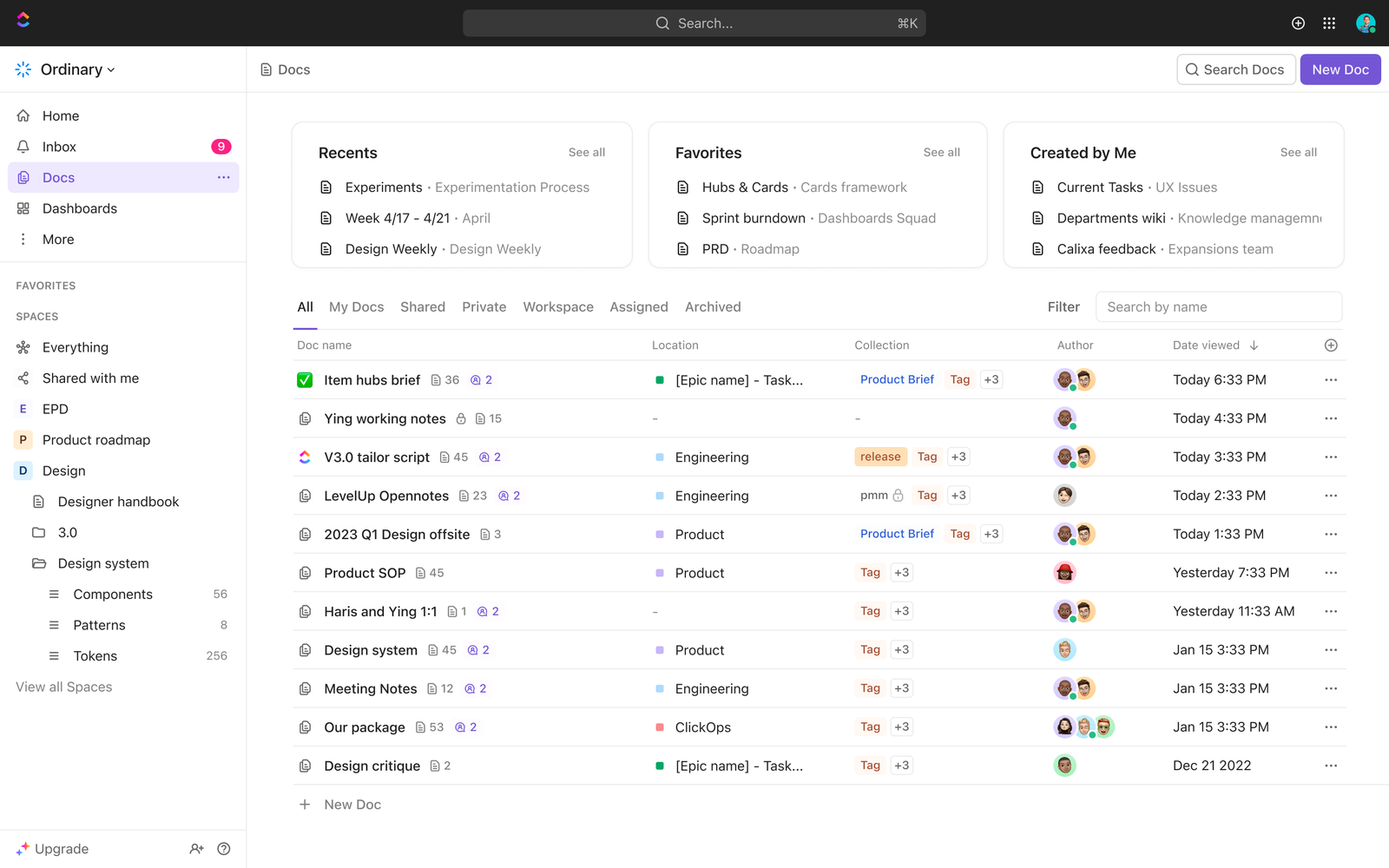
The first change that you will notice is of course the new user interface. It’s generally cleaner and more modern. This means there are fewer distractions so that you can fully focus on your work. We think that the new user interface is a big improvement as the previous UI felt quite cluttered compared to other productivity apps such as Asana or Notion. At the same time we don't feel that any features are hidden in submenus; everything still feels readily accessible.
A few key things that have changed in the UI are the sidebar, table view and especially the task view: Task view 3.0 acts as more of a command center instead of a static single data source. It is now easier to navigate to other tasks, to view and edit custom fields, and to build relationships without having to leave the task view. This allows you to build or design new processes directly in the parent task.
And lastly, this new UI also brings a significant increase in speed & reliability: The new UI responds a lot faster so getting work done never looked and felt so good. With this ClickUp has tackled one of the other minor shortcomings of the previous versions so it's great to see that they have their priorities straight.

Find data instantly with global search
ClickUp 3.0 also comes with an upgrade on the search bar. Using this search bar will pull results from almost anywhere on the platform, including comments, chats, and files. The added filters such as "Current location," "Created by," and "Assigned to" make it even easier to find what you're looking for. In the short time we've worked in ClickUp 3.0 this quickly became our most used feature. No more clicking or navigating in the sidebar, the search bar brings you immediately where you need to be. The search bar also comes with added buttons which allows you to track time, start a whiteboard, and even manage your account settings from this new search bar.
Hubs for Docs, Dashboards & Whiteboards
It is clear that ClickUp has put a lot of focus on making data more readily available to you. Next to the search bar, they have updated the inbox as well as added brand new hubs for Docs, Dashboards and Whiteboards.
The Hubs allows you to organize, search, and create Docs, Dashboards and Whiteboards from a centralized location. This will make it easier to bring work to light for your teams. Don't waste time digging for context, sending status updates, or looking for project summaries. Simply get a quick view of all the work happening within any Space, Folder, or List. The Hub for dashboard proved to be particularly helpful, as it allows you to create your own custom quick overview of the most important data. Together with the inbox it becomes very easy to keep track of all things; something that is often very challenging when working productivity apps.
ClickUp AI
Since the launch of ChatGPT AI is everywhere and ClickUp is keeping up with the latest hype. In ClickUp 3.0 you can now use AI prompts to automatically generate creative ideas, summarize lengthy texts, and elevate your writing skills - in seconds. These AI prompts are especially useful when working in ClickUp Docs. It takes a bit of practice, but once you're familiar with the power of AI you will save a lot of time and strongly improve the quality of your work.
Custom field manager
If you have worked a long time with productivity apps then you know that custom fields can be both a blessing and a curse: They offer extreme flexibility to shape your data the way you want, but they can also be a gateway to create overly complex tables with numerous similar fields living next to each other. The system admin might still have an idea what's going on but most users end up being confused when adding or editing records.
This is why we're a big fan of the new custom field manager that's been added in ClickUp 3.0. This custom field manager allows you to manage, edit and search your custom fields in one place, making it a lot easier to keep your list templates clean and to streamline processes across different departments. We strongly recommend each system admin to use this feature to simplify the custom fields in their accounts.
And there's more.. a lot more
Next to these big updates, ClickUp 3.0 has even more in store for you. For a complete list of new features we refer to the website of ClickUp, but here are some other features that caught our eye.
Conditional Logic in Forms
It's been almost three years since ClickUp introduced Form View. Since then, it has become a fan-favorite feature because forms can be used as the primary way for users to capture information from people and bring that data into ClickUp. With this update you can now build smarter forms that can handle conditional logic. Conditional logic allows you to hide or show certain questions based on previous answers. This avoids that forms can become too long and significantly improve the conversion rate of these webforms. A lot of productivity apps have some sort of basic webform functionality, but they rarely go far enough to make it very usable. ClickUp understands that it needs to go further and did a great job with this update.
Whiteboards
Working on digital whiteboards have become increasingly popular in the last few years. They allow you to structure thoughts, design flow diagrams and integrate mind mappings together with your team members. The Whiteboard functionality of ClickUp has all key functionalities covered: Frames, arrows, text, notes, comments & files can be added with just a few clicks. They also offer a range of templates to get you started even quicker. This means that you no longer need to switch to using separate apps such as Miro to manage whiteboards. Instead you can do it all in ClickUp which is both convenient and saves money.
Sprints
Everyone who works in technology has probably heard of the SCRUM methodology. It's a way of working where you define the work for (bi)weekly sprints. It's great to see this way of working enabled with the new Sprint feature in ClickUp. It's now possible to tailor sprint durations to match everyone’s work days and you have access to more accurate sprint reporting.
Conclusion
It's clear that with this update, ClickUp 3.0 is getting closer to achieving their vision of "one app to rule them all". Its enhanced customization, mind mapping, time tracking, integrations, automations, and collaboration features cater to the diverse needs of teams and individuals across various industries. With ClickUp 3.0, you can streamline your work processes, boost productivity, and achieve greater success in your projects.
If you're looking for a comprehensive, user-friendly, and highly customizable project management solution, ClickUp 3.0 should be at the top of your list. Try it out and experience the future of productivity and collaboration today!

Related posts
Check out our other posts on data security and product updates.

Why Backups Matter for SOC 2 and ISO 27001 Compliance
.png)
Imagine losing all your business data in an instant - customer records, project files, and important documents gone forever. It sounds like a nightmare, right? That’s why security standards like SOC 2 and ISO 27001 require businesses to have reliable backup systems in place. These rules help protect data from getting lost, stolen, or damaged. In this article, we’ll break down what these standards say about backups and how you can follow them easily.
What are SOC2 and ISO 27001?
SOC 2 and ISO 27001 are two widely recognized frameworks for information security and data protection. SOC 2 (Service Organization Control 2), created by the American Institute of Certified Public Accountants (AICPA), is a framework specifically designed for technology and cloud-based service providers. It evaluates a company’s controls around security, availability, processing integrity, confidentiality, and privacy.
ISO 27001 on the other hand is developed by the International Organization for Standardization (ISO) and is a globally accepted standard for establishing, implementing, maintaining, and continuously improving an Information Security Management System (ISMS). It focuses on risk management and best practices to protect sensitive data. Both frameworks aim to ensure that businesses safeguard customer data, mitigate security risks, and build trust with their clients and stakeholders. In general SOC 2 is more prevalent in the US while ISO 27001 is more popular in Europe.
What does SOC 2 say about backups?
SOC 2 is a security framework that helps businesses keep customer data safe. It focuses on five key areas: security, availability, processing integrity, confidentiality, and privacy. Here’s what it says about backups:
- Keep data available: You must have a backup system in place so you can restore your data if something goes wrong.
- Keep data safe: Backups should be encrypted to prevent hackers from accessing them.
- Control who Sees it: Only authorized people should have access to backup files.
- Check your backups: Regularly test your backups to make sure they work when needed.
- Plan for disasters: If an emergency happens, you need a strategy to recover your data quickly.
What does ISO 27001 say about backups?
ISO 27001 is an international standard for keeping business data secure. It is widely adopted because it provides a structured approach to managing security risks and is recognized globally as a benchmark for information security. Unlike SOC 2, which is primarily used in the U.S. and focuses on customer data protection, ISO 27001 takes a broader approach to managing security across an entire organization. It outlines key requirements for backup management:
- Have a aackup plan: Businesses must create, document, and test backup processes regularly.
- Keep backups secure: Backup data should be stored safely to prevent unauthorized access.
- Be ready for problems: If a cyberattack or system failure occurs, backups should help restore normal operations.
- Follow retention policies: Businesses should define how long they keep backups based on legal and operational needs.
How Can You Follow These Backup Rules?
There are different ways to back up your data, and the best method depends on your business needs. Here are three common approaches:
Manual Backups (Do-It-Yourself)
- Download data: Manually export important files and save them to your computer or an external hard drive.
- Use cloud storage: Store copies of your data in cloud services like Google Drive or Dropbox.
On-Premises Backup
- Use external hard drives: Copy files to an external hard drive or USB stick.
- Set up a local server: Store backup data on a secure, private network.
Cloud-Based Backup Solutions
- Automated backup services: Use tools like ProBackup to schedule automatic backups with encryption and easy restoration.
- Extra protection: Cloud-based backups are stored in multiple locations, ensuring data is safe even if one system fails.
Final Thoughts
Backups aren’t just a smart business practice - they’re required by security standards like SOC 2 and ISO 27001. Whether you choose manual exports, external hard drives, or a cloud-based service like ProBackup, having a solid backup plan keeps your business secure and compliant. Take action today to ensure your data is always protected.
ProBackup is now officially SOC 2 Type 2 Compliant

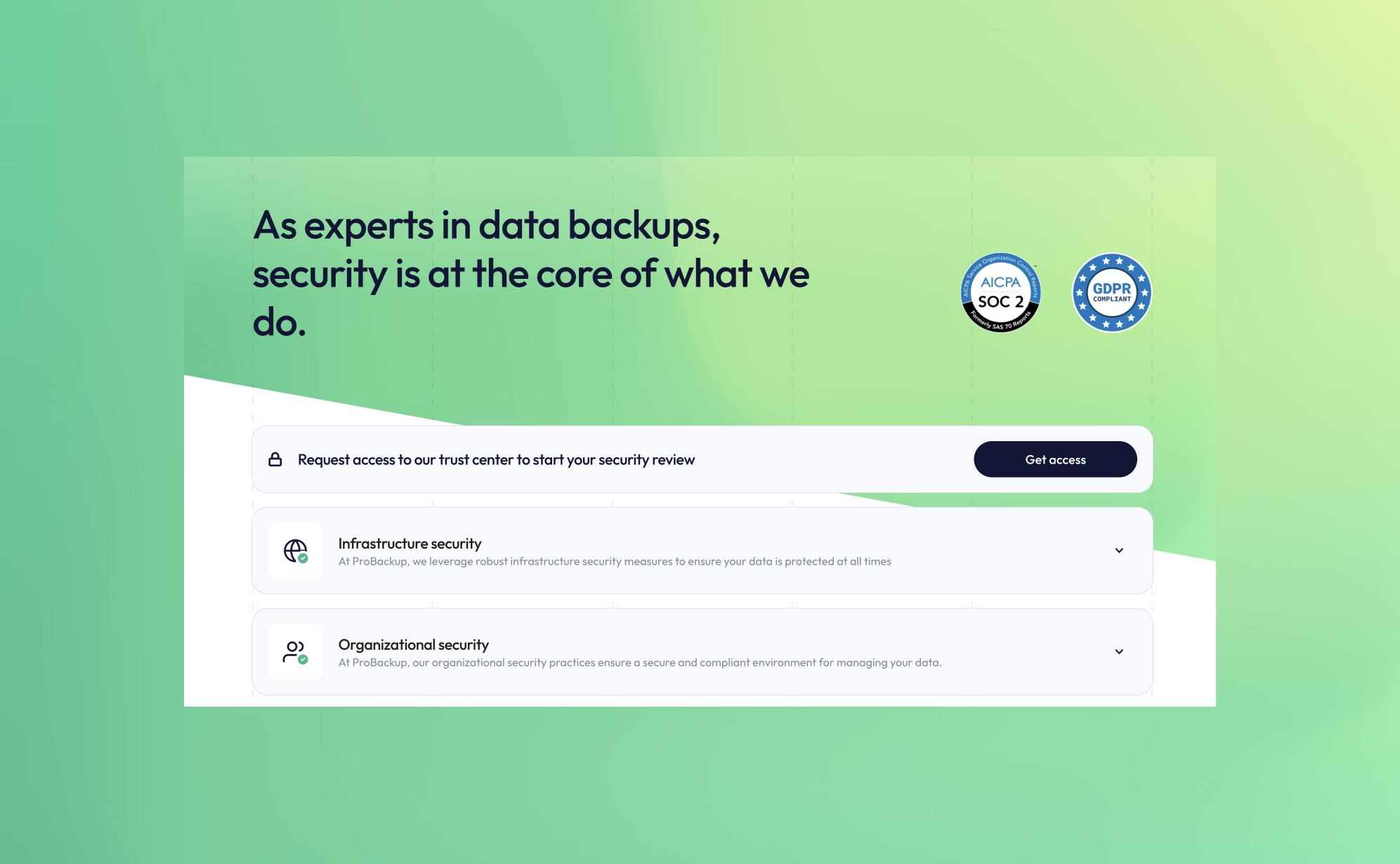
At ProBackup, security and compliance are at the core of our mission. We are thrilled to announce that we are now officially SOC 2 Type 2 compliant! This achievement reflects our ongoing commitment to providing a secure and reliable cloud backup and restore service for businesses using Asana, Airtable, ClickUp, Trello, and other productivity and CRM apps.
What is SOC 2 Type 2 compliance?
SOC 2 (System and Organization Controls 2) is a rigorous security standard designed for SaaS companies handling sensitive customer data. It evaluates a company’s ability to manage and safeguard data based on five key trust principles:
- Security – Protecting systems and data from unauthorized access.
- Availability – Ensuring services are operational and accessible.
- Processing Integrity – Guaranteeing accurate and reliable data processing.
- Confidentiality – Keeping sensitive business information secure.
- Privacy – Handling personal data responsibly and in compliance with regulations.
SOC 2 Type 2 certification goes beyond the initial audit (Type 1) by demonstrating continuous adherence to security controls over an extended period.
Enhanced security resources now available
To further enhance transparency and trust, we have updated our security page (https://www.probackup.io/data-security) with detailed insights into our product and infrastructure security. Here’s what you’ll find:
- SOC 2 Report – Download the latest report verifying our security compliance.
- Penetration Test Report – Access our most recent third-party security assessment.
- Data Processing Addendum (DPA) – Review our data protection commitments.
Additionally, users can now request access to our renewed Trust Center, where they can explore all policies and controls related to SOC 2 compliance. This provides deeper insights into our security framework and compliance measures.
Why SOC 2 compliance matters for cloud backups
For businesses relying on cloud backups, ensuring that backup data is secure, monitored, and compliant is critical. Achieving SOC 2 Type 2 compliance means our users can trust that ProBackup meets industry-leading standards for safeguarding their data.
By choosing ProBackup, you gain more than just an automated backup solution—you get a partner dedicated to data security, compliance, and reliability.
Stay secure with ProBackup
We are proud to offer SOC 2 Type 2 compliant cloud backup services, giving our users peace of mind when it comes to data protection and disaster recovery. Explore our updated security page today and download our latest reports!
.jpg)
How to Delete and Restore Data in Asana
.png)
Keeping your Asana workspace organized requires more than just completing tasks - it also involves managing your data efficiently. Whether you’re clearing out old tasks to reduce clutter or recovering important information that was mistakenly deleted, Asana offers tools to help. In this article, we’ll explore how to delete and restore data in Asana, so you can maintain a streamlined and well-structured workspace.
Types of data that can be deleted in asana
Asana allows users to delete various types of data, including:
1. Tasks
Tasks can be deleted if they are no longer relevant. Deleted tasks move to the ‘Deleted Items’ section and can be restored within 30 days unless permanently deleted.
2. Projects
Project owners or admins can delete entire projects, including all associated tasks, comments, and attachments. When a project is deleted, the person who deleted it receives an email with a recovery link to restore it if needed.
3. Sections and Columns
Sections (list view) and columns (board view) can be deleted if there are at least two present in the project. If there is only one section or column, the delete option is disabled. When deleting a section or column, Asana will prompt you to either delete all tasks within it or move them to another section or column.
4. Attachments
Files linked to tasks can be removed if they are no longer needed.
5. Comments and Messages
Users can delete their own comments on tasks. However, once a comment is deleted, it cannot be restored.
How to Delete Data in Asana
Deleting a Task
- Open the task you want to delete.
- Click on the three-dot menu in the task’s upper right corner.
- Select Delete task.
- Confirm the deletion.
Deleting a Project
- Navigate to the project you want to remove.
- Click the dropdown beside the project name.
- Select Delete project.
- Confirm your choice.
Deleting a Section or Column
- Ensure that your project has at least two sections or columns (the delete option is disabled if only one exists).
- Hover over the section title.
- Click the three-dot menu.
- Select Delete section.
- Choose whether to delete the tasks within the section or move them to another section.
How to Restore Deleted Data in Asana
If you accidentally delete something, Asana provides options to recover it within 30 days, unless it has been permanently deleted.
Restoring a Deleted Task
- Click the Search bar at the top of the page.
- Click the filter icon to open advanced search.
- Click the Status dropdown and select Deleted.
- Use additional search filters (e.g., Assigned to: [User Name]) if needed.
- Click Search to display deleted items.
- Find the deleted task and click Restore.
Restoring a Deleted Project
- Click the Search bar at the top of the page.
- Click the filter icon to open advanced search.
- Click the Status dropdown and select Deleted.
- Use additional search filters (e.g., project name or team name) if needed.
- Click Search to display deleted projects.
- Find the deleted project and click Restore.
Alternatively:
- If a project is deleted, the person who deleted it will receive an email with a Recovery link to restore it.
- Other project members will receive an email notification about the deletion but cannot restore the project themselves.
Undoing a Deletion Instantly
- When you delete an item, Asana provides an Undo button in a notification at the bottom left of the screen for about 15 seconds. Clicking Undo immediately restores the item.
- If you delete a task and don’t navigate away, an Undelete button appears in the task details pane.
Finding a Deleted Item’s URL for Asana Support
If you cannot restore an item and need Asana’s support team to assist, providing the deleted item's URL can help track it. URLs can sometimes be found in Asana inbox messages or email notifications.
Final Thoughts
Asana provides basic tools for managing and restoring data, but it's always good to be careful when deleting important tasks or projects. Understanding how deletion and restoration work can help you avoid unnecessary data loss and keep your workspace organized.
How to Delete and Restore Data in HubSpot
.png)
Keeping your HubSpot CRM organized is essential for maintaining data integrity and efficiency. Whether you’re decluttering outdated records or recovering mistakenly deleted information, HubSpot provides flexible tools to help you stay in control. In this guide, we’ll walk you through how to delete and restore various types of data in HubSpot, ensuring you manage your CRM with confidence.
Deleting data in HubSpot: What you need to know
HubSpot offers two types of deletions:
- Restorable Delete: Moves records to the recycle bin, allowing restoration within 90 days.
- Permanent Delete: Irreversible deletion, typically used for compliance (e.g., GDPR).
Deleting Individual Records
To delete a specific record:
- Navigate to CRM > Contacts, Companies, Deals, or Tickets in your HubSpot account.
- Click on the record you want to delete.
- In the left panel, click Actions > Delete.
- Choose whether to temporarily delete or permanently delete the record.
- Confirm by clicking Delete [record].
Bulk Deleting Records
If you need to delete multiple records at once:
- Navigate to the relevant CRM section (Contacts, Deals, etc.).
- Select the checkboxes next to the records you want to delete.
- Click Delete at the top of the table.
- If you want to delete all records in your view, click Select all [number] records.
- Confirm the number of records to delete and finalize the action.
What Can Be Deleted in HubSpot?
HubSpot allows users to delete a variety of data types, including:
- Contacts (customer records, leads, and email data)
- Companies (business profiles and related information)
- Deals (sales opportunities and pipeline records)
- Tickets (customer support inquiries and resolutions)
- Custom Objects (user-defined data structures)
- Calls (logged calls and call recordings)
- Emails (marketing and sales emails)
- Products (good or service that you sell)
- Workflows (automation rules and sequences)
- User Accounts (removal of HubSpot users)
- Activities (notes, tasks, and logged interactions)
Deleting a HubSpot User Account
If you no longer need access to HubSpot, you can permanently delete your user account. Be sure to check that your account isn’t linked to any active HubSpot accounts.
To delete your HubSpot user account:
- Log in to your HubSpot account.
- Click on your account name in the top right corner and select Profile & Preferences.
- In the left sidebar menu, click Security.
- Scroll down to the Permanently Remove section and click Delete My User Account.
- Enter your email address for confirmation.
- Click Delete User to complete the process.
Note: Deleting your user account will also remove any HubSpot Academy certifications linked to your email address. If you want to retain your certifications, transfer them to a different email before deleting your account.
Automating Record Deletion (Professional & Enterprise only)
HubSpot allows Professional and Enterprise users to automate the deletion of contact records based on specific criteria using workflows.
To set up automated record deletion:
- Go to Automations > Workflows in your HubSpot account.
- Create a new workflow or open an existing one.
- Set enrollment triggers that define the conditions for deletion.
- Click + Add Action > Delete Contact.
- Click Save.
- Activate the workflow by clicking Review and Publish, then confirm by selecting Turn On.
Note: Automated deletions only apply to contacts. Other objects like deals, tickets, and companies cannot be deleted through workflows.
How to restore deleted data in HubSpot
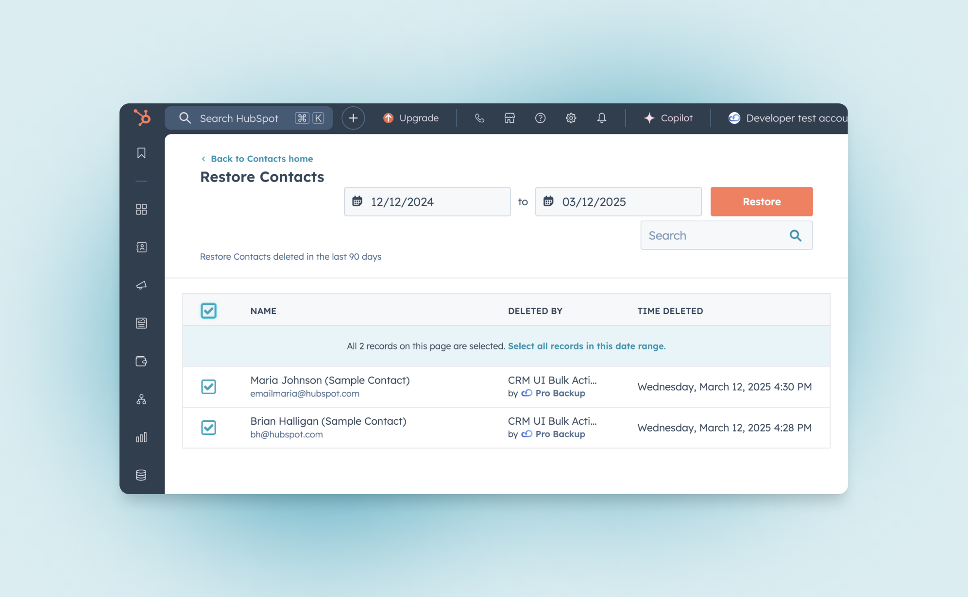
If you accidentally delete a record, HubSpot’s Recycle Bin lets you recover it within 90 days. However, permanent deletions (such as GDPR-compliant deletions) cannot be restored.
Restoring deleted CRM records
To restore a deleted contact, company, deal, or ticket:
- Go to the relevant CRM section (Contacts, Companies, etc.).
- Click Actions > Restore Records in the top-right corner.
- The Recycle Bin will open in a new tab.
- Select the records you want to restore.
- Click Restore to confirm.
Restoring deleted activities
Activities in HubSpot include notes, tasks, calls, and other logged interactions. If you or another user has mistakenly deleted an activity, it can be recovered within 90 days as long as it has not been permanently deleted.
To restore deleted activities:
- Navigate to any contact, company, deal, or ticket record in your CRM.
- Click on Actions > Restore Activity in the left panel.
- The Recycle Bin will open, displaying all deleted engagements.
- Use the date filter to narrow down the timeframe when the activity was deleted.
- Select the checkbox next to the activities you want to restore.
- Click Restore to recover the selected activities.
Restoring deleted workflows
If a workflow was mistakenly deleted, you can restore it by following these steps:
- Navigate to Automations > Workflows in your HubSpot account.
- Click on the Deleted tab at the top of the page.
- Locate the workflow you want to restore.
- Hover over it and click Clone.
- In the dialog box, confirm by clicking Clone again.
- The restored workflow will now appear in your dashboard as an inactive workflow with its original name followed by a timestamp (e.g., Workflow Name (Restored 02/26/2025)).
Note: Restoring a workflow does not recover past workflow history or data; only the workflow structure is recovered.
Final thoughts
HubSpot offers powerful tools to help you manage and recover CRM data efficiently. Whether you’re tidying up outdated records or undoing an accidental deletion, understanding these deletion and restoration processes will save you time—and potential headaches. Looking for a fail-safe way to protect your data? Consider a backup solution to ensure you never lose critical information again.
ClickUp Chat: How does it compare to Slack and other productivity apps

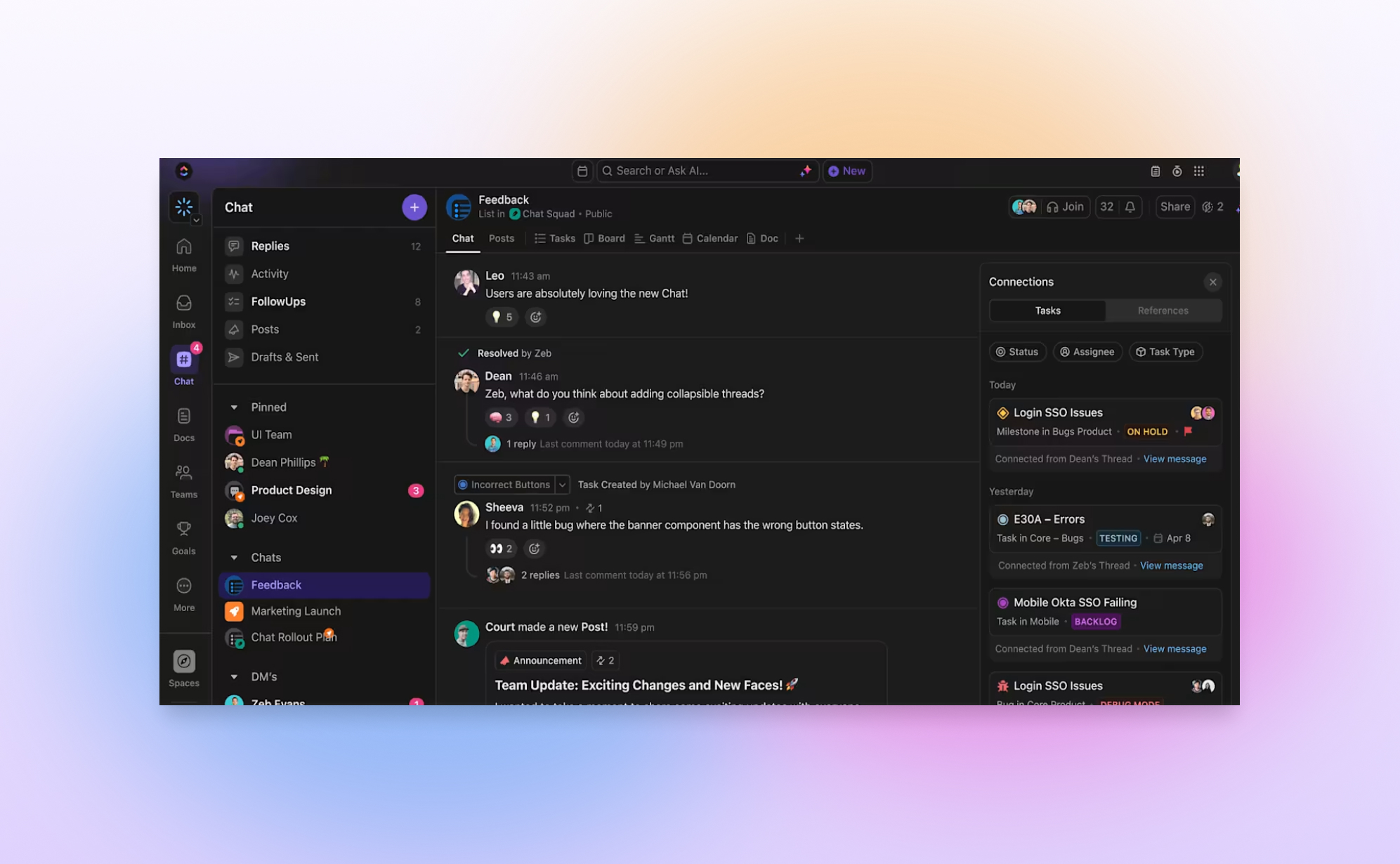
ClickUp aims to be the "one app to replace them all". It offers a broad range of project management features such as task managent, time tracking, goals and since recently it has also launched ClickUp Chat. ClickUp Chat lets you send messages to your team members without leaving the app. In this article, we’ll explain what ClickUp Chat is, how to use it, and how it compares to Slack and other tools.
What is ClickUp Chat?
ClickUp Chat is a built-in chat feature in ClickUp. It lets you talk to your team without needing another app like Slack. You can send messages, share files, and even create tasks straight from your conversation. This makes it easier to keep track of discussions and get work done in one place.
How to Use ClickUp Chat
ClickUp Chat is super easy to use. You can:
- Open a chat view to talk with your team.
- Use @mentions to get someone’s attention.
- Share links and files.
- Turn messages into tasks with one click.
- React to messages with emojis.
Is ClickUp Chat Free?
Yes! ClickUp Chat is included in all paid plans and even in the Free Forever plan. Unlike Slack, which deletes old messages after 90 days on the free plan, ClickUp keeps all your messages.
ClickUp Chat vs. Slack: What’s the Difference?
Slack is a great chat tool with advanced features, but ClickUp Chat is better if you want to keep your messages connected to your tasks. A big plus of ClickUp chat is that it keeps all chat messages, even if you're using the free plan. Slack on the other hand deletes messages after 90 days on the free version. Here's a comparison of some of the key features:
Can share files?
- ClickUp: ✅ Yes
- Slack: ✅ Yes
Has an advanced text editor (e.g. quotes, code blocks, etc)
- ClickUp: ✅ Yes
- Slack: ✅ Yes
Allows to have threads within a channel?
- ClickUp: ✅ Yes
- Slack: ✅ Yes
Works with task management?
- ClickUp: ✅ Yes
- Slack: ❌ No
Do old messages remain available?
- ClickUp: ✅ Yes, all messages are kept
- Slack: ❌ No, messages are deleted after 90 days
Doesn't require a separate app & license?
- ClickUp: ✅ Yes
- Slack: ❌ No
Can turn messages into tasks?
- ClickUp: ✅ Yes
- Slack: ❌ No
Do other productivity apps offer similar chat functionality?
Not all productivity apps have a built-in chat like ClickUp. Here’s how some popular tools approach team communication:
- Asana: Instead of live chat, Asana uses task comments to keep discussions tied to specific tasks (which is also possible in ClickUp).
- Trello: Trello doesn’t offer built-in chat, but you can add Slack as a Power-Up to have a closer integration between Trello and Slack. This Power Up allows you to create Trello cards from Slack Conversations.
- Monday.com: It has an Updates section, which works similar to the comments functionality from other apps.
- Airtable: You can leave comments on records, which is great for context, but there’s no dedicated chat feature.
If chatting in the same place where you manage your work is important to you, ClickUp Chat is a solid option that eliminates the need for third-party messaging tools.
Conclusion
ClickUp Chat is a simple and helpful way to talk to your team without switching apps. You don’t have to worry about losing old messages, and you can even turn chats into tasks. If you want an easy way to chat while keeping work organized, ClickUp Chat is a great choice.
Want to see how it works? Watch this video:
How Notion AI Can Boost Your Productivity
.png)
If you find yourself having trouble creating content, improving your writing or organizing information in Notion, Notion AI is here to help. It’s a smart assistant built right into Notion that makes your work easier and faster. It also helps automate repetitive tasks, so you can save time and focus on the more important parts of your work. In this blog post we will cover how Notion AI can help your day-to-day work and what its common use cases are.
How can Notion AI help you?
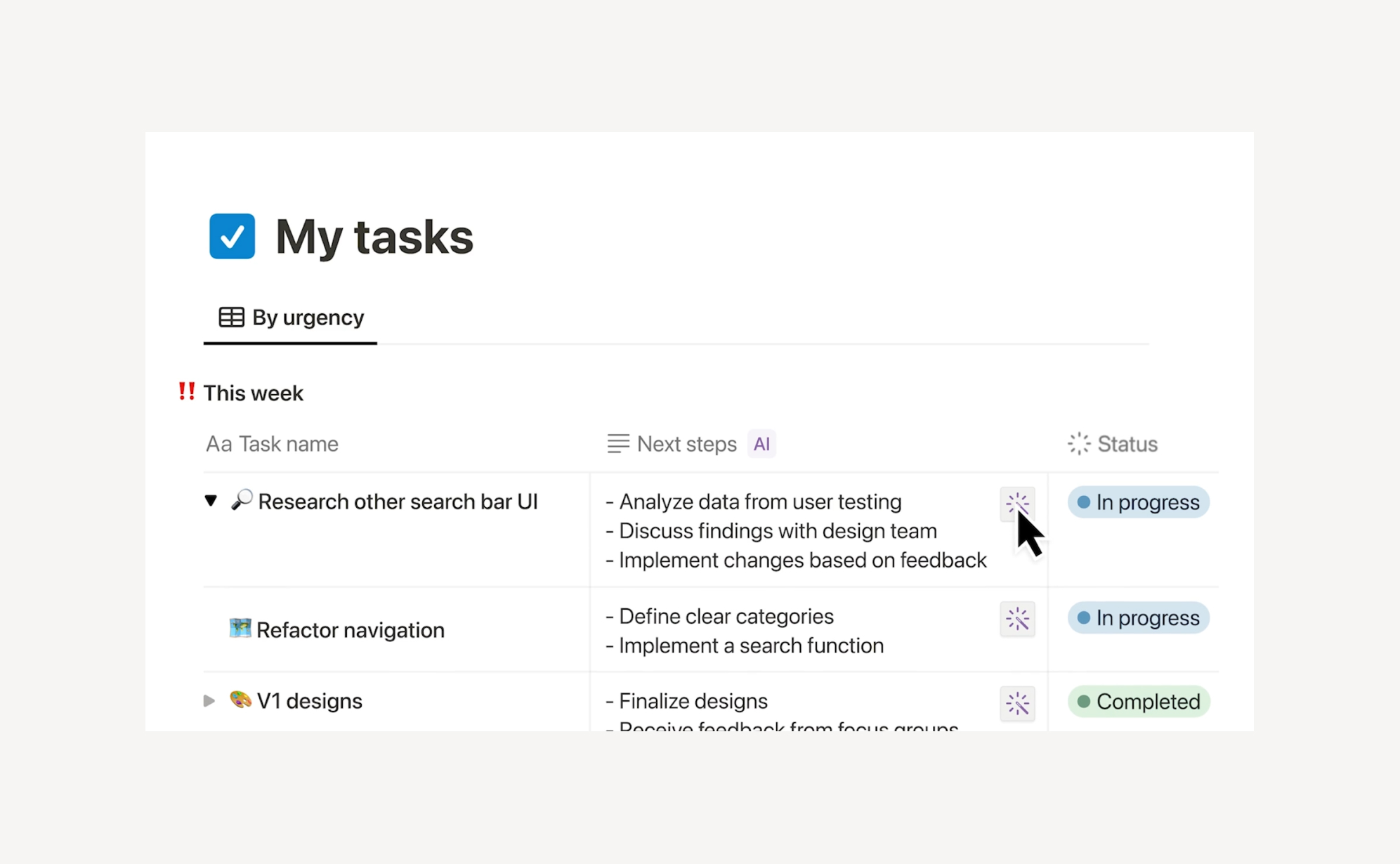
Notion AI helps you with all kinds of tasks. For example, it can quickly help you write things like blog posts, emails, reports, and presentations. It also makes editing easier by fixing grammar mistakes, improving clarity, and changing the tone if needed. If you have a long text, Notion AI can shorten it into a simple, easy-to-read summary.
When you're stuck for ideas, Notion AI can help you brainstorm and come up with outlines or creative prompts for your projects. It also helps you save time by automatically creating things like to-do lists, SOPs (Standard Operating Procedures), and structured documents. For people working with teams across different countries, Notion AI can instantly translate text into other languages, making collaboration easier. And if you have a lot of information, it can help you find the most important points and highlight them.
Where Can You Use Notion AI?
Notion AI is integrated across different areas of the app, allowing you to enhance productivity in multiple ways:
- Pages & Docs – Generate, refine, and improve your writing directly within Notion.
- Databases – Automate task descriptions, meeting notes, and structured documentation.
- Notes & Knowledge Bases – Summarize lengthy notes and organize complex information.
- Project Management – Save time by generating reports, updates, and structured action items.
Is Notion AI Part of Every Plan?
Notion AI isn’t included with the regular Notion plans. To use it, you’ll need to pay extra. It costs $8 per user per month if billed annually, or $10 per user per month if billed monthly.
Compared to other AI writing tools like ChatGPT Plus ($20/month) or ClickUp AI ($7/user/month), Notion AI falls in the mid-range pricing tier. Its value depends on how deeply you rely on Notion for content creation and organization.
How Does Notion AI Compare to Other AI Tools?
I tested Notion AI and ClickUp AI with the same writing task, and here’s what I found. Notion AI gave well-organized, clear responses, perfect for making documents and notes. ClickUp AI, however, focused more on helping with tasks and project management rather than writing.
When compared to other tools like ChatGPT and Jasper, Notion AI is best for people who need help organizing or taking notes inside Notion. ChatGPT and Jasper are better for writing long, detailed content. Grammarly is great for fixing grammar and improving your writing but doesn't help with creating content from scratch.
For example, when asked to summarize a 500-word project brief, Notion AI produced a well-structured paragraph, while ClickUp AI formatted it into a bulleted action list. This highlights how each AI tool serves different purposes. Notion AI is ideal for structured writing, while ClickUp AI is better for task-oriented breakdowns.
Final Thoughts
In my experience, Notion AI is a great tool for Notion users who need an AI-powered writing assistant embedded within their workflow. It enhances content creation and organization, but the additional cost may not be justified for those who only need occasional AI assistance.
Would I recommend Notion AI? If you heavily use Notion for writing and content management, it’s a valuable addition. However, if your AI needs extend beyond Notion, you may find more flexibility in standalone AI platforms like ChatGPT. The best way to decide is to test Notion AI with your workflow and see if it enhances your productivity.
To learn more about how Notion AI works, check out this video.

Airtable Cobuilder: Create Airtable Apps with AI

What if you could turn your idea into a fully functional app in seconds? That’s exactly what Airtable’s Cobuilder offers. This exciting update allows users to create no-code apps instantly using AI-generated prompts and Airtable interfaces. In this blog post, we’ll explore how Airtable Cobuilder works, its advantages and limitations, and how it compares to other AI-powered no-code platforms.
What is Airtable Cobuilder?
Airtable is redefining low-code app development with Cobuilder. With just a simple prompt (e.g., "I want an app to manage my recipes"), Cobuilder generates a custom app tailored to your request. Each generated app consists of multiple interlinked tables, complete with views, workflows, and filters.
Built on Airtable’s Interface Designer, Cobuilder enables users to create intuitive dashboards and data-driven applications. Interface Designer already allows users to streamline collaboration by displaying only the most relevant information. With Cobuilder, Airtable has taken accessibility even further, allowing businesses to jumpstart the design process and customize applications without writing a single line of code.
Common Use Cases
Cobuilder streamlines operations for a variety of teams and industries. Whether managing projects, organizing inventory, planning events, or tracking sales, users can generate purpose-built apps with minimal effort—no manual setup or external integrations required.
Here are some example prompts:
- "I need an app to launch a women’s skateboarding shoe for the Olympics."
- "Help me track renovations for our boutique hotels in Marrakesh."
- "Create an app to track parts and production schedules for the Artemis SLS rocket."
How Does It Compare to Other No-Code Solutions?
Airtable Cobuilder stands out for its seamless AI-powered app generation, but how does it stack up against other platforms?
- Notion AI – Primarily designed for content generation and knowledge management, while Cobuilder focuses on structured, database-driven applications.
- Glide – Another AI-powered app builder, but geared more toward mobile applications, making it a strong competitor for mobile-first tools.
- Zapier – Specializes in automating workflows between apps, whereas Cobuilder generates complete applications from scratch.
How to Get Started?
Cobuilder is available to all Airtable users. To try it out, log into your Airtable account, click "Create," and select "Build an app with AI." For further inspiration, check out the following demo video showcasing Cobuilder’s capabilities in action.
Final Thoughts
Airtable Cobuilder is a game-changer in the no-code space, making app creation faster and more accessible than ever. While still evolving, it already offers immense value for businesses seeking efficiency without developer resources. If you use Airtable, experimenting with Cobuilder could unlock new opportunities for automation and streamlined workflows.
What's new in ClickUp Whiteboards?

Work today moves at lightning speed, and teams need tools that can keep up. Enter ClickUp Whiteboards 3.0 - a huge update that makes brainstorming, planning, and executing easier than ever. In this blog post, we will explain how to use Whiteboards 3.0 and highlight the most important updates in this version.
What is ClickUp Whiteboards 3.0?
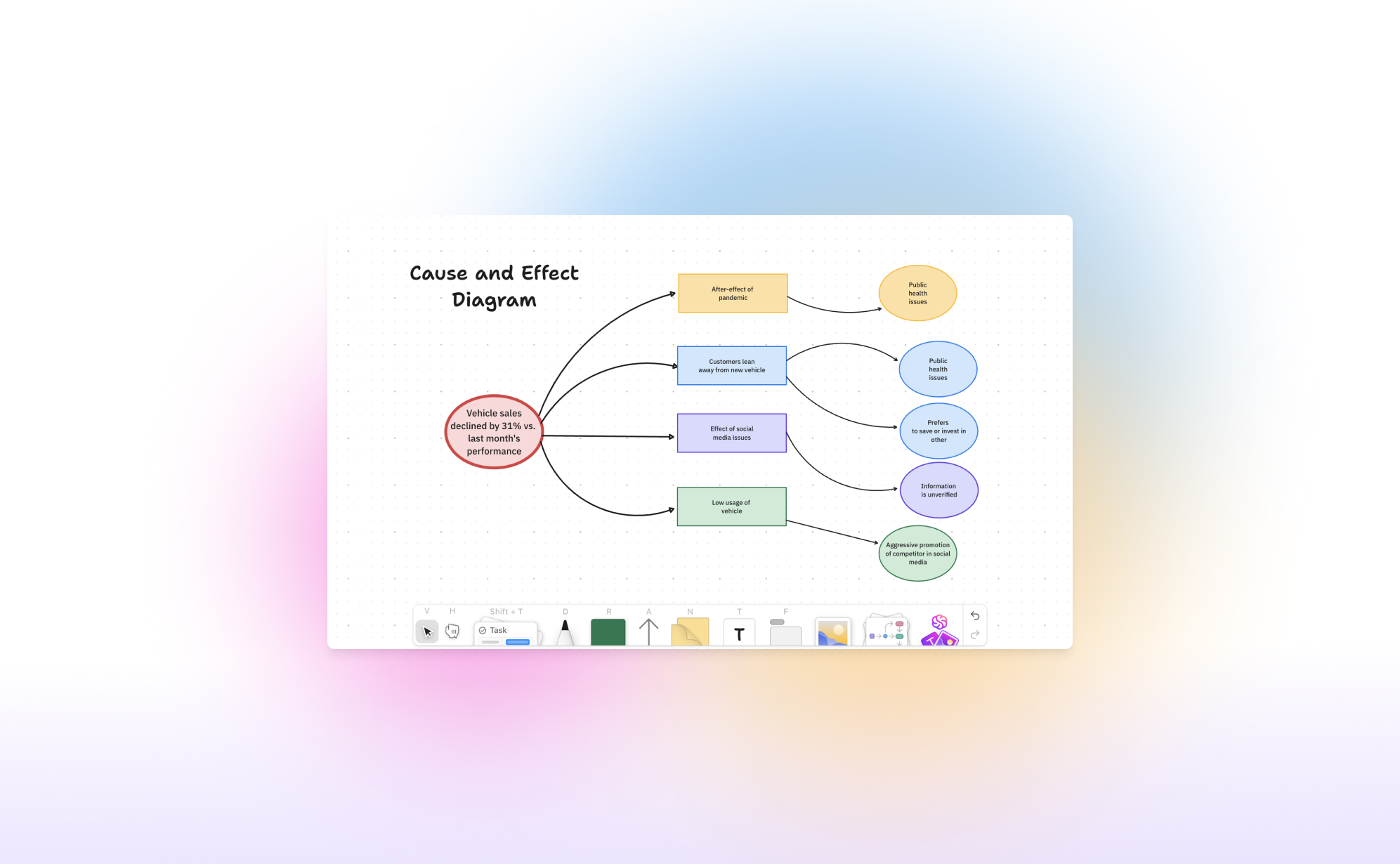
In 2022, ClickUp introduced their Whiteboard feature, a fresh approach to virtual whiteboards for hybrid work environments. It is similar to other tools like Miro, but it is fully integrated with ClickUp's task management system. This integration allows you to create a ClickUp whiteboard to start a brainstorming session, design a flowchart, or discuss the team's retrospectives, using the whiteboard as a foundation to kickstart a project.
How to get started with Whiteboards?
The Whiteboard feature is available in every plan, even the free one! You can create a whiteboard in several ways:
- Via the Sidebar: Whiteboards are listed as an option in the sidebar below the home page and inbox. This page shows all whiteboards created in your workspace and lets you create a new one.
- Via a space: Click on the plus next to a space and click on Whiteboard.
- Via a Task: When you open a task, you can add a whiteboard directly to it. Click "/" to open the commands and search for "Create whiteboard." You can embed a whiteboard into the description, making it easy to quickly draw and add flowcharts.
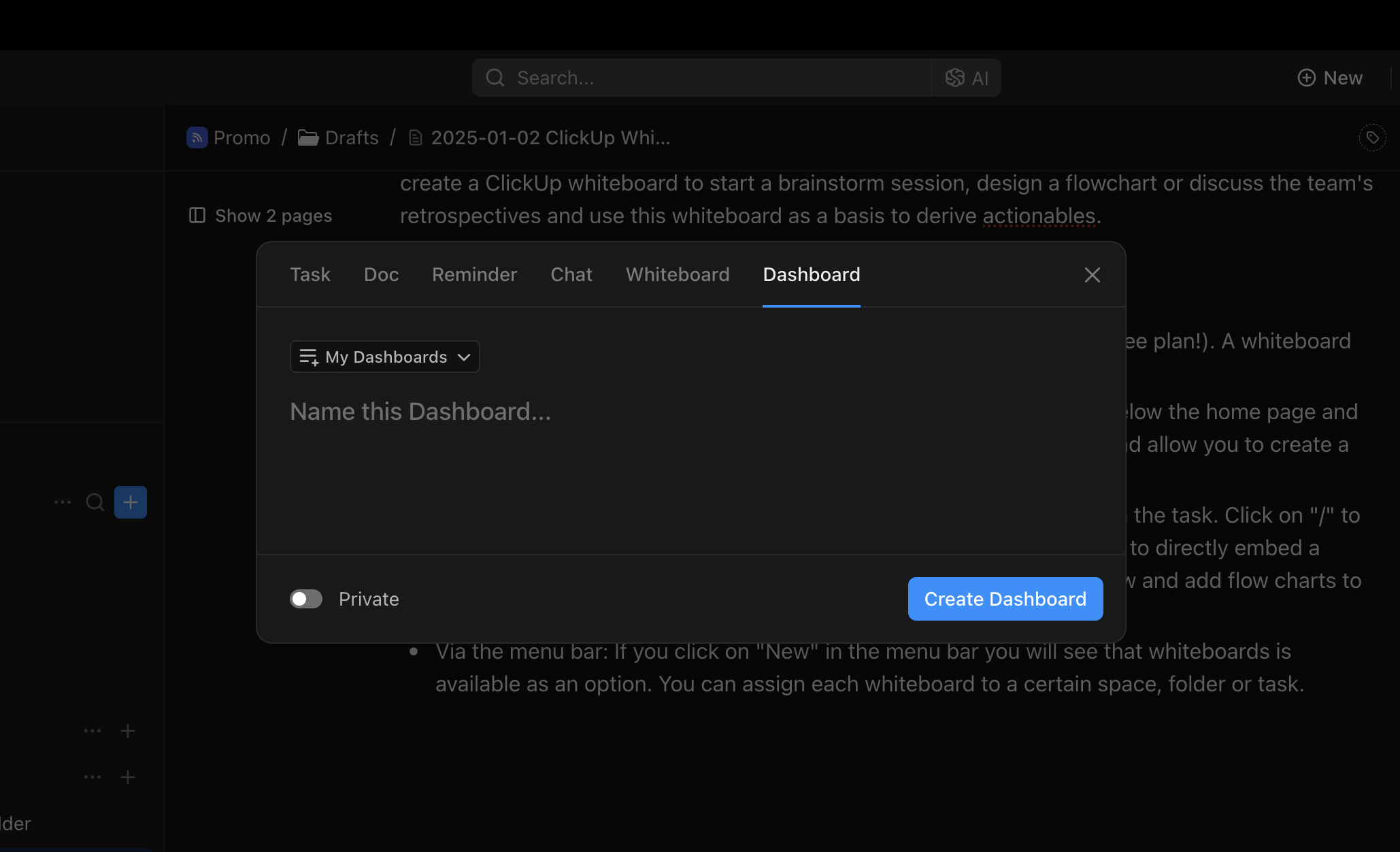
- Via the Menu Bar: Click "New" in the menu bar, and you'll see whiteboards as an option. You can assign each whiteboard to a specific space, folder, or task.
What is new in ClickUp 3.0?
The 3rd iteration of ClickUp Whiteboards introduces some strong new features and impressive quality of life improvements.
Seamless Sharing and Integration
One of the strongest points of Whiteboards 3.0 is its seamless integration with the rest of ClickUp.
- Tasks: You can easily embed whiteboards into task descriptions, mention your team in comments, and create tasks directly on the whiteboard. The connection between Whiteboards and Tasks ensures every great idea is executed. '
- Docs: Embed Docs in Whiteboards and vice versa for real-time collaboration and updates.
- Chat: Whiteboards and chat live together for real-time brainstorming and sharing without switching apps.
This integration make it incredibly useful for turning brainstorm session action items into tasks with due dates, priorities, and assignees.
Improved speed
Nobody likes waiting for things to load. That's why Whiteboards 3.0 is now 10 times faster than the previous version. Whether you're mapping out a project or collaborating live with your team, it's smooth, responsive, and reliable.
A Design That Inspires
Your workspace should be as inspiring as your ideas. Whiteboards 3.0 offers a clean, intuitive interface that's a joy to use. Love working at night? The new dark mode is not only easy on the eyes—it helps you stay focused and creative, no matter the hour.
Turn Text Into Stunning Visuals Using AI
Bring your ideas to life with the power of AI-driven image generation. Simply type out your concept, and the AI will work its magic to create a stunning graphic right on your whiteboard. There's no need to switch between different apps or waste precious time—experience a seamless flow of creativity without any interruptions.
Touch-Friendly Controls
Sometimes, it's just easier to draw things out rather than trying to explain them verbally or through text. The touch interface is designed to let you sketch, draw, and move items naturally on any device you choose to use. Whether you're working on a tablet or a touchscreen laptop, Whiteboards 3.0 feels incredibly intuitive and effortless to use.
Ready-to-Use Templates
Looking for a starting point? Check out the new template library. It's filled with professionally designed options for brainstorming, project planning, and more. These templates let you dive in and get productive right away. Some of our favourites include the 2x2 priority matrix and the 5 whys.
Closing thoughts
We think the that whiteboards functionality is really well executed and covers most of the use cases. It takes a bit of time to get used to the UI but once you're used to adding new shapes and text, it is a very fast and useful tool to visualise your thoughts.
If you're interested to learn more about white, then we strongly recommend watching the tutorial below:
Will Asana AI Studio make a splash?
.png)
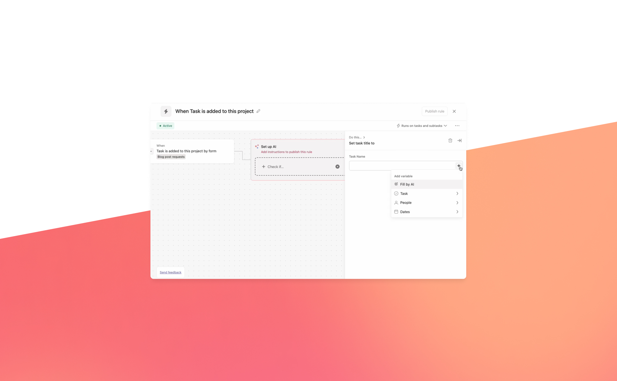
2024 marked a pivotal year for productivity apps, with AI becoming an integral part of their offering. Major platforms like monday.com and ClickUp introduced powerful AI-driven features, such as enabling users to summarize Zoom calls, enhance writing, and get instant answers. AI assistants are steadily taking on more routine tasks, making work simpler and more efficient.
At Asana’s Work Innovation Summit in New York, the company unveiled AI Studio—a new tool designed to automate repetitive tasks. Whether it’s assigning work, organizing updates, or summarizing progress, AI Studio helps you focus on high-impact tasks by eliminating busywork.
What is AI Studio?
Asana AI Studio is an extension of the app's existing rules engine. It enables teams to design workflows, embed AI agents into that workflow, and deploy it directly within Asana—without needing to write a single line of code. AI Studio can be used by every kind of team, from marketing and operations to IT and HR. It is designed to approach varied tasks in the same four stages -- intake, planning, execution, and reporting -- regardless of the nature of the project.
Use Cases
Unlike traditional AI tools that focus on synthesizing information, AI Studio integrates directly with teams, acting as a virtual teammate. Here are some practical ways teams are using it:
- AI Teammate for Quick Answers: Tag the AI in task comments to get instant suggestions or answers, simulating a knowledgeable team member.
- Lead Evaluation for Sales: Use Smart Workflows to assess leads based on predefined criteria, helping sales teams prioritize opportunities efficiently.
- Meeting Preparation: Summarize key updates before meetings, ensuring teams are informed and ready to contribute.
- Content Creation Assistance: Enable marketing teams to generate keyword suggestions or automatically tag and organize content drafts, reducing manual effort.
How to get started with AI Studio?
AI Studio is available to Enterprise and Enterprise+ customers. Follow these steps to enable and use it:
- Enable Asana AI Features: Ensure your organization has activated Asana AI features.
- Admins, super admins, and billing owners can enable AI Studio via the admin console.
- Grant access to individual users as needed.
- Access AI Studio:
- In any project or My Tasks, click the Customize button in the top-right.
- Under the Add section, select AI Studio.
- Build Smart Workflows:
- Open AI Studio to create custom workflows tailored to your team’s needs.
Responsible Usage
To maximize the benefits of AI Studio, ensure your workflows are designed responsibly. Familiarize yourself with industry-standard policies from Asana’s AI partners, including OpenAI and Anthropic. These guidelines can help you create ethical and effective AI-driven processes.
AI Studio represents a significant leap forward in workflow automation, making Asana an even more indispensable tool for teams striving to work smarter, not harder. Ready to revolutionize your workflows? Explore AI Studio today.
What’s New on Monday.com: The Biggest Updates for 2024
.png)
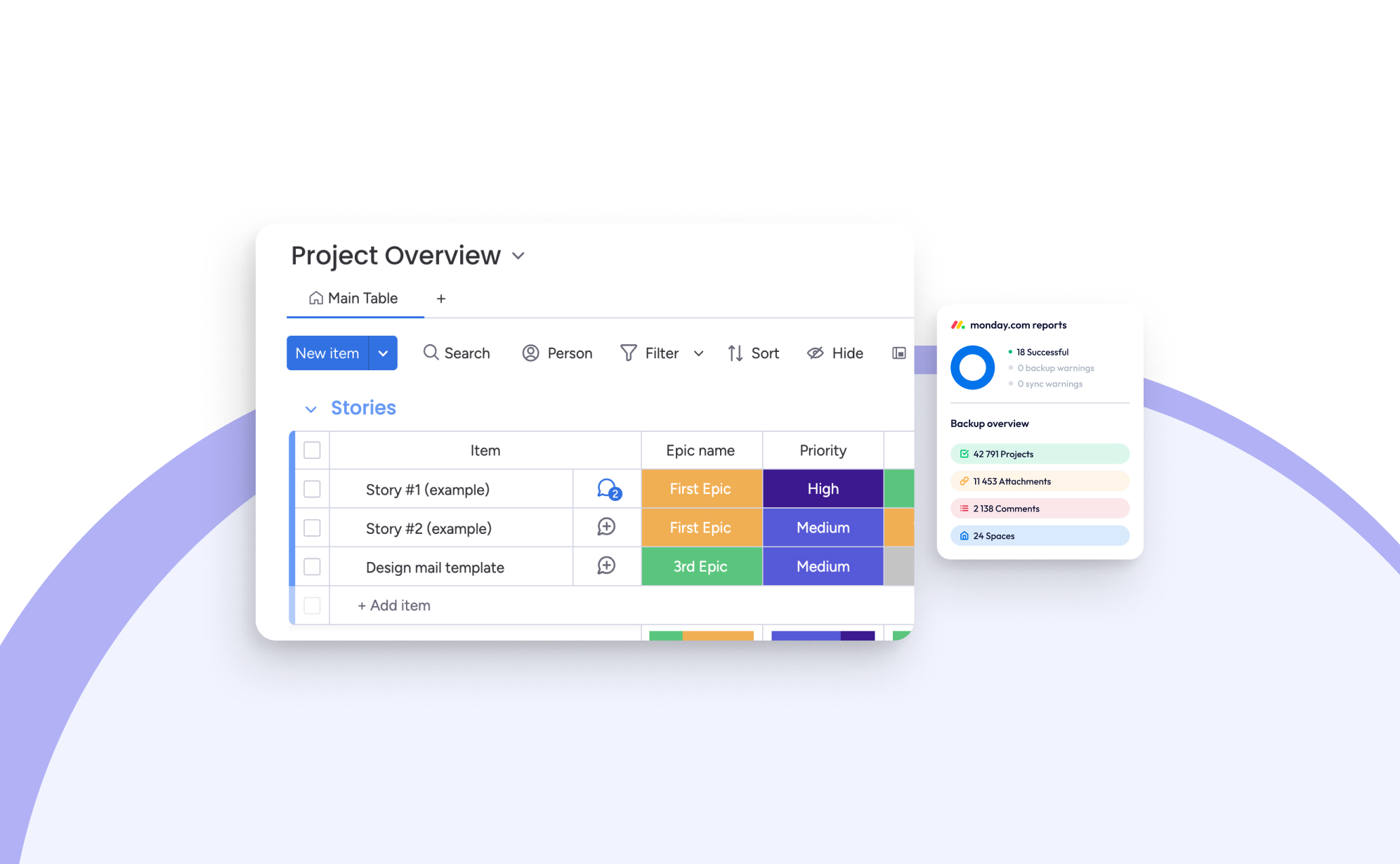
At ProBackup, we are deeply committed to ensuring that you are always up-to-date with the tools that power your daily workflows. In this blog post, we take a closer look at the most impactful updates introduced to Monday.com in 2024. It’s been another significant year for Monday.com, packed with exciting improvements.
Tailored product suites
One of the standout developments this year is Monday.com’s introduction of four tailored product bundles. These curated suites are designed to cater to specific use cases, making it easier for teams to get started and maximize the platform’s potential:
- Work Management: This bundle offers the classic Monday.com experience, which focuses on helping teams effectively manage projects and tasks. It’s a reliable foundation for streamlining workflows and ensuring productivity.
- Monday CRM: This specialized package provides tools to oversee your entire sales funnel, from managing leads to closing deals and maintaining client relationships. It’s tailored for sales teams looking for greater control and efficiency.
- Monday Dev: Aimed at fostering collaboration between developers, product designers, and business teams, this suite is designed to accelerate the product development lifecycle, helping teams bring ideas to life more efficiently.
- Monday Service: Currently in its beta phase, this suite focuses on streamlining support and IT ticket management, ensuring smoother communication between customer-facing and development teams.
We believe this strategic move by Monday.com is a step in the right direction. While the platform’s flexibility has always been a strong suit, the sheer number of options can sometimes feel overwhelming. By offering these focused bundles, teams can start with a well-defined package tailored to their needs and gradually customize their setup as they grow.
Monday Sales CRM
For those new to Monday Sales CRM, it is a powerful customer relationship management tool seamlessly built into Monday.com. Its primary goal is to streamline sales processes, track deals, and enhance client interactions. What sets it apart from other CRM solutions is its unparalleled customization options and robust integrations with other tools.
Here are some of the most noteworthy updates to Monday Sales CRM:
- Sequences allows you to automate repetitive tasks such as email outreach and task reminders, creating a smooth and efficient workflow for activities like client onboarding and lead nurturing.
- With five available steps—automatic emails, manual email reminders, general tasks, call tasks, and delay steps—you can create sophisticated, multi-step sequences.
- Advanced rules let you define when a sequence should start or stop, such as automatically removing a contact from a sequence once they respond to an email.
- The Sequence Manager provides an overview of all sequences, showing how many contacts are enrolled, active, or completed. This feature, though relatively new, already rivals established tools like Drip and ActiveCampaign.
- Zoom AI integration: Another time-saving innovation is the integration with Zoom AI, which automatically summarizes video calls by capturing key takeaways, action items, and highlights. These summaries are added directly to your activity timeline, allowing you to focus on the conversation without worrying about taking notes.
- Enhanced import tool: Importing data into Monday.com has never been easier. The new and improved import tool provides a step-by-step guide to map columns to the board structure and merge duplicate entries. This ensures that your data is accurate, organized, and ready for use right from the start.
WorkCanvas Updates
This year, Monday.com introduced WorkCanvas, a versatile digital whiteboard tool integrated within the platform. Similar to tools like Miro, WorkCanvas allows teams to brainstorm, visualize workflows, and collaborate in real time. Despite being a relatively new feature, it has already received some impressive updates:
- Synced Templates: This update enables users to create project templates in WorkCanvas that are automatically linked to specific boards. This synchronization ensures that updates, tasks, and progress are always aligned across platforms, saving time and eliminating redundant setup steps.
- Project Timelines: With this feature, you can transform your WorkCanvas into dynamic Gantt charts, providing a clear visualization of tasks, dependencies, and deadlines. This makes managing complex workflows more intuitive.
- Table Element: The new table element allows you to create, edit, and format tables directly within WorkCanvas. You can add or remove rows and columns, apply formatting, and drag-and-drop data to keep everything structured and easily accessible.
Dynamic Values in WorkDocs
WorkDocs, introduced in 2023, has become an indispensable tool for many teams, functioning like Google Docs but fully integrated with Monday.com. In 2024, Monday.com enhanced this feature by adding dynamic values, which allow live data from boards to be embedded directly into documents.
For example, by linking a Doc to a board column, you can automatically pull in data such as dates, statuses, or text updates. This feature is perfect for generating up-to-date reports, summaries, or templates without needing to manually refresh information. It’s a game-changer for teams seeking accuracy and efficiency in documentation.
Work Management Updates
In addition to the major feature rollouts, Monday.com has introduced several updates that enhance its core work management capabilities:
- Advanced Dependencies: This update makes project planning more precise by allowing users to add lead times (tasks starting earlier) and lag times (tasks starting later). It’s an essential tool for teams handling complex projects with interdependent tasks.
- Filter Subitems on Dashboards: Subitem filtering adds a new layer of granularity to dashboards, enabling users to analyze data at a deeper level. For instance, you can now filter tasks by priority, assignee, or status, making it easier to generate detailed reports and actionable insights.
- Reply Directly from Inbox: This seemingly simple but impactful update allows users to reply to comments or updates directly via email, eliminating the need to log into Monday.com or switch between tabs. It’s a small change that significantly improves communication efficiency.
Closing Thoughts
These updates reflect Monday.com’s ongoing commitment to innovation and user satisfaction. From enhanced collaboration tools to improved automation and data management capabilities, the platform continues to evolve to meet the needs of modern teams.
At ProBackup, we’re thrilled to see these advancements and are here to help you make the most of them. As always, we ensure your data stays secure while you explore and implement these exciting new features.
Which of these updates are you most excited about? We’d love to hear how they’re transforming your workflows and boosting your productivity!
.jpg)
Airtable’s Latest Release: Introducing Portals

Airtable has recently unveiled Portals, a feature designed to streamline collaboration with external users like clients, vendors, and partners. With Portals, you can create a tailored, secure experience for guests by offering a custom sign-in page that provides easy access to your Airtable app. This innovation makes sharing relevant data simpler and more secure than ever.
Why is this a big deal?
Portals enable you to give external users or guests access to Airtable Interfaces without requiring them to purchase a full Airtable license. This means you can collaborate with external stakeholders at a fraction of the cost. Pricing for the Portals add-on starts at $8 per guest per month or $120 per month for 15 guests and one portal.
Key use cases for Portals:
- Client portal: Provide clients with real-time access to project updates and deliverables.
- Vendor management: Simplify communication and document sharing with suppliers.
- Partner collaboration: Enable seamless data exchange with business partners.
- Customer support: Enhance customer experience with self-service options, FAQs, and support ticket tracking.
It’s important to note that a guest is defined as a user who does not share your team or company’s email domain, or uses a personal domain (e.g., gmail.com, yahoo.com). This ensures team members cannot be treated as guests to reduce licensing costs.
How is different from Airtable interfaces?
Airtable Interfaces have been available for some time and allow you to share access to underlying Airtable data in a customized way. With Interfaces, you can control what parts of the database are visible and editable, tailoring the experience to suit your needs.
The key distinction with Portals lies in the external login capability. Instead of logging directly into Airtable, external users access your custom partner portal to interact with Airtable Interfaces. This provides a more professional, branded experience.
Key features:
- Custom sign-in page: Allow external collaborators to access your Airtable Interface without needing to log into Airtable itself.
- Granular permissions: Control exactly what guests can see and edit, ensuring secure and tailored collaboration.
- White labeling (coming soon): Personalize your portal by matching it to your brand. Add your company logo and customize the background for a cohesive, professional look.
How to get started with Portals?
Portals are currently in beta for Teams, Business, and Enterprise Scale customers. If you’re eligible, you can add the Portals add-on to invite external users and manage their access easily.
As a trusted backup provider for Airtable, ProBackup ensures your data remains secure no matter how Airtable’s features evolve. Stay tuned for more updates on this powerful tool!
See Portals in action
Here are a few tutorial videos to help you explore Airtable Portals:

ProBackup Picks ClickUp's Highlights of 2024

ProBackup Picks ClickUp's Highlights of 2024
ClickUp ended 2023 strong with the launch of ClickUp 3.0. As 2024 wraps up, we're eager to see if they kept their momentum (spoiler alert: they did!).
Here are some of the biggest updates ClickUp added or improved in 2024.
ClickUp Chat
ClickUp is fulfilling its promise to become the "one app to replace them all" with ClickUp Chat. Previously, you could communicate by commenting on tasks and docs, but now ClickUp Chat has its own spot on the sidebar (here's how to activate it).
The feature set is familiar: post announcements, message colleagues directly, and create channels for each department. The biggest advantage is its deep integration with other parts of the app. Here are two examples:
- Create a chat view for a specific list to ask for general updates related to that list or team.
- Turn conversations into tasks with one click and link chats to related work items.
Additionally, you can use the AI option to suggest replies and summarize threads. This leads us to another significant improvement...
ClickUp Brain
The rise of AI was initially met with skepticism, but 2024 proved it's here to stay. Many big SaaS players are integrating AI into their apps, and ClickUp is leading the way with impressive AI features for productivity.
When you log in, the new AI features are easy to find. The pink widget in the bottom right corner gives quick access to summarize, write, or ask a question. It's a clever way to highlight the three main AI use cases within ClickUp.
Summarize: Select text in ClickUp and "ask AI" to summarize, improve, lengthen, or shorten it. You can also check spelling and grammar or translate it. It's super handy and quick!
Writer: This feature helps you draft new text. Use it for anything: generate a meeting minutes template, draft a brainstorming agenda, or write an email with feedback. While the output is often impressive, a human review is recommended.
Ask AI: This option lets you ask questions to the ClickUp Brain. It's the most exotic option, and we haven't explored it much. In theory, you can ask AI to summarize project updates or explain a team process.
Whiteboards 3.0
In December, ClickUp launched the third version of ClickUp Whiteboards. This version is a complete rebuild, featuring a sleek design and powerful capabilities. With improved features and impressive speed, it's easier than ever to work and chat with your team in real-time on the same board.
ClickUp added hundreds of new, professionally designed templates for brainstorming, project planning, and more. They also introduced AI-powered image generation to transform text into stunning visuals in seconds. These updates make it easy to jumpstart sessions and get ideas flowing quickly.
Once you're done, convert whiteboard ideas into tasks, making it simple to turn brainstorming sessions into assigned tasks. You can also export the whiteboard as a PDF, PNG, or JPEG.
Clips 3.0
With Clips, you can instantly create and share videos, making it easy to convey your message clearly and effectively. The process is as simple as hitting record, sharing your screen, and sending your ideas to your team faster than typing a response.
Clips stand out because they integrate seamlessly into the platforms where you already work. There's no need to switch to Loom or upload files.
The flexibility in sharing Clips is remarkable: embed a Clip directly within ClickUp, send a public link to anyone outside your Workspace, or download the video file. Every Clip you record, whether in a comment, task, or Doc, is automatically stored in the Clips Hub (accessible via the navigation bar).
Conclusion
It's clear that ClickUp has had another banging year with new and improved features. This exciting development makes us even more eager to see what innovative features they'll bring in 2025!
New Integration: ProBackup Now Supports Teamwork.com!

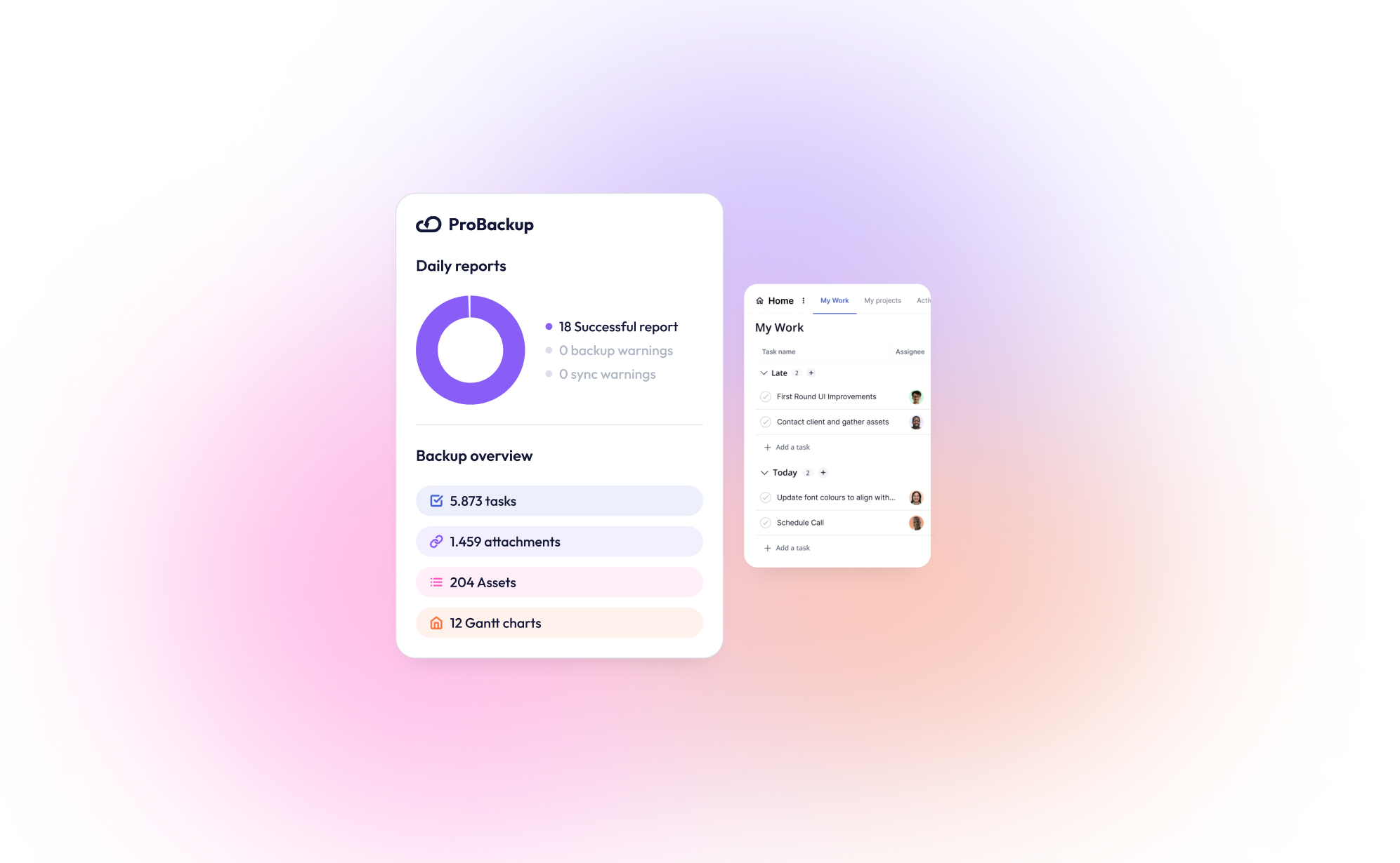
We are thrilled to announce that ProBackup now supports Teamwork.com, the popular project management and collaboration platform. With this new integration, ProBackup continues to deliver on its promise of safeguarding your business-critical data for the SaaS tools you rely on.
Teamwork.com is a project management and collaboration platform designed to help teams plan, track, and manage their work efficiently. It offers tools for project planning, task assignments, time tracking, resource management, and client collaboration, making it especially popular in client-focused industries like marketing, agencies, and professional services.
What makes Teamwork.com unique?
Teamwork.com stands out from competitors by avoiding overly technical or jargon-heavy language. While platforms like Jira have steeper learning curves due to terms like “epic” and “issue,” Teamwork.com uses straightforward terminology, making it accessible to users across various professions and backgrounds.
Its automation features are equally user-friendly. Unlike some tools that require extensive tutorials, Teamwork.com allows you to automate tasks, such as moving items on a Kanban board, with ease.
Additionally, Teamwork.com includes built-in features for time tracking, budget management, and invoice calculations, providing clear insights into your project’s financial health.
To streamline business operations further, Teamwork.com offers complementary products like Teamwork Chat, Teamwork Desk, and Teamwork Spaces. These tools integrate seamlessly with the main platform, eliminating the need for cobbling together disparate systems.
Why Backup Teamwork.com?
Teamwork.com offers a decent trash can feature to recover recently deleted items: Deleted items are stored in the trash can for 30 days, before being permanently deleted. We think it's great that only admins can access the trash which prevents that other team members can empty the trash can.
However, despite this you could still lose business-critical data in some scenarios:
- Malicious deletion of trash can items by the admin
- Recovering items that were deleted more than 30 days
- Rollback data after a wrong bulk import or update
ProBackup provides an answer to these worst-case scenarios by offering:
- Daily Automated Backups: Never worry about losing important project updates.
- Data Restore Options: Quickly recover lost or corrupted data in just a few clicks.
- Comprehensive Security: Your backups are encrypted and stored securely.
What We Back Up
With ProBackup, you can ensure the safety of all your essential Teamwork.com data:
- Tasks
- Projects
- Clients
- Attachments
- Comments
- Task Lists
- Users
Get Started
Integrating Teamwork.com with ProBackup is simple. Log in to your ProBackup account to enable this feature today. Stay ahead of potential data loss and keep your projects secure with ProBackup for Teamwork.com.
Ready to protect your Teamwork.com data? Start your free trial now.

On the Path to SOC 2 Type II Certification: What It Means for You
.png)
We’re excited to share that ProBackup is on the path to achieving SOC 2 Type II certification, with our audit currently underway. We anticipate completing the process by mid-February, marking a significant milestone in our mission to deliver secure and reliable backup solutions for project management apps like ClickUp, Airtable, Jira, and many more.
SOC 2 Type II is widely recognized as a benchmark for data security, evaluating not just the design of security controls but their operational effectiveness over an extended period. This rigorous process reflects our unwavering commitment to safeguarding your data and earning your trust.
What Does This Mean for You?
As we work toward certification, here are the 3 main benefits for you as a customer:
- Enhanced Security: Strong protections against unauthorized access to your data.
- Reliable Operations: Systems designed for high availability and performance.
- Greater Transparency: Assurance that we’re meeting stringent security standards.
The updated policies and security practices will soon be available for customers in a brand new Trust Center. The Trust Center will give customers easy access to all policies and security reports such as the latest pen test results and the SOC2 report. The trust center will be launched by the end of February.
Stay Tuned
We’ll keep you updated on our progress and will share the news once our certification is complete. If you have any questions about our journey to SOC 2 Type II or the measures we take to secure your data, feel free to reach out.
Thank you for trusting ProBackup to protect your business-critical data. Together, we’re building a safer, more secure future for your operations.
.jpg)
Why Backing Up Slack Data Is Crucial After Recent Changes
.png)
Slack recently rolled out significant updates that impact users on free workspaces, limiting data retention and message history. If you manage projects or collaborate with teams on Slack’s free plan, it's crucial to understand these changes and how they affect your ability to access past conversations and files. Here’s everything you need to know about the update and why a solid backup strategy is more important than ever.
What’s Changing in Slack’s Free Workspaces?
Slack has shifted from storing messages and files indefinitely to a rolling 90-day limit on free workspaces. This means:
- Message Retention: Only messages from the past 90 days will be available. Anything older will be inaccessible unless your workspace is upgraded to a paid plan.
- File Storage: Similarly, files shared more than 90 days ago will no longer be accessible.
This change can be a major disruption for teams that rely on Slack for daily communication. Old conversations, decisions, and shared files are critical, especially in long-term projects.
Why Should You Be Concerned?
While Slack's free plan remains a valuable tool for small teams, the updates pose a risk of data loss. Without proper backups, you could lose access to important files, project discussions, or decision-making threads, which may affect future work. Key risks include:
- Loss of Historical Data: Teams often refer back to past discussions in long-term projects. Under the new Slack policy, this historical data could vanish unless you pay for a higher plan.
- Unreliable File Availability: Shared files older than 90 days will no longer be stored, which could lead to gaps in your documentation.
How ProBackup Can Help
ProBackup is designed to protect your valuable data on platforms like Slack. Our solution offers automated, scheduled backups that ensure your conversations, files, and attachments are securely stored and easily retrievable - no matter what happens on Slack’s servers.
With ProBackup, you can back up various types of data, including:
- Users: Maintain records of all team members.
- Channels: Keep a complete history of discussions across different channels.
- Threads: Save important threaded conversations for context.
- Messages: Archive all messages for future reference.
- Attachments: Securely store files shared in channels and direct messages.
- Direct Messages: Back up direct messages that you have access to, ensuring no vital communication is lost.
With ProBackup, the retention of your data depends on your subscription plan:
- Plus Plan: Retains revisions for up to 6 months.
- Pro Plan: Retains revisions for up to 2 years.
- Premium Plan: Retains revisions for up to 4 years.
This flexibility allows you to choose a plan that best fits your team's needs.
What You Can Do Now
To avoid any disruption or potential data loss, here’s what you should do:
- Evaluate Your Needs: If you rely heavily on Slack’s free version for project management, consider the potential impact of the 90-day limit.
- Upgrade or Back Up: You can either upgrade to Slack’s paid plan for longer retention or use ProBackup to ensure your data is backed up and retrievable.
- Set Up ProBackup: Automate the process of securing your Slack data, giving you continuous access to your messages and files based on your chosen retention plan.
Conclusion
Slack's changes to free workspaces introduce limits that could put your team’s data at risk. ProBackup offers a seamless solution to these challenges by ensuring your conversations and files are always backed up, accessible, and secure - so you can focus on what matters most: getting work done.
New Integration: Backup Your GitHub Data with ProBackup

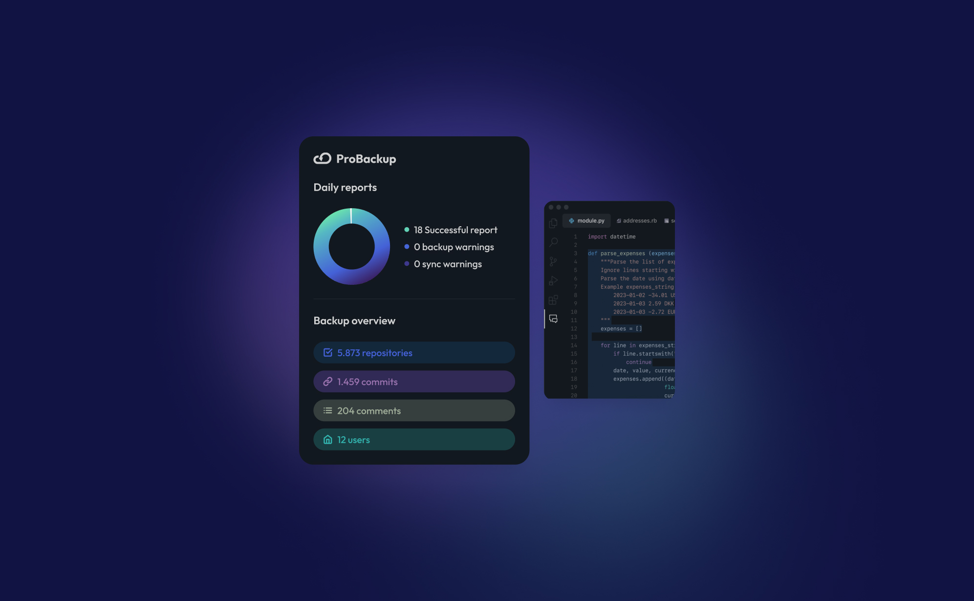
We’re thrilled to announce that ProBackup now supports GitHub! With this new integration, you can back up key data from your GitHub account, ensuring your code and development history are safe and secure.
For those unfamiliar, GitHub is the world’s leading platform for version control and collaboration, allowing developers to store, track, and manage their code. It’s a crucial tool for teams working on software projects, providing a centralized place for code repositories, branches, and commits. Developers can work together on projects, review changes, and maintain a complete history of every version of their code.
With ProBackup’s GitHub integration, you can back up:
- Repositories: Secure all your project files and codebases.
- Branches: Preserve every branch of your development efforts.
- Commits: Keep a record of every change made to your code.
- Repository Snapshots: Capture specific points in your repository's history, allowing easy rollback if needed.
ProBackup automatically backs up your GitHub data on a daily basis, so you never need to worry about losing important work. You can view your backups directly in our UI and even sync them to your Google Drive for additional storage and redundancy.
Currently, ProBackup provides backups of all your GitHub data, but restoring data back to GitHub is not yet available. However, your backups are easily accessible, and your data is always protected.
Get started with ProBackup’s GitHub integration today and keep your development history safe! Stay tuned for more updates!
.jpg)
How to Back Up Your ClickUp Lists?
.png)
Managing tasks and projects in ClickUp is a lifesaver for many teams, but what happens if all that data suddenly vanishes? Losing a ClickUp list can derail productivity and leave teams scrambling to recover critical information. That's why backing up your ClickUp lists is not just important, but essential.
In this post, we’ll walk you through how to back up your ClickUp lists using ProBackup, explain the types of data you can protect, and why a solid backup strategy is key to safeguarding your workflow.
Why You Need to Back Up Your ClickUp Lists
ClickUp is a versatile project management tool, but relying on any single system without a backup plan is risky. Here’s why:
Protection Against Data Loss
ClickUp users face risks like accidental deletions, software glitches, or unauthorized access. Losing key tasks, timelines, or attachments could halt a project and create chaos for your team. A backup ensures your lists are protected and quickly restorable if something goes wrong.
Prepare for Unforeseen Events
Even though ClickUp is a reliable platform, no cloud service is immune to outages or system failures. A backup plan allows you to restore data fast, keeping your team on track, minimizing downtime, and ensuring continuity.
Archiving Completed Projects
Sometimes, you need to archive a project and store it for future reference. Backups help you easily retrieve old ClickUp lists without cluttering your workspace.
Compliance and Data Retention
If your industry has data retention regulations, regular backups help you stay compliant by securely storing historical data, safeguarding it over time.
What Data Can You Back Up in ClickUp?
ProBackup ensures that all critical data in your ClickUp environment is fully backed up, both on an account level and a list level.
On Account Level:
- Teams & Users: Preserve team structures and user data.
- Workspaces & Shared Workspaces: Secure all workspaces, ensuring no collaborative data is lost.
- Folders & Lists: Back up the organization of your tasks within folders and lists.
On List Level:
- Tasks & Subtasks: Save all tasks, including subtasks, along with their detailed breakdowns.
- Assignee & Due Dates: Capture task assignments and deadlines to maintain accountability.
- Custom Fields & Values: Protect your custom configurations and any associated values.
- Attachments & Files in Task Descriptions: Securely store attachments and files added within task descriptions.
- Docs: Preserve any docs created in ClickUp.
- Comments & Replies: Back up comments and threaded replies to ensure no team discussions are lost.
- Checklists: Save detailed checklists associated with tasks.
- Goals: Ensure team objectives and goals are backed up for continued progress tracking.
- List Members: Secure the member roles assigned to your lists.
- Tags: Keep the tags used for task categorization intact.
- Time Tracking & Time Estimates: Preserve time-tracking data and estimated time requirements for tasks.
- Views: Back up customized views, ensuring your preferred layout and workflow settings are maintained.
How to Back Up Your ClickUp Lists with ProBackup
With ProBackup, automating the backup of your ClickUp data is simple and efficient. Here’s how to do it:
- Log into ProBackup: Open your ProBackup account and navigate to the integrations section.
- Connect ClickUp: Select ClickUp as the integration to back up. Follow the steps to securely link your ClickUp account with ProBackup.
- Choose Your Lists: Select the ClickUp lists you want to back up. You can choose specific lists or opt to back up everything.
- Automatic Daily Backups: ProBackup automatically backs up your ClickUp data daily. No need to configure a custom schedule—your backups will run consistently every day, ensuring your data is always up to date.
- Monitor and Restore: Use the ProBackup dashboard to monitor your backup history and restore data as needed. Restoring is straightforward, allowing you to recover full lists or specific items.
Why Use ProBackup for ClickUp?
ProBackup offers more than just basic backups. Here’s why ProBackup is the perfect solution for your ClickUp data:
- Automated Daily Backups: Set it and forget it. ProBackup automates the process with daily backups, ensuring your data is always secure and up to date.
- Easy Restoration: Restore entire lists or individual tasks with just a few clicks.
- Secure Storage: All data is encrypted, ensuring your backups are safe from unauthorized access.
- Compliance-Friendly: ProBackup helps you meet data retention requirements by offering long-term storage solutions.
Start Backing Up Your ClickUp Lists Today
Don’t leave your project data vulnerable to loss. With ProBackup, you can secure your ClickUp lists with ease, ensuring peace of mind. Log in to ProBackup today and protect your workflow from unexpected disruptions.
.jpg)
How to Back Up Your Asana Projects (and Why It Matters)
.png)
Asana is an excellent tool for organizing tasks, tracking progress, and keeping your team on the same page. But have you ever wondered what would happen if something went wrong? Data loss can strike unexpectedly, whether due to accidental deletions, technical issues, or even compliance needs for some businesses. Having a reliable backup for your Asana projects is the best way to protect your data and stay prepared.
In this guide, we’ll show you how to back up your Asana data and highlight why a backup solution like ProBackup can keep your work safe, automated, and worry-free.
Why Should You Back Up Your Asana Projects?
Backing up your Asana data isn’t just a nice-to-have - it’s essential. Here’s why:
- Accidental Deletions: One wrong click or accidental drag, and you could delete critical tasks, milestones, or even a whole project.
- Compliance: For certain industries, keeping data archived and recoverable is a regulatory requirement.
- Peace of Mind: A reliable backup means you can work confidently, knowing that you can recover data anytime if something goes wrong.
Ways to Back Up Your Asana Data
1. Manual Exports (The Basic DIY Method)
Asana lets you export projects manually, giving you a simple backup for specific projects.
How It Works:
- Open your project in Asana.
- Click on "Export/Print" in the dropdown menu.
- Select "CSV" to download a snapshot of your project.
Limitations: While useful in a pinch, manual exports are time-consuming, don’t update automatically, and only provide a static view of your data.
2. Automated Backups with ProBackup (The Easy, Hands-Off Solution)
Automated backup services like ProBackup make data protection effortless. ProBackup integrates directly with your Asana account, providing daily, automated backups of all your essential data - without needing you to lift a finger.
What We Back Up for You:
- On Account Level:
- Workspaces
- Teams
- Projects
- Portfolios
- On Project Level:
- Tasks & Subtasks
- Dependencies
- Custom Fields
- Tags
- Comments
- Attachments
- Milestones
- Goals
- Approvals
How It Works:
- After setup, ProBackup runs in the background, performing daily backups of everything from tasks and subtasks to comments, attachments, and goals.
- If you need to restore data, simply choose what to recover - whether it’s a single task or an entire project.
Advantages:
- Automated Daily Backups: No need for reminders or manual exports. Your data is backed up continuously, with the latest version always available.
- Data Security: ProBackup protects your data with encryption, keeping it secure and accessible.
- Easy Restoration: If data loss occurs, you can quickly restore what you need, saving time and stress.
3. Custom Backups with the Asana API (For Tech-Savvy Teams)
For those with technical expertise, the Asana API allows for custom-built backup solutions.
Pros:
- Full control over data selection and backup frequency.
- Customization for unique data requirements.
Cons:
- Requires ongoing maintenance and coding skills.
- Less convenient for regular backups, especially if you manage multiple projects.
How to Restore Your Asana Data
- Manual CSV Restoration: For CSV exports, restoring involves manually re-creating tasks and structures, which can be time-consuming.
- Automated Restoration with ProBackup: With ProBackup, restoring data is simple. You can choose exactly what to recover - tasks, projects, or even entire workspaces - without losing hours of work or trying to reconstruct data from scratch.
Conclusion
Asana makes project management easy, but having a backup ensures your work is safe from unexpected issues. Manual exports can work for quick backups, but a reliable, automated solution like ProBackup offers continuous, worry-free protection.
If your team relies on Asana for critical work, ProBackup provides an effortless way to protect your data. With automated backups and secure restoration, you can focus on getting things done - without worrying about what could go wrong.
Need Help?
Have questions about backing up your Asana projects or want to see ProBackup in action? Contact us today, and our friendly team will be happy to assist you!
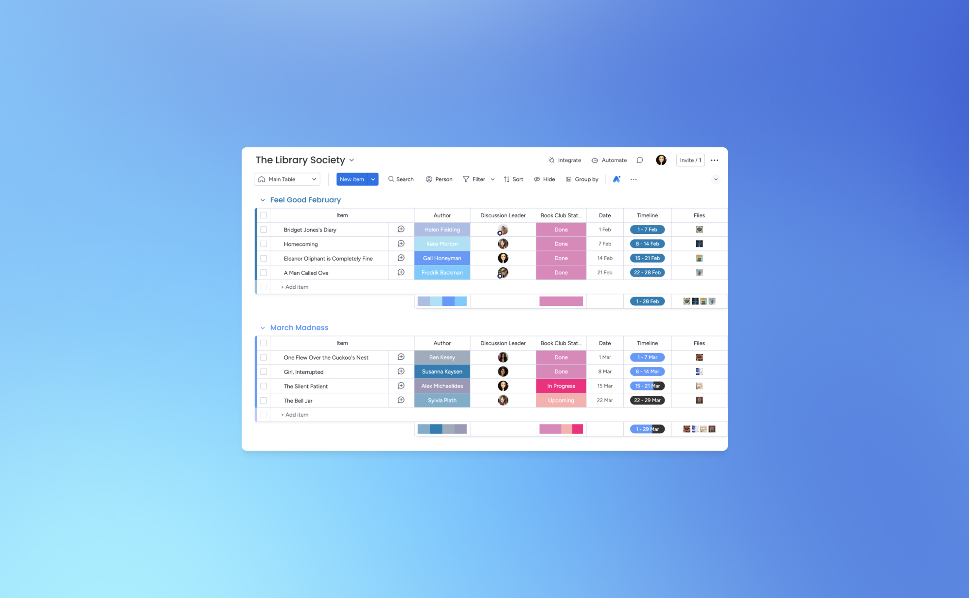
How to Back Up Your monday.com Boards
.png)
Let’s face it - losing your monday.com board can feel like a major setback for your project. One minute everything’s in order, and the next, things can spiral out of control. That’s why backing up your monday.com boards is crucial. Think of it as your safety net for ensuring that your team’s valuable data stays secure.
Whether you're managing multiple projects or dealing with complex workflows, having a reliable backup system in place can prevent data loss. Below, we’ll guide you through the process of backing up your monday.com boards using ProBackup and explore why it's essential for protecting your data.
Why You Need to Back Up Your monday.com Boards
Imagine working on an extensive project on monday.com, carefully organizing tasks, timelines, and team responsibilities, only to lose all of it due to an unexpected event. This kind of scenario happens more often than you might think. Having a solid backup strategy is not just a precaution—it’s a must to protect your project’s progress.
Here’s why backing up your monday.com boards is important:
Protection Against Data Loss
Data loss can happen for many reasons, including accidental deletions, software glitches, and cyberattacks. Losing critical project data can cause delays, disrupt team productivity, and impact client relationships. Regular backups safeguard your monday.com data and ensure that you can restore it quickly in case anything goes wrong.
Preparing for Unforeseen Events
While monday.com is a robust platform, no cloud-based system is immune to risks like server outages or data corruption. If such an event occurs, having backups allows you to restore your data fast, minimizing downtime and keeping your team on track. A solid backup plan is your insurance against these unpredictable scenarios.
Data Migration and Archiving
As your business evolves, you might need to move your data to a different platform or archive old projects. Backups make it easy to transition or archive data securely without losing vital information.
Compliance and Data Retention
Many industries have strict regulations regarding data retention and security. Regular backups can help you meet these compliance requirements by securely storing your project data over time.
How to Back Up Your monday.com Boards
With ProBackup, you can automate your monday.com board backups and save time. Here’s how to get started:
- Access Your monday.com Account:
- Log into your ProBackup account and go to the integrations section.
- Connect monday.com:
- Select the monday.com integration and follow the steps to securely connect your account.
- Select Your Boards:
- Choose which boards you want to back up. You can back up all boards or only the ones that are critical to your projects.
- Automatic Daily Backups
- ProBackup automatically backs up your Monday board data daily. No need to configure a custom schedule - your backups will run consistently every day, ensuring your data is always up to date.
- Monitor and Restore:
- From your ProBackup dashboard, you can easily monitor your backup history and restore data when needed.
Why Choose ProBackup for monday.com?
With ProBackup, you get more than just a backup - it’s a full solution that ensures the integrity of your monday.com data. Here are a few reasons why ProBackup is the right choice:
- Automated Backups: No need to remember manual backups - our system takes care of it.
- Restore Options: Restore entire boards or individual items, depending on your needs.
- Secure Data: All backups are encrypted, ensuring that your data is always protected.
- Compliance Support: Meet industry-specific regulations with easy access to data retention solutions.
Start Backing Up Your monday.com Boards Today
With ProBackup, securing your monday.com boards is simple, fast, and reliable. Don’t wait until it's too late—get started with automated backups and ensure your project data is safe and sound. Log into ProBackup today and start protecting your monday.com data with ease.
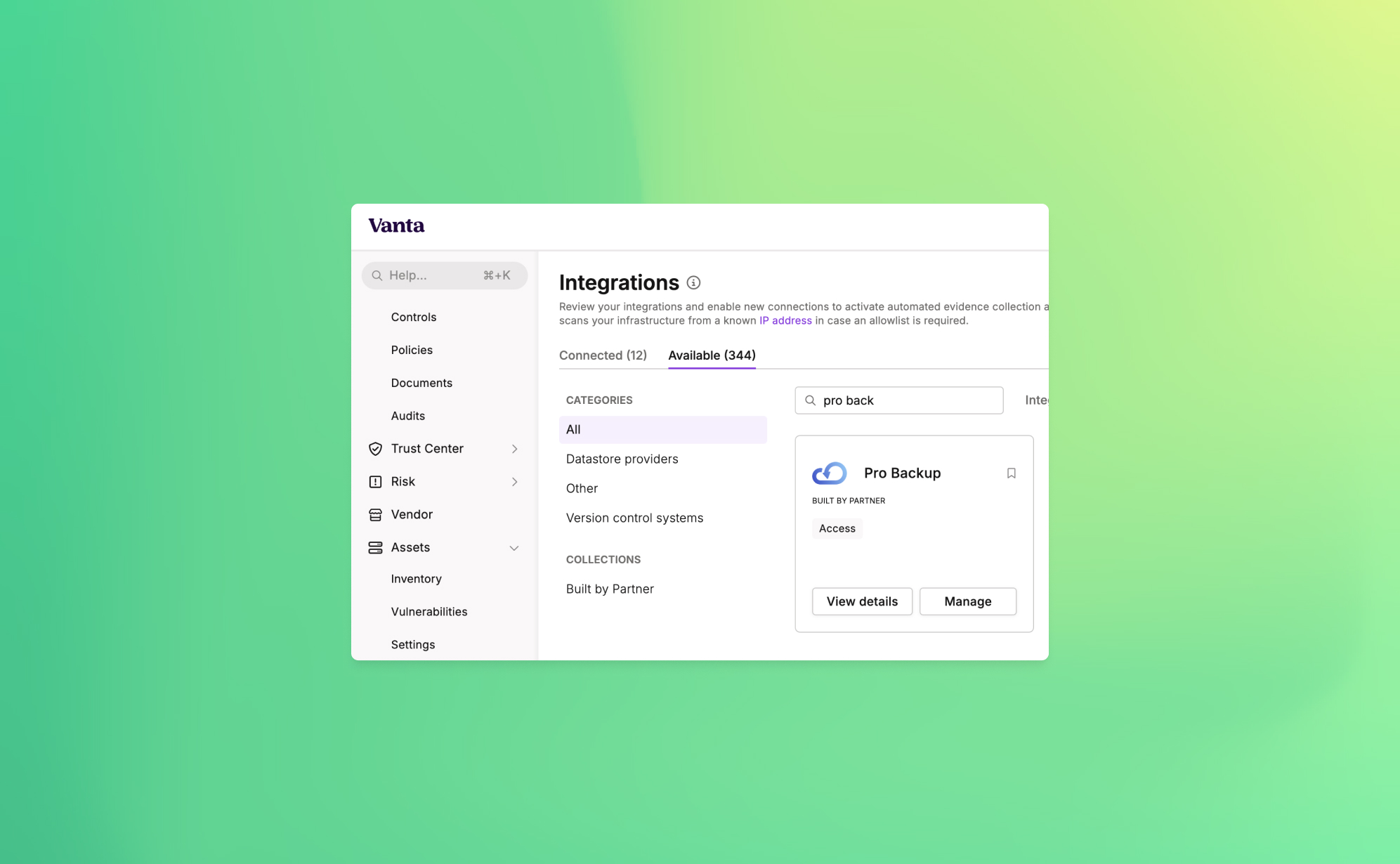
Announcing ProBackup's New Vanta Integration for SOC 2 Compliance

At ProBackup, our mission is to provide businesses with secure, reliable cloud backup solutions. As part of our commitment to security and compliance, we're excited to announce a new integration with Vanta, a leading platform that automates the path to SOC 2 compliance.
This new integration is designed to help companies strengthen their security posture by automating the compliance tests that are linked with the ProBackup platform. For organizations working towards or maintaining SOC 2 compliance, this integration provides both peace of mind and significant time savings.
Why SOC 2 Compliance Matters
SOC 2 (System and Organization Controls 2) is a crucial standard for SaaS companies, especially those dealing with sensitive customer data. It sets the guidelines for managing customer data securely, covering five key principles: security, availability, processing integrity, confidentiality, and privacy.
SOC 2 compliance assures your customers that your organization follows strict protocols to protect their data. Achieving SOC 2 compliance not only strengthens security but also builds trust and credibility with your clients.
Cloud Backups and SOC 2 Compliance
Cloud backups are a critical component of any organization's data protection strategy. However, simply having backups is not enough—SOC 2 compliance requires that backups are secure, monitored, and managed in line with strict protocols. The ProBackup + Vanta integration simplifies this process by automating the checks necessary to meet compliance requirements.
How the ProBackup + Vanta Integration Works
The integration includes 3 automated tests that Vanta runs to ensure your backup processes are secure and compliant with SOC 2 standards:
- Accounts deprovisioned when personnel leave (ProBackup): Ensures that user access to cloud backups is revoked when employees leave your organization.
- User accounts associated with users (ProBackup): Verifies that all backup accounts are correctly linked to an individual, reducing the risk of orphaned accounts.
- User accounts have MFA enabled (ProBackup): Confirms that multi-factor authentication (MFA) is enabled for all user accounts, adding an extra layer of protection.
These automated tests help your organization meet the following SOC 2 controls:
- Remote access MFA enforced: Ensures that all users accessing your systems remotely have MFA enabled, reducing the risk of unauthorized access.
- Unique production database authentication enforced: Guarantees that each user has a unique identifier for accessing the production environment, improving accountability and security.
Cloud Backups and SOC 2 Compliance
Cloud backups are a critical component of any organization's data protection strategy. However, simply having backups is not enough—SOC 2 compliance requires that backups are secure, monitored, and managed in line with strict protocols. The ProBackup + Vanta integration simplifies this process by automating the checks necessary to meet compliance requirements.
How to Get Started
To start using the new integration, simply go to the Integrations section within Vanta and link your ProBackup account. From there, the automated tests will continuously run in the background, helping your organization stay compliant without additional manual effort.
With this integration, you can rest easy knowing that your cloud backups are secure, compliant, and in line with industry best practices.

Why Cloud Backups Are Critical for SaaS Data Protection

With an increase in the number of online businesses, it has become customary for them to depend largely on Software as a Service (SaaS) platforms. These cloud-based tools are extremely useful in the optimization of processes and improving communication between employees. But with that great ease arises an important concern as well: what if you lose your data?
Many make the same mistake. They think everything is taken care of and their data is safely hosted – SaaS provides that peace of mind, but that is not entirely true. Indeed, they manage uptime and security. However, they do not protect you from accidental deletions or target attacks. This is where cloud backups protect consumers as well as many companies. Let's analyse why having cloud backups in place is essential for any business using SaaS tools,, and why such measures will save you from all headaches.
1. The Risk of Data Loss Is Real
It is very common to think that data loss will not happen to your business until it does. And the truth is that if you depend on your SaaS provider’s protection solely, that may leave you exposed more than you think. Here’s why:
- Human error: Mistakes happen. An employee leaves their hard drive plugged into a conference call system and a criminal comes in and deletes as much as possible from the poor man's hard drive.
- System glitches: Even the most reliable SaaS providers are oftentimes only 95% reliable. Programming or operator errors, hardware malfunction, power outages, and internet downtime are all common nuisance problems that waste people’s time as well as opportunities to create value in an organization.
In the absence of a substantially good backup strategy, making good the lost data may be so hard if not impossible. This is the reason why having an efficient cloud backup system is so vital.
2. Why Cloud Backups Are More Than Just a Safety Net
Cloud backup can be likened to an insurance policy – one you pray that you’ll never have to use but will be immensely grateful for how useful it is when the worst comes to the worst. This is exactly the reason they are so popular
- Backup fatigue: Because these are cloud backups, these plans will keep a copy of the data and that copy is going to be kept in other places away from where the SaaS provider’s office is located. Therefore, even if there are any inconsistencies with your SaaS data, you don’t have to fret as there’s a backup already in place B and ready to be utilized instead.
- Automatic updates: The most important feature? The majority of cloud storage backup solutions are automatic. So, once you decide how often to back up your information, you will never have to disturb yourself to back up the information regularly – your information will be backed up automatically.
Eventually, however, we can expect and appreciate cloud storage for backup and recovery of valuable information because in case the worst case scenario occurs, one does not lose information for good.
3. Cyberattacks and Ransomware: How Cloud Backups Can Save You
This age, especially after the growth of ransomware, brought the danger of cyber threats higher than ever. They take hold of the resources you have at this moment as well as your data and agree to unlock the data only for a huge fee. The damage in terms of business and processes might be preventive.
Luckily for our business, against ransomware attacks one of the most efficient measures would be the taking of online cloud backups. There is no point in stealing ANY of your SaaS data because you will always have a backup, which attackers will not be able to access.
To get more security, businesses mostly use services such as the Cheapest monthly VPN which keeps the internet traffic secure while the data is being backed up or changed. It is a clever, multi-level method to secure your information.
4. Best Practices for Cloud Backups in SaaS
If you wish to optimize the effectiveness of your cloud backups, there are several practices you should observe regarding your data.
- Backup frequently: Regularly, data loss is less likely when frequent backups are made.
- Use encryption: Encryption needs to be applied whenever and wherever your backups are being sent or kept.
- Test your backups: Make it a point to carry out some recovery testing regularly. The chances of accomplishing this in an actual crisis are quite slim so it is advisable to carry out this during a drill.
Conclusion
Cloud backups should not be considered as an additional feature: they are a must include in every strategy for SaaS data protection. They help prevent human errors, protect against hackers and assist in meeting legal requirements which is quite a valuable asset for your company. In the era we are living in, no one is too cautious about how they go about keeping the most important item in business – the data.
How to Back Up Your Slack Channels?
.png)
If your team uses Slack, you know it’s more than just a chat tool - it’s where important conversations, files, and decisions happen every day. But what would happen if any of that data disappeared? Mistaken deletions, account changes, or even accidental closures can result in the loss of critical information. That’s why it’s worth having a reliable backup strategy in place for your Slack channels.
In this post, we’ll walk you through why it’s essential to back up Slack and share simple ways to protect your team’s conversations.
Why Backing Up Your Slack Data is Essential
While Slack stores a lot of information, there are still good reasons to have your own backup:
- Data Loss Risks – We’ve all seen it happen: messages or files get accidentally deleted. Having a backup means you can restore that lost data with just a few clicks.
- Compliance Needs – Certain industries, like finance or healthcare, require records of communication for compliance. Backups ensure you have data stored long-term to meet these requirements.
- Business Continuity – When disruptions occur, it’s comforting to know that you can recover Slack data without missing a beat.
What ProBackup Covers
With ProBackup, you don’t have to worry about losing the most important parts of your Slack workspace. Here’s what we back up:
- Users – We capture the information of all workspace members.
- Channels – ProBackup covers both public and private channels, keeping track of all those valuable team conversations.
- Threads – Preserve context by backing up threaded conversations.
- Messages – Every message in your channels is backed up, so nothing slips through the cracks.
- Attachments – Files, images, and any other media shared in channels are backed up too.
- Direct Messages – We back up direct messages (DMs) that the workspace admin has access to, so you don’t lose any critical one-on-one discussions.
With this coverage, ProBackup gives you the peace of mind that, if needed, you can restore complete conversations and files quickly.
Three Ways to Back Up Slack Data
Let’s take a look at the main ways to create Slack backups:
1) Manual Exports
Slack allows workspace owners and admins to export data. To do this:
- Go to Settings & Administration > Workspace Settings in the Admin Dashboard.
- Head to Import/Export Data and choose Export to download your public channel messages and files.
Manual exports have some limitations, though. For example, direct messages and private channels aren’t always included on the free and standard plans, and the export format (JSON) requires extra steps if you need to review or restore content.
2) Automated Daily Backups with ProBackup
For a set-it-and-forget-it solution, ProBackup offers automated daily backups. Once you set up ProBackup, it will back up your Slack data daily without any extra work on your end. This includes:
- Continuous Backup – You won’t need to manually export or worry about missing anything, as ProBackup does this daily.
- Access Control – Customize who can access or restore the data, which is helpful if only certain admins need that responsibility.
- Customizable Retention Policies – Choose how long to retain data to meet your compliance or archival needs.
Daily backups keep your Slack data fresh and up to date, so your team’s conversations are always protected.
3) Slack’s Built-In Retention Policies
For organizations on Slack’s Enterprise Grid, there are advanced retention policies that allow you to schedule deletions of messages based on compliance requirements. While these are useful for compliance, they aren’t a true backup solution, as data is deleted once the retention period expires.
Best Practices for Slack Backups
To ensure you’re covering all your bases:
- Use Daily Backups: ProBackup’s daily automated backups make sure your Slack data stays safe without requiring any manual steps.
- Define Your Backup Scope: Identify the channels and types of messages (public, private, DMs) you want to protect.
- Consider Data Privacy: Be mindful of data privacy standards, especially if you’re backing up sensitive information.
- Test Restores: Run periodic tests to confirm that you can restore data smoothly if you need it.
Protect Your Slack Data with ProBackup
At ProBackup, we specialize in making sure your team’s data across SaaS tools, including Slack, stays safe and accessible. ProBackup offers:
- Complete Coverage – We back up channels, messages, threads, files, and DMs that you need.
- Ease of Use – Quick setup and easy integration with your worksfdfdfdfdpace.
- Security – We store your backups securely, meeting industry encryption standards.
Start protecting your Slack conversations today with ProBackup and stay prepared for whatever comes your way.
Guest post: Interview With SafetyDetectives

In the world of digital transformation, data is the lifeblood of businesses. Whether it’s customer information, project details, or vital internal communications, the importance of safeguarding this data cannot be overstated. However, many companies mistakenly assume their cloud apps provide adequate protection, only to find themselves scrambling when critical information is lost. Enter ProBackup, a company dedicated to filling this gap with a straightforward yet powerful solution for backing up and restoring data from popular project management and CRM apps.
SafetyDetectives recently had the opportunity to sit down with Willem Dewulf, CEO of ProBackup, to discuss the inspiration behind founding the company, what sets them apart in a crowded market, and the common misconceptions businesses have about data backups. Willem’s journey from experiencing a data loss firsthand to building a specialized backup service provides invaluable insights into why robust data protection is crucial for businesses of all sizes. Read on to learn more about ProBackup’s unique approach, their commitment to data security, and advice for companies just beginning to think about their backup strategies.
| Can you share the story behind the founding of ProBackup? What inspired you to create this service?
The idea for ProBackup came from a personal experience. Years ago, we ran a SaaS company and used Podio for our internal project management. One day, one of our clients accidentally deleted a significant amount of data, including apps and accounts. When we tried to recover it, we discovered that Podio’s backup solution was inadequate. They could only provide a raw file with basic records, but none of the metadata, comments, or files were recoverable. That was a huge problem.
This experience made us realize the need for a robust backup solution. As a tech company, we decided to build one ourselves. That was about eight years ago. Over the years, we went through several iterations of our backup app for Podio, and around four years ago, we launched Pro Backup as a dedicated service focused on providing quick and easy backup and restore solutions for popular SaaS apps. Our goal was to keep it simple, avoiding unnecessary functionalities and focusing on what really matters—backing up data and making it easily restorable.
| What sets ProBackup apart from other data backup solutions on the market?
There are a few key differences. Firstly, most cloud backup solutions target major suites like Office 365, Google Workspace, Salesforce, or HubSpot. We, on the other hand, focus on popular project and CRM apps like Trello, Asana, and ClickUp. We aim to be the best in this niche rather than competing in the crowded Office 365 space.
Secondly, our app is incredibly easy to use. You can start backing up your cloud apps in just a few minutes. We design our onboarding process to be as straightforward as using the apps we’re backing up, like Trello or Asana. Once connected, everything happens automatically—backups run every 24 hours without the need for manual scheduling.
Finally, our pricing model is a significant differentiator. We offer a simple, transparent pricing structure with three plans: Plus, Pro, and Premium. Unlike our competitors, who often charge separately for each app integration, we allow you to back up multiple apps with a single subscription. This makes it easier for customers to understand what they’re paying for and offers great value without the complexity of managing multiple subscriptions.
| What are some common misconceptions businesses have about data backups?
Two big misconceptions come to mind. First, many businesses assume that their cloud apps have built-in, foolproof backup solutions. They think, “If we delete something, the provider can recover it.” But that’s not always true. It’s surprisingly easy to permanently delete data in many apps. Additionally, some apps, like Trello, lack the necessary controls to limit actions by certain employees. For example: Anyone with access can delete a whole Trello board and empty the trash bin with just a few clicks, making the data irretrievably lost.
The second misconception involves the limitations of backing up through public APIs. We can only back up what the app’s public API allows us to access. This means certain data types, like automations or specific metadata, might not be backed up because they’re not available through the API. We strive to be transparent about these limitations with our customers, but it can still lead to disappointment when users expect a full, 100% backup.
| How does ProBackup ensure data security, especially when dealing with sensitive company information?
Security is our top priority. From the start, we’ve made it a core part of our company culture. We use the latest encryption technologies and leverage the security features provided by AWS, as we store our data on S3. Internally, we follow strict security protocols. Access is tightly controlled, and all team members undergo regular training on data security. Even our admin access is restricted; we limit the number of accounts any admin can access daily, and we have alerts in place for any unusual activity. Most importantly, the majority of the data isn’t accessible to our team by default. We’ve designed our processes to minimize risk at every level.
| How do you see AI and machine learning impacting the future of cloud backups?
For us, AI is mostly a tool to enhance productivity and speed up certain processes. We use AI to assist with coding and other tasks, but when it comes to data backups, we don’t see an immediate impact. Our data backups are highly secure, and we don’t view them as a data source for machine learning. The complexity involved in developing backup integrations for new SaaS apps still requires a lot of human input and understanding. We’re not at a point where AI can fully automate this process. So, while AI is valuable, we don’t currently see it revolutionizing our core backup functions.
| What advice would you give to small businesses just starting to think about their data backup strategy?
It depends on the size of your business, but as soon as you start relying on any cloud app to manage your business, you should consider securing that data. Start by thinking about worst-case scenarios. In the beginning, manual exports on a weekly basis might suffice. But as you grow, switching to a daily automatic backup solution makes more sense. We’ve seen many small businesses come to us in panic after losing critical data, only realizing the importance of backups after the fact. Just like you wouldn’t wait to get car insurance after a crash, don’t wait to set up a backup after losing data. It’s crucial to have a plan in place from the start to avoid potential disasters.
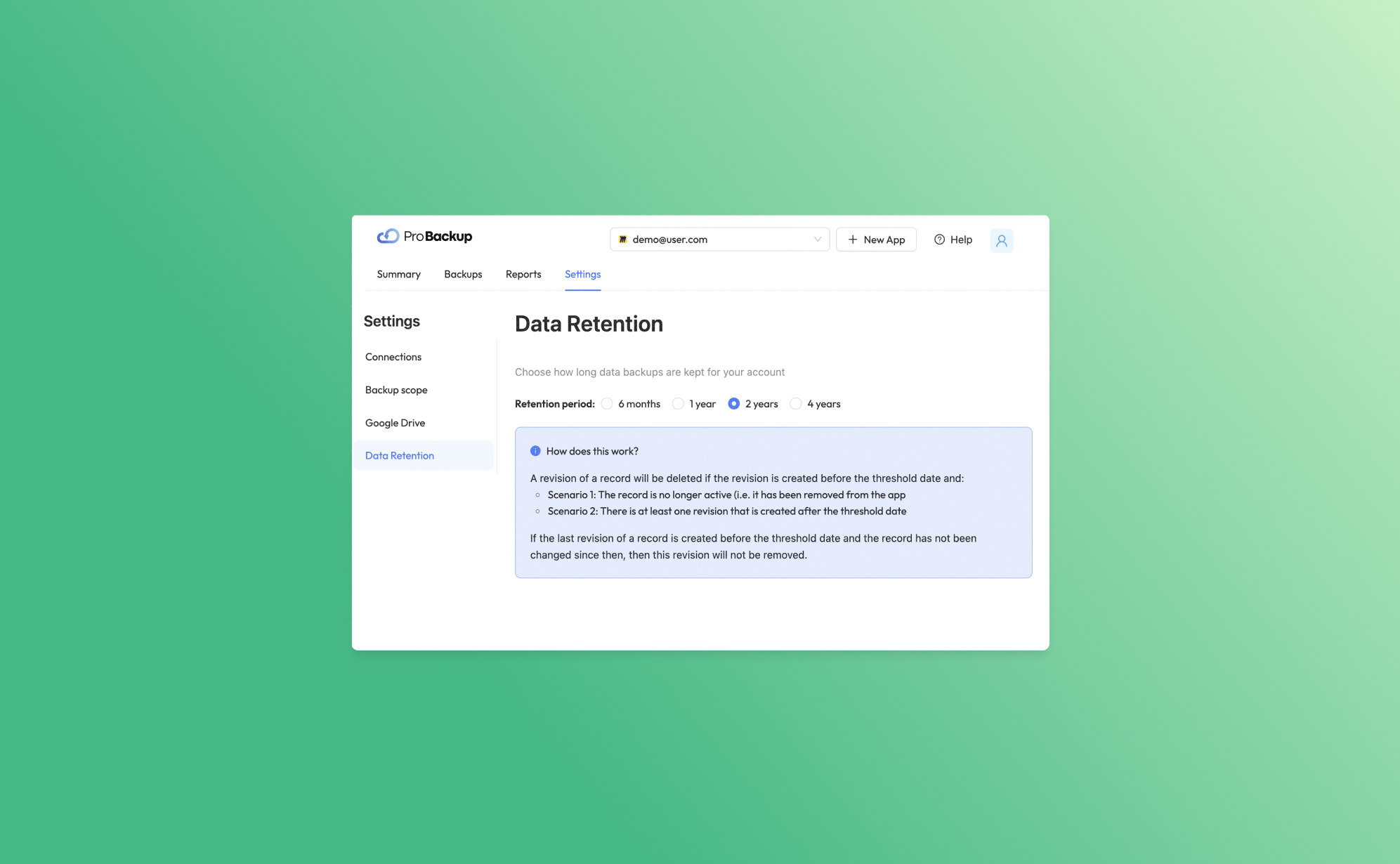
Introducing Our New Data Retention Feature

At Pro Backup, we are dedicated to providing top-tier cloud backup solutions tailored to meet the diverse needs of our B2B clients. Today, we are thrilled to unveil a powerful new feature designed to give you greater control and flexibility over your data management: Data Retention. This feature allows you to determine how long we keep your data backups, ensuring you can comply with various regulatory requirements and internal policies.
Understanding Data Retention
Data Retention is a feature that enables you to manage the lifecycle of your data backups. Each time an item is created or changed in your application, a new revision of that record is created. Depending on your subscription plan, the retention period for these revisions varies:
- Plus Plan: Revisions are kept for up to 6 months.
- Pro Plan: Revisions are kept for up to 2 years.
- Premium Plan: Revisions are kept for up to 4 years.
Tip: Users on the Pro and Premium plans can further customize their data retention period by navigating to Settings > Data Retention. This means you can set shorter retention periods if required, offering you greater flexibility.
What Happens with Older Revisions?
Our data retention policy ensures that your storage is optimized by removing unnecessary older revisions under certain conditions. Here’s how it works:
Inactive Records
If a revision is created before the threshold date and the record is no longer active (i.e., it has been deleted from the app), that revision will be deleted.
Example: Suppose you have a client record that was last updated on January 1st, 2020, and you are on the Pro plan. If you delete this client record on February 1st, 2021, the revision from January 1st, 2020, will be removed since it is no longer active and past the threshold date of January 1st, 2022.
Active Records
If a revision is created before the threshold date but there is at least one newer revision created after the threshold date, the older revision will be deleted.
Example: You have a project file that was revised on January 1st, 2020, and again on January 1st, 2021. If you are on the Pro plan, the older revision (from 2020) will be deleted after January 1st, 2022, since there is a newer revision from 2021.
If the last revision of a record was created before the threshold date and the record has not been modified since then, this revision will remain. This ensures that the most recent state of your records is always preserved.
Subscription and Trial Policy
It's important to note that in the event of an expired trial or a canceled subscription, your data backups will be removed within 10 days. This policy helps us maintain a streamlined and efficient backup environment.
We are confident that the Data Retention feature will significantly enhance your data management capabilities, providing you with the necessary tools to align with your data governance strategies. Should you have any questions or need assistance configuring your data retention settings, our support team is always here to help.
Thank you for entrusting Pro Backup with your cloud backup needs. Stay tuned for more exciting updates and features that will continue to empower your business!
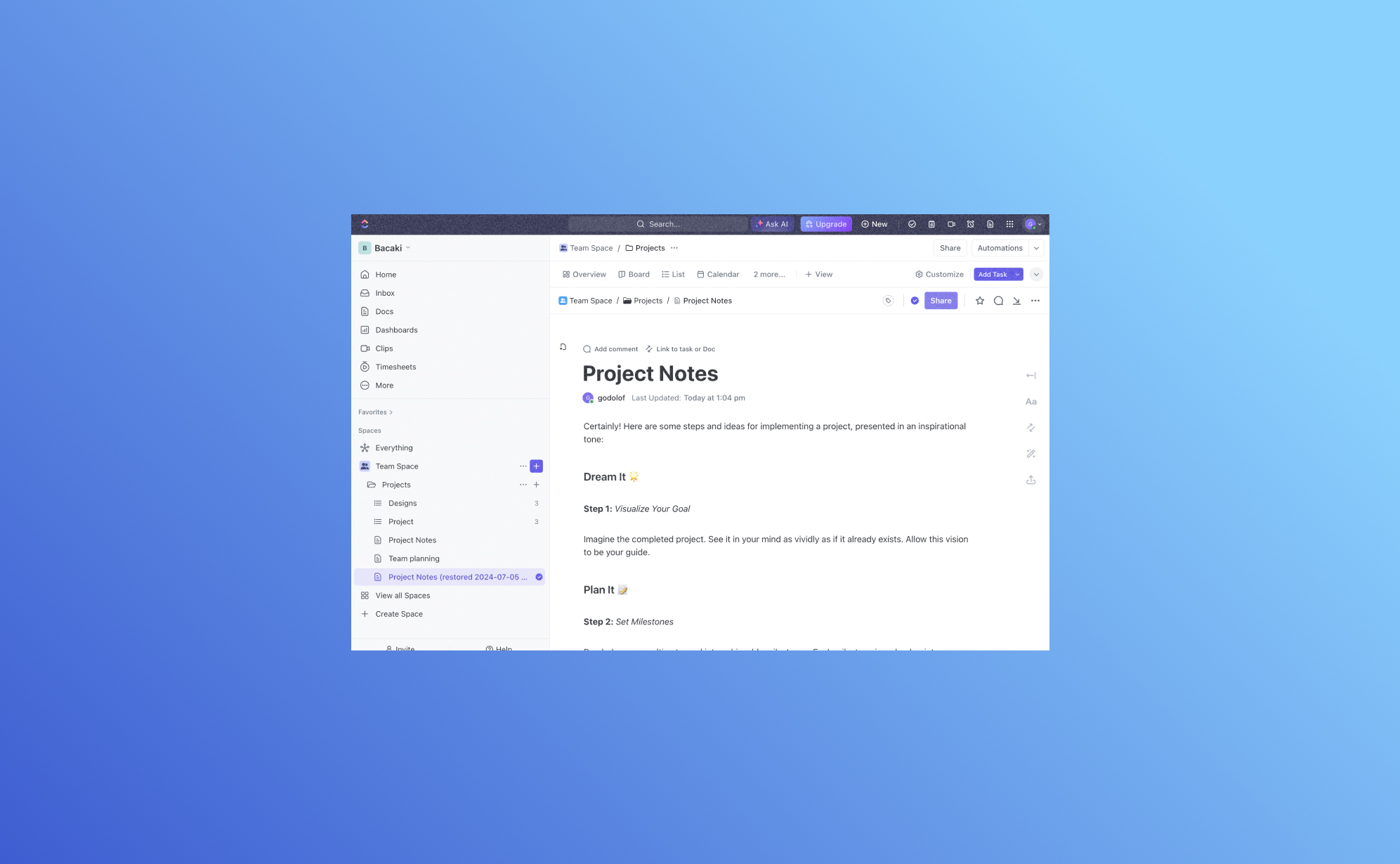
Exciting Update: Backup and Restore ClickUp Docs with Pro Backup

We are thrilled to introduce a significant enhancement to Pro Backup: you can now back up and restore your ClickUp Docs!
Why back up your ClickUp Docs?
ClickUp Docs is a powerful feature within the ClickUp ecosystem, enabling teams to create, edit, and collaborate on documents seamlessly. From project plans and meeting notes to knowledge bases and team documentation, ClickUp Docs plays a vital role in organizing and storing critical information. Losing this data can be detrimental to your business operations. That’s why having a reliable backup and restore solution is crucial.
Thanks to a recent update to ClickUp's API, Pro Backup can now extend its robust backup and restore capabilities to include ClickUp Docs. This way you can ensure that all your valuable documentation is securely backed up and easily recoverable, minimizing the risk of data loss and ensuring business continuity.
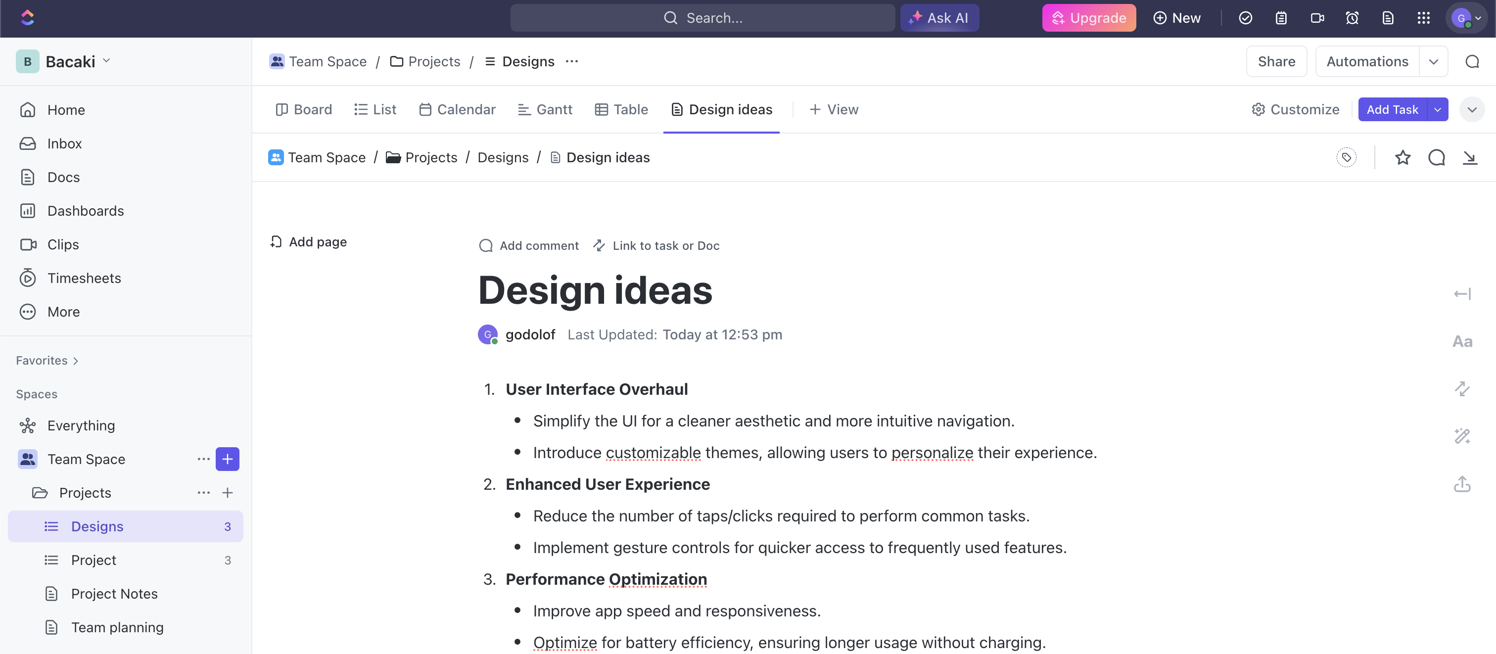
How to get started?
Setting up the back up of your ClickUp Docs is a very quick & easy process. Simply visit this link to create your Pro Backup account and add ClickUp as a backup to your account. Here's a youtube tutorial on how you start backing up your ClickUp data. Once set up, your ClickUp Docs will be backed up regularly without any need for manual intervention. This ensures that your data is always up-to-date and secure.
If you already have an active backup running for your ClickUp account, then your Docs will be automatically added to the backup scope.
How to view your ClickUp docs?
To access your Docs, go to the Backups page and click on Docs in the left side pane.
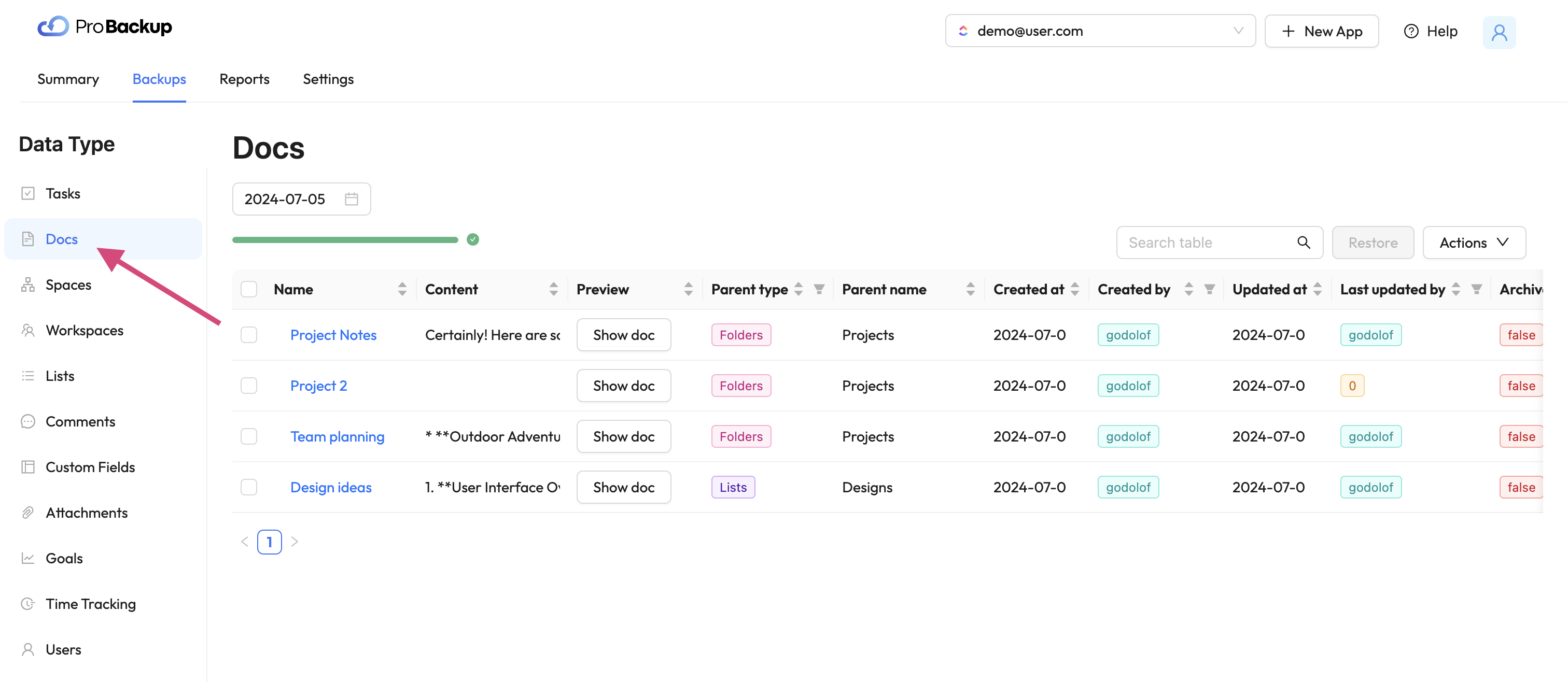
In the table you will see the your ClickUp Docs created within your account. We collect and backup Docs an each level: workspace, list & task. To preview your in Doc directly in Pro Backup, click on Show Doc. This will open a popup with the latest version of your ClickUp Doc. You can look up a previous version of your document by changing the version date above the table.
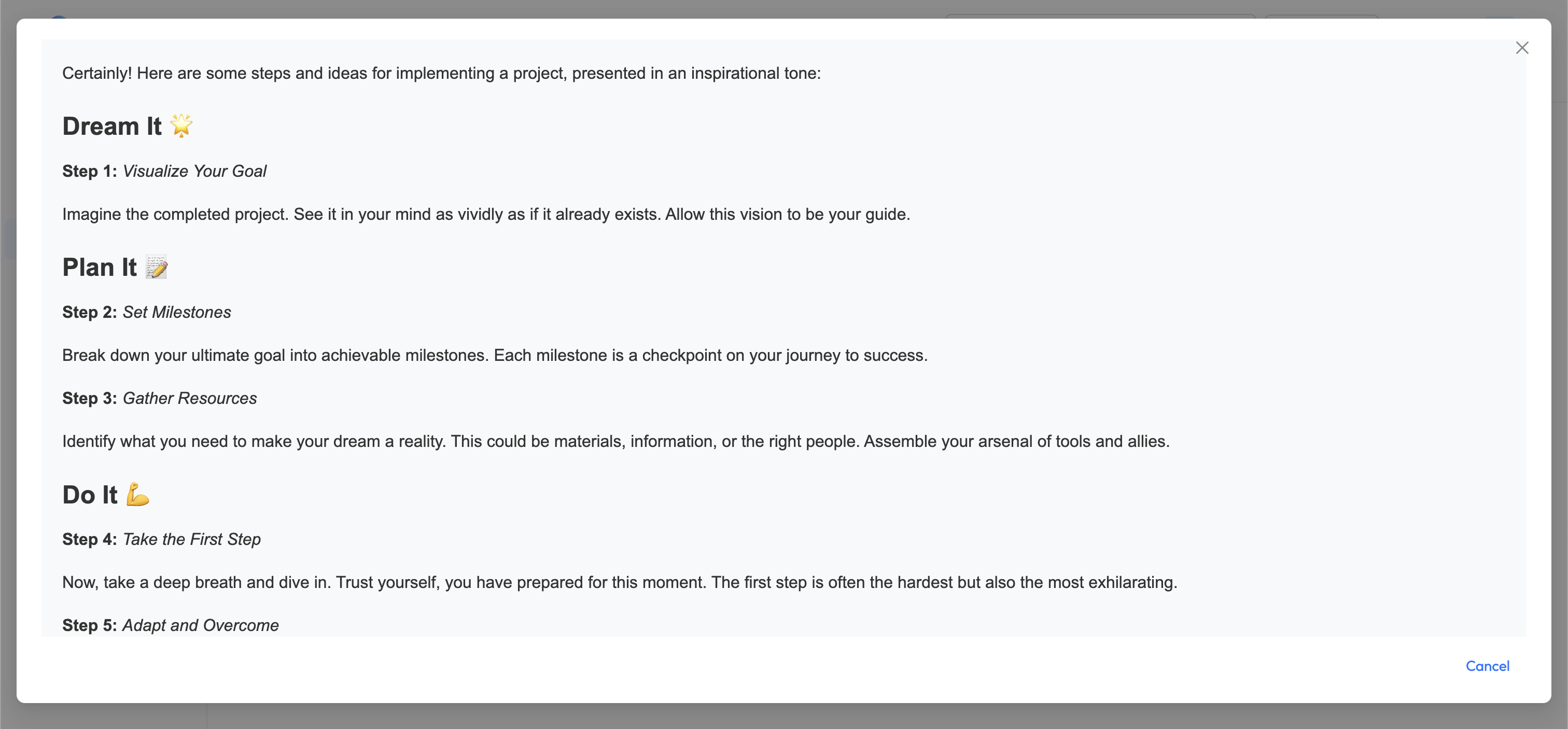
How to restore your ClickUp docs?
To recover and restore a previous version of any your Docs, select the item in the table and click on restore.
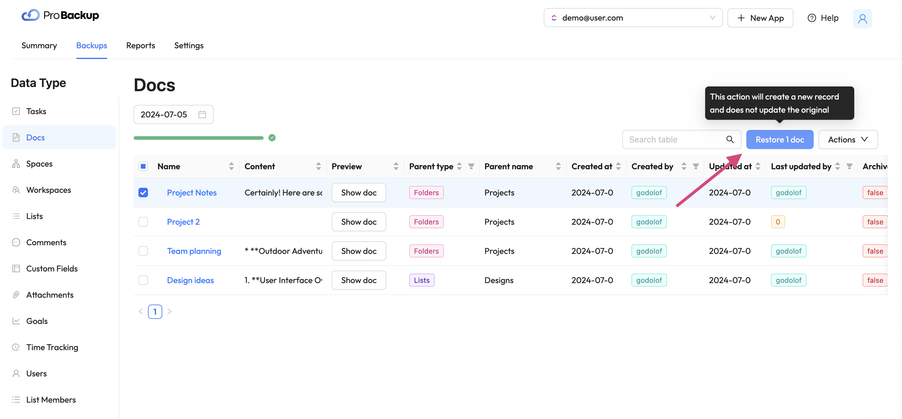
Once you have restored a Doc, a new copy of this ClickUp Doc will be created in your account. The name of the restored document will be appended with the restore date. The restore functionality allows you to recover Docs that were deleted from your ClickUp account, but also Docs that are still available. For example: It can be useful to restore a previous version of a Doc, even when the latest version is still available in your account.
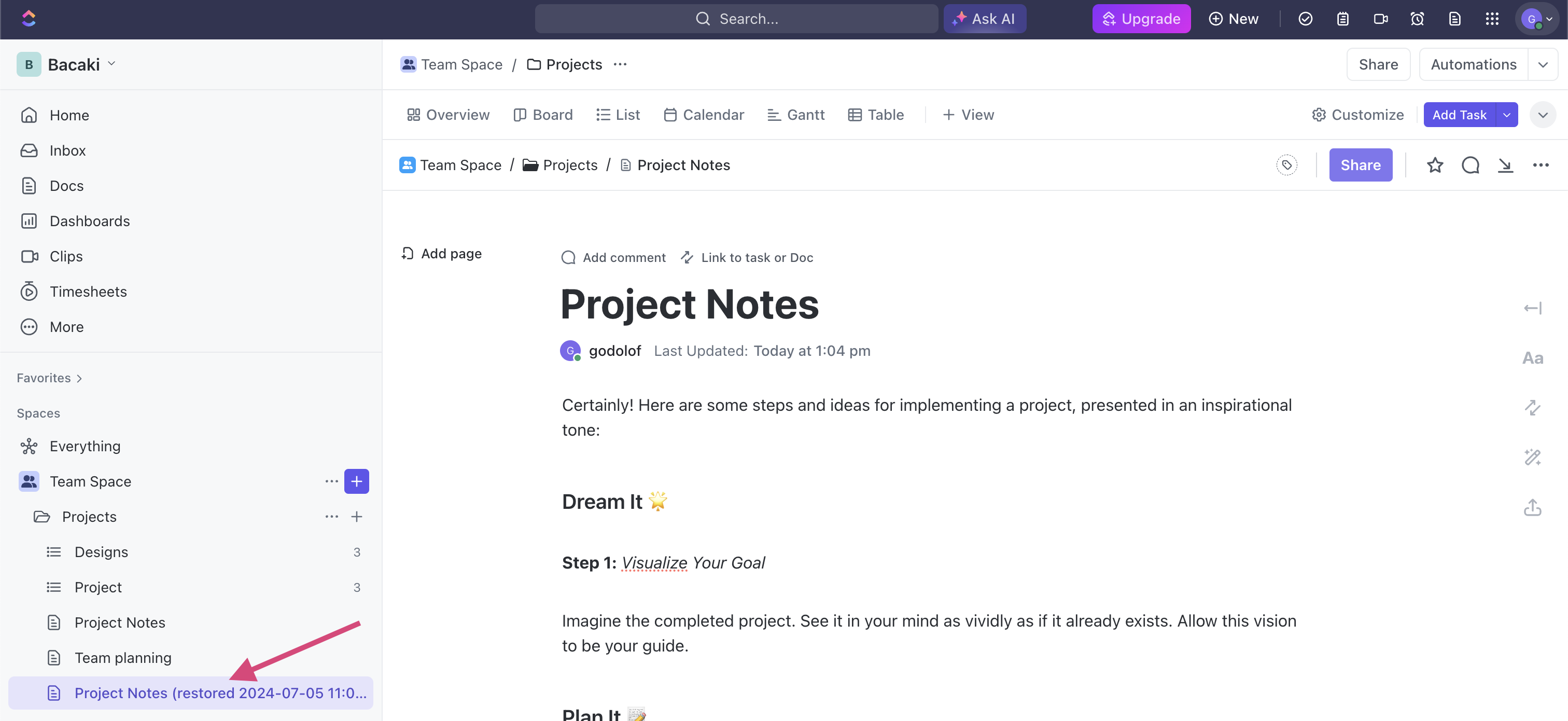
Start Protecting Your ClickUp Docs Today
Don’t wait until it’s too late. Start protecting your ClickUp Docs with Pro Backup today and enjoy the peace of mind that comes with knowing your critical documentation is safe. Our new backup and restore feature is designed to provide you with a robust and reliable solution to safeguard your data.
For more detailed instructions and support, visit our help center.
Stay secure and keep your ClickUp Docs protected with Pro Backup!

Asana Vs. Trello Vs. Monday.com: Which Project Management Platform Is Right For You?
.png)
When it comes to project management, there are a lot of tools on the market. While having options is great, the truth is that all of these competing platforms can make choosing the right project management service for your team feel like searching for a needle in a never-ending haystack.
That’s where we come in.
Today, we’re taking a deep dive into three of today’s leading project management platforms: Asana, Trello, and Monday.com. Not only that, we'll be giving you insight into the types of teams and projects best suited to each platform so that you can make an informed decision about your operation's future.
Let’s get straight to it!
Asana
As a legacy project management platform with more than 15 years in the marketplace, Asana offers teams endless options for collaboration, automation, and creating a fully integrated workflow. With both free and paid plan options, Asana makes it easy for organizations to customize their plans based on the size of their team, making it a strong choice for operations looking to scale.
Pros
100+ Software Integrations
Tired of constantly switching between platforms in your workflow? Asana eliminates speedbumps in your operation with more than 100 software integrations featuring the tools your team already knows and loves, like Microsoft Teams and Google Workspace.
Customized Automation
Your workflow is about your rules. That’s why Asana strives to offer more customization opportunities for its users, allowing you to automate your process based on your own criteria. This feature helps to take the stress out of routine tasks and gives your team the freedom to focus on more pressing jobs.
Multiple Views
From Lists and Timelines to Calendars and Progress Tracking, Asana allows all users to access multiple viewpoints for every single task. Ultimately, this leads to fewer errors in your workflow and greater prioritization for your most high-stake projects.
Who It’s For?
Asana is a versatile platform for teams of every size, but we think this tool works best for agile organizations with lean teams. In the free plan alone, Asana allows up to 15 users, with additional users costing just 10.99 per user per month beyond that point.
Cons
Since the paid version of Asana charges per user each month, this platform can be somewhat pricey for larger teams or organizations who anticipate adding new members as they scale.
Trello
Launched in 2011, Trello gives users a unique approach to project management that fuses simplicity, efficiency, and collaboration all in one. Unlike other popular team-driven platforms, Trello features a Kanban-inspired layout that uses visual cues to encourage better organization and streamlined workflows. Simply put, Trello is a sleek, modern approach to project management that is easy and accessible for every member of your team.
Pros
List-Style Format
At its core, Trello is a list-making tool. Although that may sound restrictive in terms of managing projects, the platform allows users to create unique columns, boards, and project cards that can seamlessly be moved from one list to the next. This creates a visually-driven project-tracking system that takes the stress out of figuring out which tasks require the most attention.
User-Friendly Interface
Because Trello follows a simplified Kanban methodology for organization, the platform is naturally easy to use. In just a few clicks, team members can assign tasks, create sub-projects on each card, and move their work through the project pipeline without the need for additional tools or training.
Optimized For Mobile
One of the most alluring features of Trello is its mobile optimization, which allows teams to work more effectively from anywhere in the world. This makes it an ideal choice for teams with members who work remotely around the globe or who need to adjust their workflow while on the go.
Who It’s For?
Thanks to its simplicity, Trello is the ideal choice for teams who need to work quickly at moving projects through their pipeline and regularly onboard new members. Most importantly, Trello offers both a free plan and three paid tiers, allowing you to find the perfect price for your operation.
Cons
While we may love Trello for its list-style format, this can also make managing complex tasks more challenging and may require additional integrations to handle large-scale projects.
Monday.com
Despite being one of the newer project management platforms on the market, Monday.com has amassed a loyal following of users since its launch in 2019, and for good reason. This cloud-based platform offers some of the best customization and collaboration tools on the market, earning it plenty of recognition from organizations with diverse teams. Plus, Monday.com offers 24/7 live customer support for its users, a rarity in the project management space.
Pros
Visual Dashboards
When you need a quick snapshot of your project status, Monday.com has you covered. The platform uses visual dashboards to give you insight into all current projects and customizable Kanban, list style, and other views.
Real-Time Collaborations
Collaboration is the heart and soul of Monday.com’s project management approach, offering real-time collaboration tools that can be utilized by multiple team members at a time. This allows you to create custom access for specific users to edit tasks, assign collaborative projects, and everything in between.
Customization-Driven
Like Asana, Monday.com also leans heavily into customization and automation. This allows organizations to set their own rules and create a workflow unique to their tasks, and the platform has over 200 customizable project templates to help you get started.
Who It’s For?
Monday.com offers both free and flexible plans that go up to 16 per month, which makes it a great choice for small teams and entrepreneurs who are just beginning to grow their operations. However, thanks to its growing prominence in the market, we suspect that organizations of every size will soon be leveraging Monday.com’s benefits.
Cons
As Monday.com is still relatively new, the brand is continuing to evolve its approach to project management, which may result in hesitation from higher-ups and senior management.
Which Project Management Tool Is Right For You?
No matter the size and scope of your team, there are certainly plenty of project management tools designed to meet your needs. Whether you’re looking for a traditional approach to organizing tasks like Asana, a scaled-down alternative like Trello, or Monday.com’s innovative mix of both worlds, your team is sure t1o work more efficiently than ever before.

The Top 3 Latest Trends in Data Security

Most modern businesses digitally store and transmit the sensitive information of their customers, employees, and other stakeholders. Digital data technology increases the productivity of companies and allows them to serve their customers faster and better.
Unfortunately, digital information is under constant threat from hackers and cybercriminals worldwide. No matter where your company stores and transmits information, a hacker could steal the data or damage the cloud server storing it if you don’t have the proper safeguards to prevent such attacks.
The Importance of Data Security
Data security refers to the procedures, processes, and technologies designed to protect digital information wherever it is transmitted, such as a client’s computer, the organizational network, and the cloud servers and storage devices.
The best data security measures will protect sensitive digital information from disclosure, theft, damage, corruption, or unauthorized access. These security measures must consider the vulnerabilities of physical hardware, software applications, user data accessibility, and organizational policy standards (CFI).
New threats to digital information exist every day. For this reason, companies must frequently update their database security technologies and protocols to better protect data from the latest malware, ransomware, and other security threats circulating on the internet.
If a company fails to protect its data from cybercriminals and their attacks, it could jeopardize the privacy of its customers, reduce productivity, and damage the overall reputation of the business. That is why you must take data security seriously if you want to protect the productivity and integrity of your business.
Watch for Data Breaches
A data breach is when an unauthorized person or third party may have accessed, stolen, copied, modified, or retrieved sensitive information from a company’s cloud server, network, or client’s computer (Wikipedia). Some people may also refer to it as a data leak or security breach, but they are the same thing.
Data breaches can happen to even the most protected and updated security systems. Here are some examples of common data security breaches (Sutcliffe Insurance):
- Weak security credentials are easily susceptible to hackers
- Software application vulnerabilities (e.g., poor configurations, back doors, etc.)
- Malware unintentionally downloaded into the security system
- Too many access permissions granted (increases the risk of hackers gaining unauthorized access to user accounts)
- Stolen login credentials of authorized users
- Failure to update security protocols and configurations
- Physical attacks on security systems (insider threats)
- Lack of data encryption technologies
Major corporations spend millions of dollars on data loss prevention each year but still suffer data security breaches periodically. Here are a few notable examples of famous data security breaches from recent years (Drapkin & Farrelly):
1) T-Mobile Security Breach – May 2023
The famous cellphone service provider, T-Mobile, suffered a cyber attack affecting roughly 800 customers. Based on reporting, unauthorized parties accessed sensitive customer data, including ID cards, PINs, social security numbers, and contact information. It was T-Mobile’s second security breach within one year.
2) Chick-fil-A Security Breach – January 2023
Suspicious activity was suspected on several customer accounts of the popular fast-food chain restaurant Chick-fil-A. The company urged customers to report all suspicious or unusual activity on their accounts, such as strange login activity. Unauthorized third parties may have accessed some customers’ names, phone numbers, email addresses, physical addresses, and stored payment information.
3) MGM Resorts International – September 2023
A ransomware cyber attack was inflicted upon MGM Resorts International, reducing its operational productivity and costing the company around $80 million in lost revenue in under one week. The hacker may have used the “social engineering” technique to break through the company’s cybersecurity defenses. Combating social engineering requires better employee training and the ability to spot phishing and baiting attempts online.
The Newest Trends in Data Security
Companies of all industries are eager to search for effective ways to protect their computer systems and cloud data storage servers from the most common types of modern cyberattacks, such as phishing and ransomware. Because of this, new data security methods and protections are trending almost every month.
Here are the top five newest trends in data security methodology and technology (DeVry University):
1) Machine Learning & Artificial Intelligence
Machine learning is a data security practice utilizing the power of artificial intelligence to locate cyber threats and vulnerabilities in a security system. It is a faster, cheaper, and effective way for companies to safeguard their data without relying entirely on humans. After all, humans are more prone to making mistakes than AI.
Machine learning is the future of cloud security and data leakage prevention. AI is a more sophisticated form of data security in cloud computing. Although not many companies use machine learning for data loss protection right now, it is only a matter of time before it becomes the new norm in clou data security.
Of course, there are plenty of data protection services available to assist companies who are ready to implement machine learning protections into their data security systems. We recommend you act sooner rather than later to stay ahead of the attacks before they occur.
2) Multi-Factor Authentication
Have you noticed how most companies now require their customers and clients to submit at least two or more user credentials to verify their identities before logging into their accounts? This multi-layered login security method is called multi-factor authentication.
Multi-factor authentication usually applies to personal accounts. Some companies require users to submit multiple credentials to log into their accounts, while others only make it optional.
For instance, a user may have to submit a username and password as one credential. Then, on the next screen, they may have to submit a temporary six-digit code sent to their cell phone number. This double-layer authentication method helps ensure the account’s true owner is the one logging in.
3) Firewall as a Service
Firewall as a Service (FWaaS) is a new cloud firewall security service that blocks potential malware and other malicious attacks on a network before they reach a cloud server or computer hardware that stores sensitive information.
FWaaS is a vast improvement from traditional firewall software because a single computer console can manage the entire network’s security protection. In other words, you can manage the firewall protection of an entire network of computers from one console without having to update the computers separately.
Why You Need Cloud Backups for Your Business
Do you have cloud backups to protect your business data in case of a malware attack, hardware failure, or other incident that could result in the loss or theft of your data? Without a cloud backup, you will not be able to retrieve lost or stolen data resulting from these incidents.
ProBackup offers professional cloud data security and backup services to businesses of all industries. We can safeguard your company’s sensitive data by saving backup copies of encrypted cloud storage regularly. Then, if a cybercriminal ever attacks your cloud data servers, you can restore the lost data through the backup data copies generated previously. You will never have to worry about losing data to cyberattacks ever again.
References
- DeVry University - 15 cyber security trends expected in 2023. devry.edu. (n.d.). https://www.devry.edu/blog/cyber-security-trends.html
- Corporate Finance Institute (CFI). Data Security. (2023, November 21). https://corporatefinanceinstitute.com/resources/data-science/data-security/
- Farrelly, J. (2023, December 14). High-profile company data breaches 2023. Electric.ai https://www.electric.ai/blog/recent-big-company-data-breaches
- Kaspersky. (2023, April 19). Top ten cybersecurity trends. usa.kaspersky.com. https://usa.kaspersky.com/resource-center/preemptive-safety/cyber-security-trends
- Sutcliffe Insurance. (2018, October 8). 8 most common causes of Data Breach. Sutcliffe Insurance. https://www.sutcliffeinsurance.co.uk/news/8-most-common-causes-of-data-breach/
- Wikimedia Foundation. (2023, December 11). Data breach. Wikipedia. https://en.wikipedia.org/wiki/Data_breach
- Drapkin, Aaron. (2023, December 12). Data breaches that have happened in 2023 so far - updated list. Tech.co. https://tech.co/news/data-breaches-updated-list
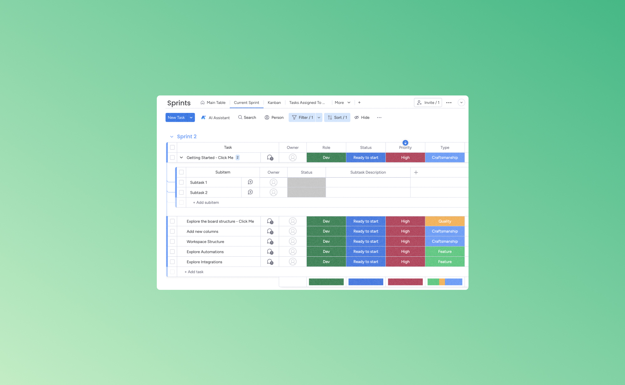
5 Ways to Increase Your Productivity with Monday.com
.png)
When you have five tasks due by the end of the day, three meetings to attend, and four follow-up calls to make, it's easy for your thoughts to get jumbled. Staying on top of your tasks and duties without a way to keep organized, the quality of your work can start to decline. One of the best ways to add order to your to-do list is with a work management app like Monday.com.
Below, we'll highlight some of the best features of Monday.com and help you see how to use it to ease your daily schedule. By optimizing your tasks, you'll find yourself accomplishing more in less time, thus freeing up valuable moments for the things that truly matter.
What is Monday.com?
Monday.com is a cloud-based work management tool that virtually connects team members and provides a flexible platform for all types of work. Designed to boost productivity and foster collaboration, it offers ways to delegate and track responsibilities for teams and businesses of all sizes.
Its user-friendly interface and customizable templates, like Kanban boards and Gantt charts, make it a popular choice for streamlined project management. This platform is best for groups looking to organize their work, track progress, and collaborate more efficiently in a centralized space.
1. Streamlining Workflow with Automation
Automation in platforms like Monday.com allows for the replacement of manual, repetitive tasks with automated processes. This shift saves time and minimizes the chance of human error. For example, when a task's status is updated, a notification can be sent to the relevant team members. With this, everyone is instantly advised about project updates, decreasing the frequency of manual follow-ups.
Automation allows for the uniform execution of routine tasks. This consistency helps maintain a smooth flow of operations and keeps team members focused on their core responsibilities. Monday.com facilitates better resource management. It promotes the allocation of tasks based on team members' availability or expertise, leading to a more balanced workload distribution and a more streamlined, error-free work function.
2. Enhancing Collaboration with Team Management Features
Monday.com's team management features are designed to foster a collaborative environment, making it easier for teams to work together efficiently, regardless of their location. One significant feature is the real-time communication capability. This allows team members to discuss projects, share updates, and solve issues directly within the platform. Doing so eliminates the need for lengthy email threads or external messaging apps, keeping all communication centralized and accessible.
Having a shared workspace where team members can view, edit, and manage tasks collectively maintains transparency. This keeps everyone on the same page and helps managers or task leaders monitor the status of each project. Similarly, team leaders can assign tasks to specific members and track progress to ensure accountability and evenly distribute the workload.
These collaborative features enhance teamwork and contribute to a more organized and productive work environment. By providing tools that facilitate easy communication and resource sharing, Monday.com can improve the overall efficiency of teams.
3. Customizable Workspaces for Tailored Efficiency
Customizable workspaces allow businesses to suit their online boards to their specific needs. This individualization extends across the whole platform, including project boards, workflows, and dashboards.
For instance, a marketing team might customize their board to track campaign progress with columns for campaign stages, budgets, and deadlines. However, a software development team can set up a board that follows their sprint cycles with columns for sprint planning, development, testing, and deployment.
Because customization takes time that companies often don't have, Monday.com offers a wide variety of templates, like a content planning template for editorial teams or a project roadmap template for project managers. These can be further tailored to meet specific project requirements. The ability to adjust these elements means that every team, regardless of its size or the complexity of its projects, can set up a workspace that aligns perfectly with its operational requirements.
4. Integration with Other Tools
Integrating management apps with other popular tools and services allows for seamless synchronization and data sharing across different platforms, ensuring that users can maintain a cohesive workflow without constantly switching between applications. Monday.com integrates with common communication tools like Slack and Microsoft Teams, making group collaboration more streamlined. It also connects with cloud storage services such as Google Drive and Dropbox, simplifying file sharing and access.
These integrations save time and reduce the potential for errors from transferring data manually between systems. They enable a more efficient workflow, where information updates in one platform are automatically reflected in others.
5. Tracking and Reporting Data
While many business management apps offer data analytics features, they don’t all add up to what insights Monday.com can provide. Some of the specific analytics tools used in Monday.com include:
- Overview Widget: Follow the status of all projects based on the number of remaining assignments. The widget visually depicts whether projects are on track, completed, or at risk by displaying an easy-to-understand progress bar next to each assignment.
- Performance Insights View: This feature tracks how long items have been spent in specific statuses or phases, offering valuable data on team tasks and project progression. It's similar to the Overview, but more specific to timeframes.
- Search Everything: Like the “Find” function on documents, the Search Everything tool allows you to find any keyword in your Monday.com board. Say you need to find your assigned projects - simply search your name. Alternatively, try the word "Stuck" to locate the tasks that take longer than expected to complete.
- Word Cloud: This visualization tool turns textual data into more meaningful insights, highlighting key terms in a visually impactful way. It tells you which key terms are mentioned the most across your board.
There are dozens of additional tools on Monday.com to analyze business performance. Each one leads to more informed decisions and streamlined processes by enhancing workflow management and productivity.
Unlocking Productivity and Collaboration with Monday.com
When you want to add a little - or a lot - more order to your company’s workflow, Monday.com may be your tool. Its host of features can help enhance team collaboration and boost overall productivity.
As you use Monday.com, though it's cloud-based, don't let unexpected data loss hinder your team's progress. To safeguard your work, consider the added security and peace of mind with Pro Backup. This way, all your content and sensitive information is safe and retrievable, no matter what happens.
.jpg)
How to Back Up Your Trello Boards?

Let's face it - losing your Trello board is like losing a piece of your project's soul. We've all been there - one minute, everything's organized, and the next, it's chaos. That's why backing up your Trello boards is crucial. Think of it as your digital safety net.
Whether you're a freelancer juggling multiple clients or part of a team managing sprawling projects, keeping your Trello data safe should be a top priority in case data recovery is needed. There's a method for everyone, from manual approaches to third-party backup options. Below, we'll guide you through the ins and outs of Trello board backups so you can choose the best option for your needs.
Why You Need to Back Up Your Trello Board
Imagine working on an intricate project in Trello, meticulously organizing every card and list, only to lose it all in a blink. This nightmare scenario is more plausible than you might think. The digital world is unpredictable, and Trello boards are no exception. Backing up your boards isn't just a nice-to-have; it's a must-do to safeguard your hard work.
Backing up your Trello boards is crucial for several reasons, and understanding these can help you appreciate the importance of a good backup strategy. Here's why it's essential:
Protection Against Data Loss
The primary reason for backing up Trello boards is to protect against data loss. This can happen in various ways, such as accidental deletion of a board or critical information, software glitches, or cyberattacks.
Losing critical project data can significantly setback your timelines, disrupt team workflow, and even impact client relationships. Backing up your boards ensures you don't lose your project information.
Guarding Against Unforeseen Events
Trello, while reliable, operates in the cloud, which is innately vulnerable to certain risks. Issues like server outages or data corruption, though rare, are possible.
If an event like that were to happen, having a cloud backup means you can restore your project's data quickly, minimizing downtime and keeping your team's productivity on track. Backups are your safety net in these rare but possible scenarios.
Facilitating Data Migration and Archiving
Sometimes, your needs can change. If a platform like Trello isn't the best for your business model, you should be able to transfer your data.
When transitioning to a new project management tool or archiving old projects, backups ensure your data is protected in the process.
Compliance and Regulatory Needs
Businesses have many laws, rules, and regulatory standards that must be adhered to when protecting data. These requirements may vary depending on the industry you work in and the type of data you store, but having a means of backing up your data is secure.
Regular backups can be a part of meeting industry-specific data retention requirements, ensuring you stay compliant with industry regulations.
Manually Exporting Your Content
Exporting your Trello content manually is a simple, step-by-step process that ensures you have a backup of your board for data recovery, if necessary.
- Access Your Trello Board: Start by opening the Trello board you want to back up.
- Open the Board Menu: Look for the 'Show Menu' button on the right side of your board and click on it.
- Find the 'More' Options: In the menu, there's an option labeled 'More.' Click on this to see additional settings.
- Select 'Print and Export': Within the 'More' section, you'll find 'Print and Export'. This is where you can initiate the export process.
- Choose Export Format: Trello allows you to export your board in JSON format. Select this option to capture all the details, like lists, cards, and comments.
- Download and Save: Once you select JSON, your board data will be prepared for download. Save the file to a secure location on your computer.
While this method is straightforward and requires no special tools, it's important to remember that it's a manual process. You need to periodically repeat these steps for each board you wish to back up, making it ideal for those with fewer boards or for occasional backup needs. Regularly scheduling backups can help keep your data up-to-date.
Automated Backup with Third Party Solutions
Automated backup with third-party solutions and GitHub scripts provide efficient and diverse ways to safeguard your Trello boards. Each caters to different needs and levels of technical expertise. Some top third party options are:
GitHub Scripts for Trello Backup:
Ideal for those with technical know-how, GitHub scripts enable automated backups by interacting directly with the Trello API.
Users can customize these scripts to schedule regular backups to their preferred storage solution. This method offers a lot of control and customization, but it requires a certain level of coding knowledge to set up and maintain.
Pro Backup
Pro Backup is designed for ease and efficiency, perfect for businesses looking for a straightforward backup solution. It connects seamlessly with your Trello account and automatically performs regular backups.
The service ensures that your Trello data, including all boards, cards, and attachments, is securely stored and easily restorable.
Each method makes it so your Trello boards are backed up regularly and securely. They cater to different preferences, whether you're seeking a quick way to secure your Trello boards or want to have access to the detailed versions of all your data types (such as field configurations, files & comments).
Trying Pro Backup for Trello Boards
Pro Backup offers a seamless and reliable solution for safeguarding your Trello boards. Its user-friendly approach, automatic backups, and comprehensive coverage of all your Trello data make it an invaluable tool for any business looking to secure their project management data.
Instead of struggling and spending time with manual backups, embrace the ease and security of Pro Backup. Visit Pro Backup today and start your journey towards effortless and secure data backup. Your peace of mind is just a few clicks away.

How Do B2B SaaS Apps Protect Your Data?

Many businesses depend on Software as a Service (SaaS) apps to help operate and manage their organizations. SaaS apps are used to manage internal projects, development cycles, ticketing & customer relationships. Some examples of the most popular SaaS apps for businesses are DocuSign, HubSpot, Jira, monday.com, Slack and Trello.
Do you know what all these apps have in common? Each transmits and stores sensitive data on cloud servers to provide fast and easy access to commercial users. Because of this, the app companies have an obligation to secure and protect all their stored and transmitted data. Not only is it a moral obligation for app companies to protect their users’ data, but it is also a legal obligation.
In this blog post we are taking a deeper look on how these SaaS providers project your data, what the main security risks are and how you can mitigate against them.
How do SaaS apps transmit your data?
SaaS backup and data security are essential for protecting user privacy when businesses send information through a subscription-based software platform. But to understand the potential data security risks of such a platform, you have to understand how SaaS data transmits in the first place.
Data is transmitted through the following three locations:
- The Cloud Server
- The Network / Internet
- The Client’s Computer
The cloud server (1) hosts the framework of the software application and stores the data of all the application clients. A client will download the software application onto their computer (2) or mobile device to access it. The network (3) is the cyber pathway responsible for transmitting information between the cloud server and the downloaded software application on the client’s computer.
When the client performs actions and saves content on the application, the updated data gets transmitted through the network and stored on the cloud server. As a result, the client can access their data from any computer or mobile device with the application downloaded on it. All they have to do is log into their SaaS account using their username and password credentials to retrieve the stored data from the cloud.
The Top 3 Data Security Risks to SaaS Apps
Several potential data security risks can occur in any of the three locations of data transmission: the cloud server, the network, and the client’s computer. The risk level depends on how much time and effort a SaaS company has invested in securing its cloud storage system, network, and user application.
Some SaaS apps are more secure than others. Therefore, you should be aware of the potential SaaS data risks involved so you can look for alternative ways to boost your SaaS data security.
Here are the top three SaaS data risks below:
1) System Hijacking
Cybercriminals usually target SaaS network computers because they are the least secure and most vulnerable. Since network computers actively transmit sensitive data, it opens up more pathways for cybercriminals to gain entry to the systems. Once that happens, the cybercriminals could hijack user accounts, access sensitive data, and upload viruses, malware, or ransomware to destroy the computer systems.
2) Poorly Configured SaaS Application
SaaS companies must adequately configure their app and its architecture with the latest security protocols to prevent data security breaches and cyberattacks. Unfortunately, SaaS companies sometimes misconfigured their apps or fail to update the security protocols. This failure leaves SaaS apps extremely susceptible to cyberattacks and unauthorized access to sensitive user information.
3) Failure to Track and Monitor Unusual Data Access Attempts
Cybercriminals will often prey upon poorly monitored SaaS apps. They may perform several login attempts using various hacking methods to gain unauthorized access to user accounts. If the SaaS app software operators are not actively monitoring for unusual login activity, they will not catch a pending cyberattack before it strikes.
The Top 4 Data Protection Methods for SaaS Apps
The best SaaS app companies use highly effective data protection methods to secure user data and prevent unauthorized access. But if you are not happy with the data protection features of a particular SaaS app, look for third-party data security integrations to improve your company’s data protection when using the app. You will learn about one example as you continue reading.
Here are the top four data protection methods below:
1) Cloud Backup Data Protection
Some SaaS companies can back up your cloud-stored data in case it gets deleted accidentally or maliciously. A cloud backup creates a saved copy of the currently stored information and puts it in a secure location where it can never be overwritten or altered. It will ensure you can retrieve your data under any circumstances, such as after a ransomware attack, virus, or data-overriding mistake.
However, not all SaaS apps have cloud backup features for restoring lost data. That is why you may need to use a backup-as-a-service (BaaS) app to safeguard the sensitive data on your SaaS apps to ensure you never lose your data. All you need to do is find a reliable BaaS app that can easily integrate into your SaaS apps.
Of course we recommend using Pro Backup as your designated backup-as-a-service app. Pro Backup is trusted by many businesses world-wide and allows you to back up data on many popular cloud-based SaaS apps, such as Airtable, Jira, and Trello. It has several easy integration options to back up your precious data flawlessly.
Pro Backup also features advanced encryption protection (256-bit) to safeguard your backups and make the data retrievable whenever the original data is lost or destroyed. The best part is that all the team members on your SaaS user account can operate Pro Backup under one license.
2) Data Encryption
Encrypting your backup data is essential, but you must also encrypt the transmitted and stored data. Security breaches usually occur within the network, allowing cybercriminals to view unencrypted or poorly encrypted sensitive information. But if you use a 256-bit encryption key to shield your data from unauthorized access in the network, you can prevent cybercriminals from gaining access to your data.
Professional SaaS companies will not allow data transmission through FTP or HTTP because they are easily compromised. Instead, they will use more secure data encryption methods like transport data encryption (TDE) or Transport Layer Security (TLS).
3) User Authentication
Secure data systems use digital key certificates to verify user identities and prevent unauthorized access to their data. Virtually all SaaS companies use key certificates or key vault services to boost user login security and ensure that only authorized people can successfully access their data. These keys may contain a series of encrypted numbers which act as digital signatures for the users. A new encrypted digital key is created each time a user logs into their account.
4) Monitor All Login Attempts
Backend cloud system monitoring is another critical security task of SaaS companies. They must monitor and record all login attempts to track suspicious activity and potential cyber-criminal wrongdoing. When a SaaS company constantly monitors attempted logins and access to the cloud, they have a better chance of stopping data breaches and implementing more robust data security techniques in the future.
Conclusion
Are you ready to begin protecting your SaaS user data? If so, you should start with probackup.io because it offers professional and reliable cloud backup services at affordable prices. It is the perfect BaaS app for saving, recovering, and retrieving data files without any risk of deleting them.
The 7 Best Project Management Apps in 2024

In my role as product manager for Pro Backup I work a lot with the project management apps that we integrate with: Not only do we explore their core features to ensure a deeply-integrated backup solution but we also keep track of their new features and updates. We speak with a lot of implementation partners about their needs and requests, which gives us a good grasp of the strengths and weaknesses of the most popular project management apps.
With an array of options at our fingertips, choosing the right tool can significantly enhance productivity and streamline workflows. In this article we wanted to give an overview of the best tools currently dominating the market, each excelling in unique ways. Whether for data management, automation, or collaborative whiteboarding, we've got the insights to help you make an informed choice in this digital era.
Why Use a Project Management App
In our competitive environment of digital outreach, the use of a project management app has become more of a necessity than a luxury. These productivity platforms offer many benefits that streamline workflows, enhance productivity, and foster collaboration, regardless of your team's size or industry. Some of the top reasons you may consider utilizing a management app include:
- Enhanced Organization: Apps provide a structured platform to manage tasks, projects, and deadlines. They allow you to organize work into manageable segments, ensuring nothing falls through the cracks. This organization is crucial for keeping track of multiple projects and meeting deadlines.
- Improved Communication and Collaboration: These apps often include tools that facilitate better team collaboration. Whether assigning tasks, sharing updates, or giving feedback, everything happens in one place, reducing the need for lengthy email threads and meetings.
- Accessibility and Flexibility: Cloud apps have cloud-based functionality, meaning they offer the flexibility to access your work anywhere and anytime. This accessibility is essential for remote teams or individuals who travel frequently.
- Time Management and Efficiency: By providing an overview of tasks and deadlines, these apps help prioritize work, leading to better time management. Many of these cloud apps also include time-tracking features, offering insights into time spent on each task, which is valuable for productivity analysis.
- Data-Driven Decision Making: Many of these productivity platforms have reporting tools, providing data and insights on project progress, team performance, and resource allocation. This information is vital for making informed decisions and strategizing future projects.
Project management apps are the backbone of modern, efficient, and practical work methods. They simplify task management and contribute to a more organized, collaborative, and data-driven work culture.
Task Management Tools with Asana
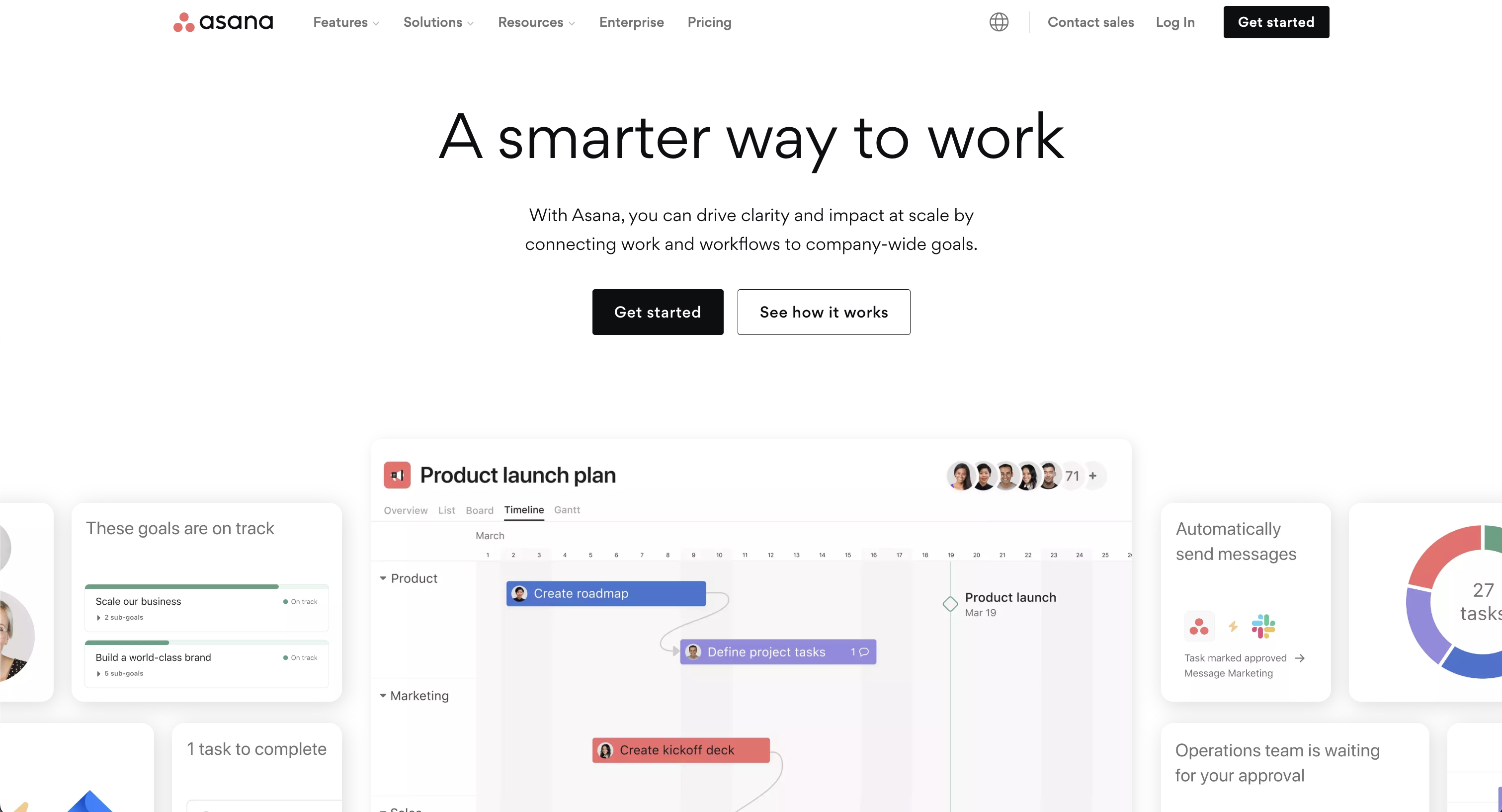
Asana is an extensive project management tool that excels in organizing work into manageable tasks and projects. It offers various views, including lists, calendars, timelines, Gantt charts, and Kanban boards, making it versatile for different team needs. Asana enables effective top-down task delegation, starting by defining goals & milestones, to then structure your projects with clear due dates and responsibilities.
Its custom fields feature allows for personalized task organization, facilitating easier sorting and filtering. Additionally, Asana provides real-time status updates, time tracking, and reporting dashboards, offering insights into team progress. It supports automated workflows, resource management, and integrates with various popular tools, enhancing overall team coordination and efficiency.
Prioritization Tactics with Trello
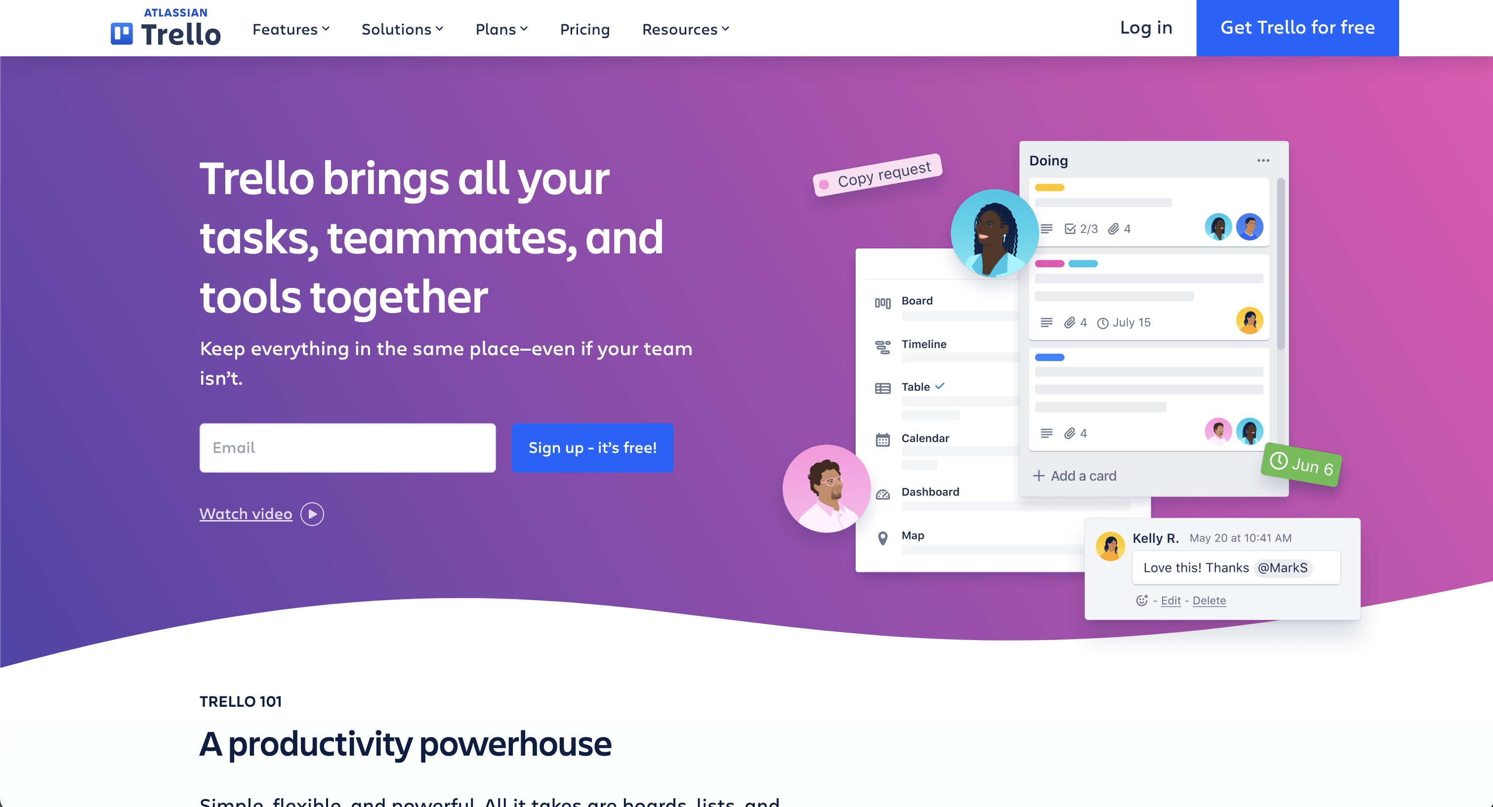
Trello is a versatile project management app known for its ease of use and visual approach to organizing projects. It employs a the classic Kanban system with cards and boards, allowing teams to create, assign, and track tasks visually. These days many apps offer a similar kanban option but we think the Trello's Kanban system is the most fun to work with. Trello's flexible setup is ideal for various methodologies, including Scrum and Kanban, making it suitable for a wide range of projects and teams.
Its features include customizable boards, lists, and cards, along with integrations with other popular tools, enhancing its functionality. Trello's simplicity and visual appeal make it a popular choice for teams prioritizing ease of use and clear communication.
Doing it All with ClickUp
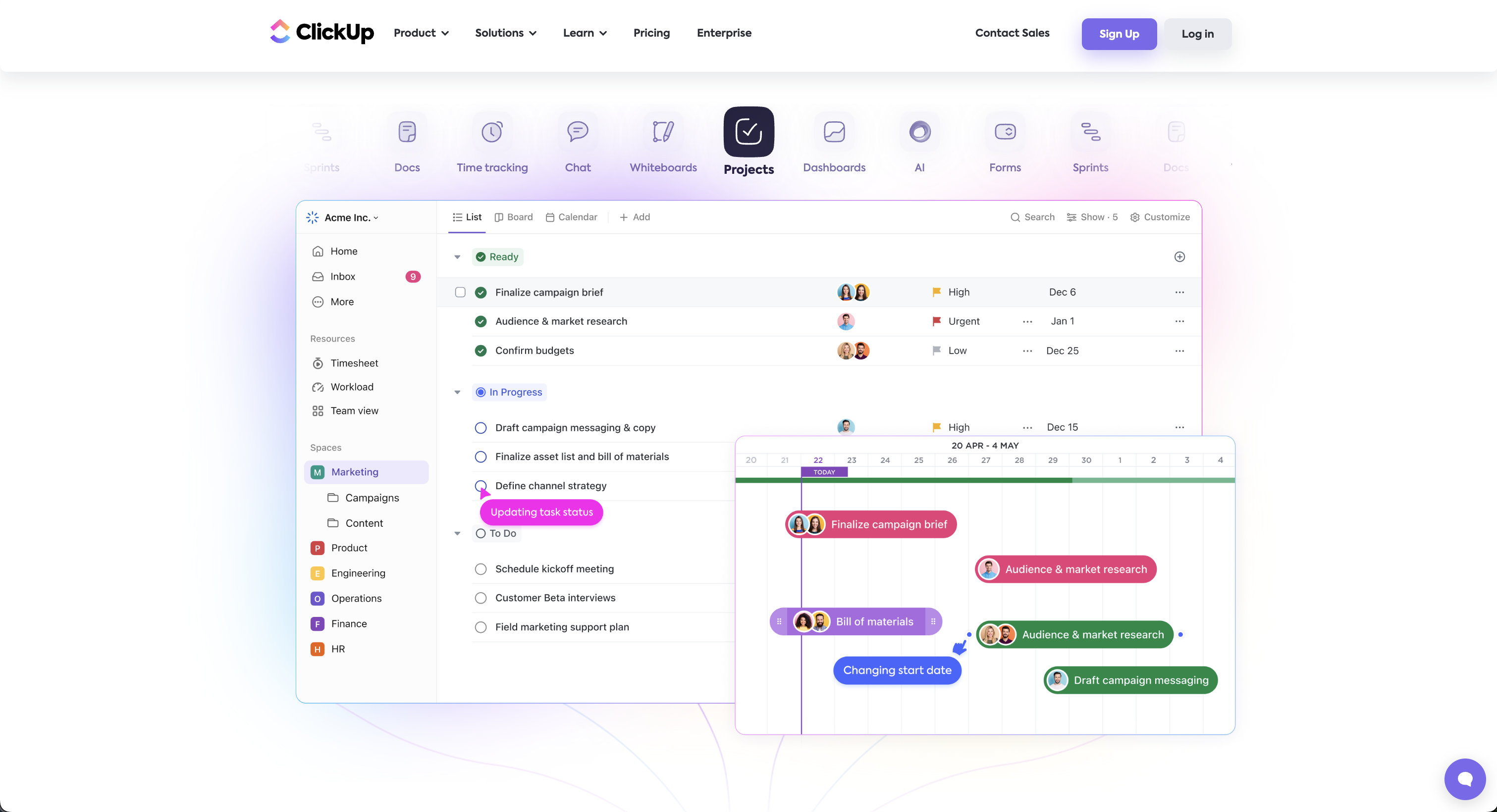
ClickUp stands as a multifaceted project management tool, offering a suite of features to cater to diverse work needs. It's highly customizable, with over 35 ClickApps to tailor task management. Key features include nested subtasks, checklists, time tracking, voice & video recording, and a variety of views like List, Board, and Calendar.
ClickUp enhances team collaboration with real-time chat, document sharing, and proofing tools. It also excels in automation, offering over 50 actions to streamline workflows. It even offers features like video recording and whiteboards. The platform integrates seamlessly with more than 1,000 tools, making it a top choice for adaptable project management, remote work, and team collaboration. With all of these ClickUp is making good on its promise to build "one app to replace them all". If you want avoid switching apps too often, then ClickUp might be the ideal solution for you.
Visual Representation with Notion
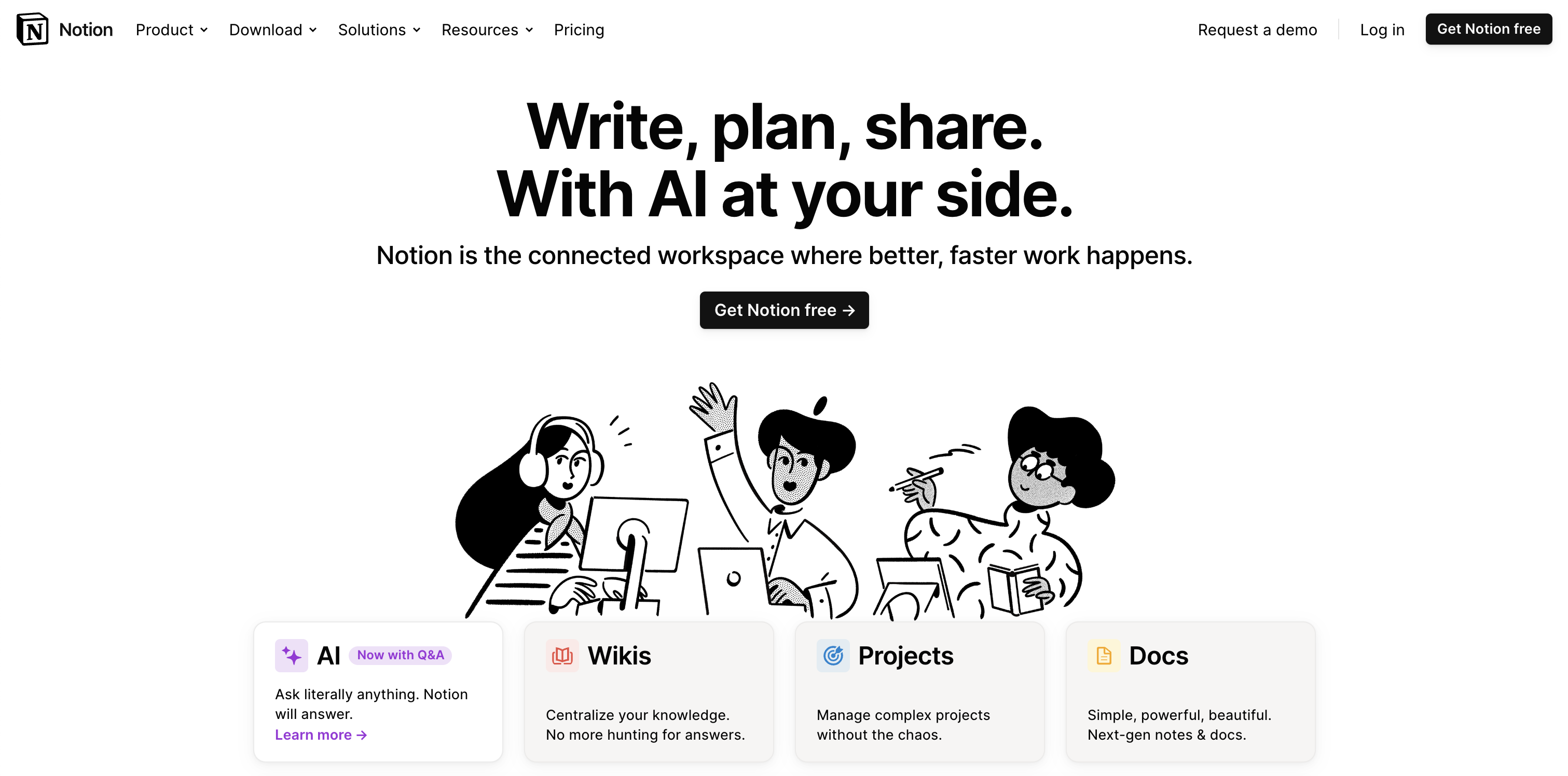
Notion is renowned for its exceptional visual dashboards, which allow for a highly personalized and flexible project management experience. Its interface supports intricate project planning and tracking with customizable tables and timeline views. Notion's strength lies in its ability to represent complex information visually, making project oversight more intuitive and accessible.
The platform's versatility extends to managing tasks with calendar views, embedding diverse content types, and offering a cohesive workspace that can adapt to various project requirements. This visual approach ensures a clear and engaging overview of projects, enhancing team collaboration and productivity.
Present Data Sets with Airtable
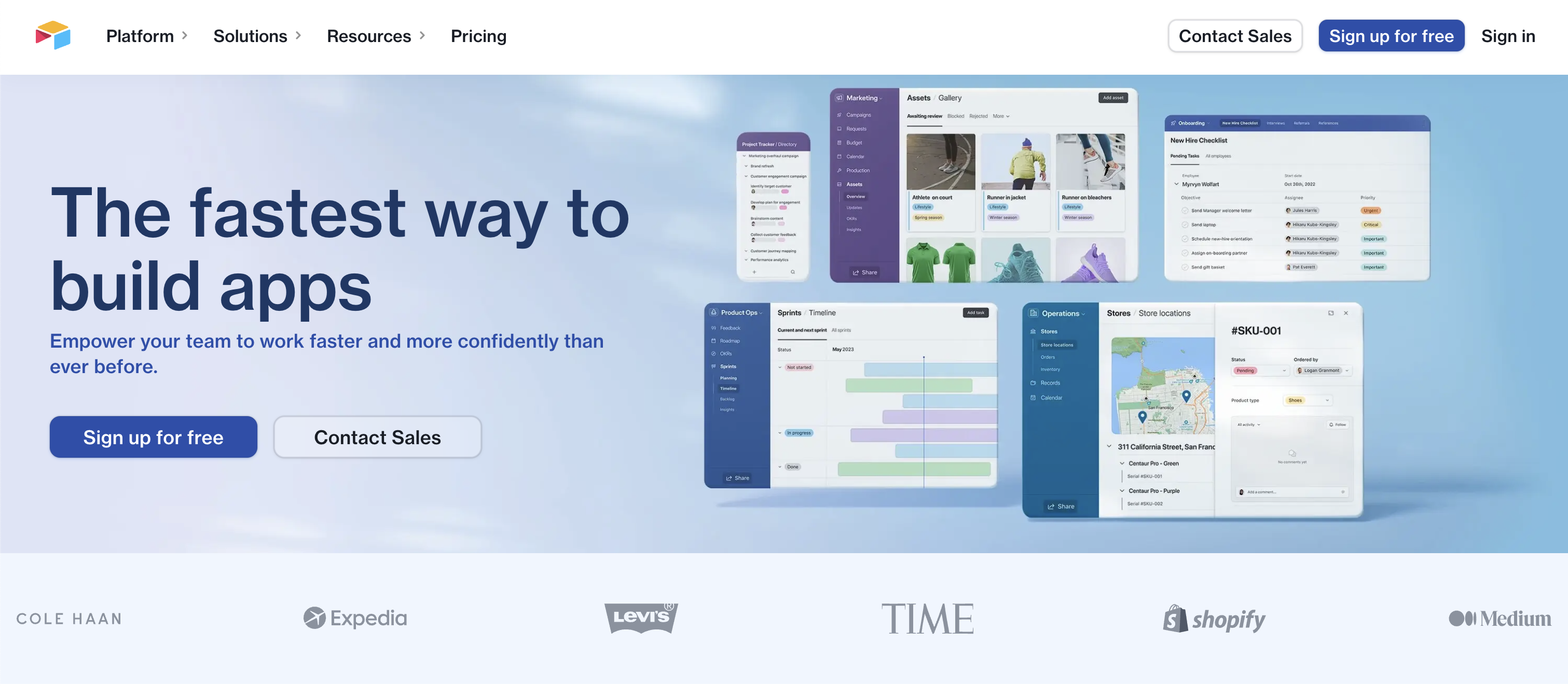
Airtable excels in managing complex data sets and creating linked tables, making it a powerful tool for data organization and analysis. It offers the flexibility of a database with the ease of a spreadsheet. Users can customize fields to store various types of data, link records between tables to show how data is related, and create views that display this information in meaningful ways (e.g. table, kanban, calendar).
Airtable's rich field types, like checkboxes, dropdowns, and file attachments, enhance its capability to handle diverse data needs, making it ideal for detailed project management and comprehensive data analysis. Its focus on the table view make Airtable the ideal candidate when you have to deal with a higher amount (let's say more than 100) records in a project or base.
Automate Your Work with Monday
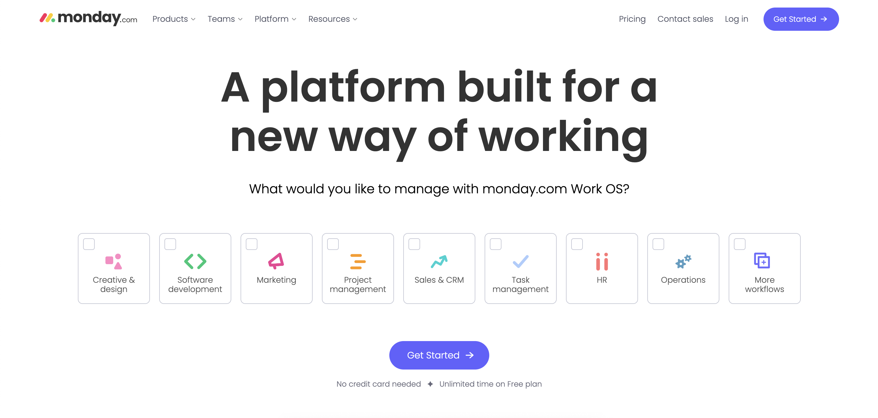
Monday.com is a dynamic project management platform that uniquely combines automation with other advanced features. It offers customizable automation for streamlining workflows and reducing manual tasks by automating task assignments, status updates, and notifications. Most project management app offer some form of automation but we believe that monday.com excels in this domain. The process of creating new automations is both very intuitive & detailed, allowing you to build advanced automations in no time.
Alongside this, Monday.com provides customizable templates, diverse views like timelines and Kanban, and seamless integrations with other tools. This blend of automation and versatility enhances team collaboration and productivity, making Monday.com a comprehensive solution for various business needs, all while maintaining a user-friendly and visually appealing interface.
Operate Whiteboards with Miro
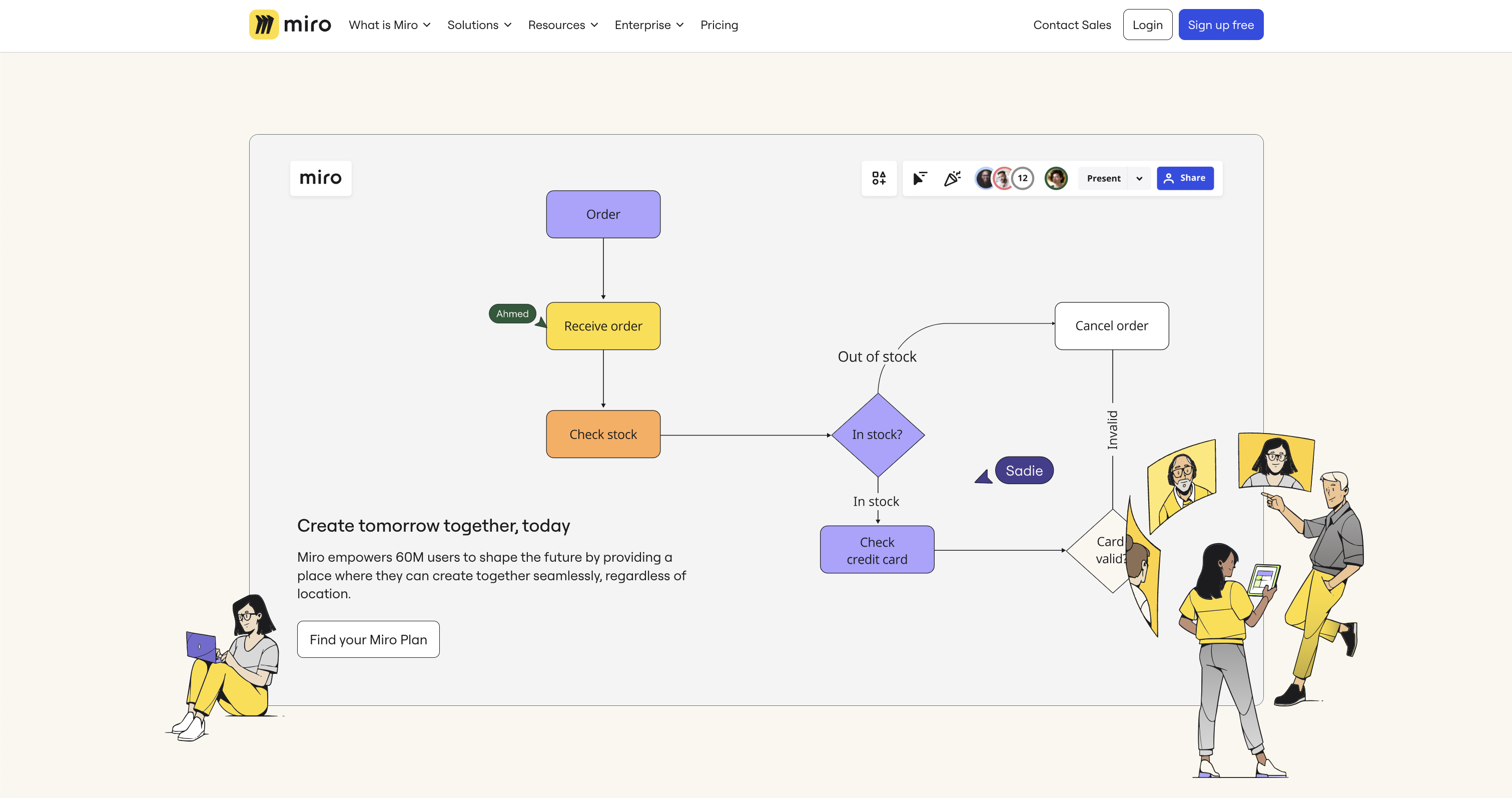
Miro is a robust platform known for its extensive whiteboarding capabilities, ideal for creative brainstorming and collaborative planning. It features an infinite canvas that allows teams to map out ideas freely, with tools like sticky notes and smart drawing.
Miro also supports various workstyles with customizable templates and seamless integrations with other cloud apps. This makes it perfect for diverse teams to collaborate visually, regardless of location. Miro's emphasis on whiteboards and visual tools fosters a dynamic and engaging way to manage projects and ideas. If you want to focus on ideation and brainstorming, rather than following up on tasks and projects, then Miro is the ideal tool for you.
Cloud Apps Today
Each of these apps have approached project management from a different angle: Trello started with its Kanban design, Airtable focused on spreadsheets, Miro on whiteboards, etc. However in the last few years each of these apps have added features that brought them closer to each other. This complicates the selection process, though each apps caters to different aspects of work and project management. Choosing the right app depends on the specific requirements of your projects and team dynamics, making it crucial to explore and understand the strengths of each tool.
.jpg)
Announcing Pro Backup 2.0: A New Benchmark in Cloud Backup Solutions

We're thrilled to unveil the latest version of Pro Backup. This upgrade isn't just an update—it's a leap forward, designed to make your backup process easier and more secure.
Why Upgrade?
We listened to your feedback and made sweeping enhancements to serve you better. Here are some key features that set the new version apart:
Increased Performance & Security
We've optimized our algorithms and fortified security protocols to ensure your data is backed up quicker and stored with maximum security. Our engineering team has re-written all backup & sync engines from scratch, applying the lessons learned from +10 years of experience. In addition to this, we’ve also added some new security measures such as password protected accounts, 2FA and Single-Sign-On (SSO will become available later this month).
Fresh & super fast User Interface
The new UI offers a more intuitive experience, streamlining the functionalities and presenting a clutter-free workspace. Snapshot and Recovery have been merged to Backups, which makes it easier to search through your data backups and compare backup versions. The data tables are now also loading with lightning speed which makes that you can view and export your data backups much faster.
The new Reports page gives you more insights about the backup & restore processes and will inform you about potential warnings or hiccups.
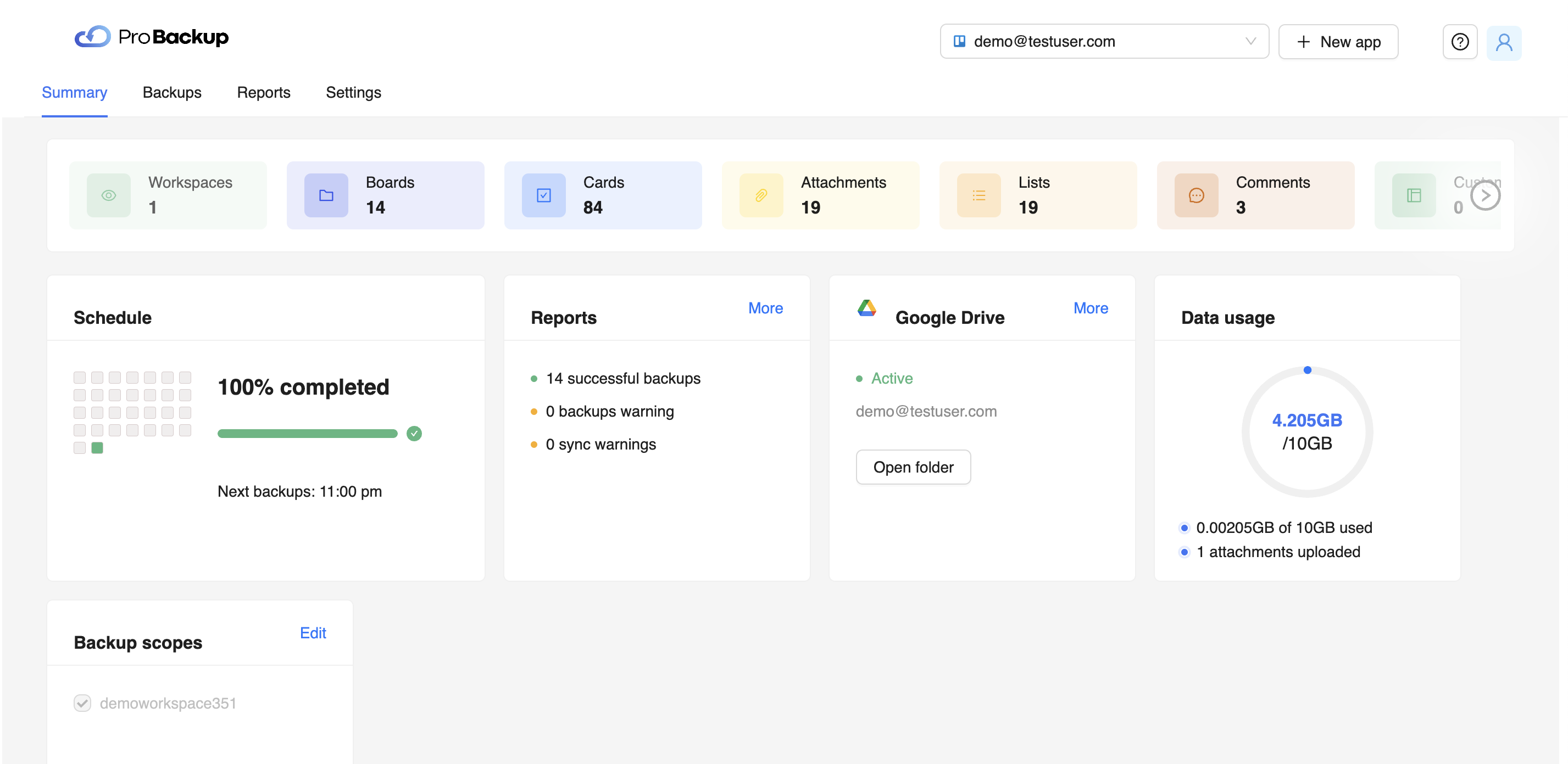
Team Invites
Now you can easily bring your whole team onboard. Send invites directly from the app to share your data backups and to add your team members’ data to the backup scope.
Manage Multiple Backups in One Account
No more juggling between different accounts for various applications. You can now manage all your backups from a single dashboard.
How to Upgrade
Log in to your existing Pro Backup account. Follow the prompt to transition to the new version.
If you need help during the transition, our support team is available at support@probackup.io
Final Thoughts
We believe this upgrade will redefine what you expect from a cloud backup service. Go ahead and take the new version for a spin and let us know your thoughts.
Here’s to smarter, safer, and faster backups!
- The Pro Backup Team
.jpg)
Cybernews: What Is Data Loss Prevention & Why Is It Important?

Data is arguably one of the most valuable assets in the modern marketplace. But it’s usually sensitive, and organizations do their best to prevent unauthorized disclosure of confidential data.
However, data loss still remains a huge concern for businesses because they can spend a fortune on data recovery in case something happens. Not only that, but the consequences of data loss can be damaging to businesses as it can ruin their reputation, affect productivity and stop organizational processes.
That’s where data loss prevention comes in.
Organizations have increased their spending on data loss prevention practices and software tools. The global market is expected to grow to $6.4 billion by 2028, and rightly so. Research has shown that you might end up paying more for data recovery solutions than you typically would for data protection measures.
This is why data loss prevention is important. We’ve prepared the following post to serve as a brief guide to everything you need to know about data loss prevention and why it is necessary.
What Is Data Loss Prevention?
Data Loss Prevention (DLP) refers to the process of preventing sensitive data from being disclosed or stolen. It is a crucial way to protect your company’s assets and information. This data could include intellectual property, corporate data, and consumer data.
The thing is, data resides in various devices, including physical servers, databases, personal computers, file servers, flash drives, and mobile phones. Not only that, it moves through many network access points, including VPNs, wire lines, and wireless connections.
There are many ways that data loss can happen. This includes human error, system failure, data corruption, theft, software corruption, natural disasters, and perhaps the most notorious one of them all, hacking.
Data loss prevention aims to provide solutions to these problems. Think of it as a combination of practices and software tools designed to prevent unauthorized access to data.
Why is Data Loss Prevention (DLP) important?
Data loss prevention is crucial because it helps minimize the risks of data being stolen, lost, or compromised. These practices and software solutions prevent data from being lost by identifying and monitoring all the different sources of data leakage.
The implications of data loss can be detrimental to organizations. For instance, business operations can come to a halt, reputations can be ruined, and money can be lost, not to mention legal actions and lawsuits.
Data loss prevention can’t be overlooked because the consequences can be devastating if an organization’s data is breached. For example, if a company has a breach of its payroll system, it might not have any money to pay its employees or make payroll deposits. This could lead to bankruptcy or, even worse – shutting down completely.
Another example would be if a healthcare provider had a breach of their records system. If private patient information leaks, it could lead to a ton of identity theft cases with patients. Not only that, but the healthcare provider would be subject to harsh legal ramifications.
5 Data Loss Prevention (DLP) best practices
1) Back up your data
Backing up your data is an essential practice in data loss prevention because it ensures that you have a copy of your data in case anything happens to the original. This way, you can restore all your files and programs.
2) Consider using a VPN
A VPN is a Virtual Private Network that provides an encrypted connection between two endpoints. This encryption means that all data sent over the network is scrambled and can’t be read by anyone else.
A VPN is essential for data loss prevention because it prevents people from intercepting, accessing, and tampering with sensitive information. And in the process, it also helps in protection against malware attacks. It would be in your best interest to carefully compare some of the best VPNs out there and choose the right solution if you want to ensure data moves securely within your organization.
3) Improve your network security
DLP focuses on protecting information as it moves across different media, such as email, cloud storage, social media, and other platforms. Network security can be improved to prevent data breaches by implementing DLP.
This can be achieved by using tools that monitor network activity to identify potential threats that could lead to unauthorized access or leakage of sensitive information.
4) Educate employees on data loss prevention practices
Employees are one of the first lines of defense against data breaches in an organization. So, investing in their education, training and raising cybersecurity awareness would be in your best interest.
Education should cover areas including using strong passwords, identifying and dealing with phishing attacks, using encryption software, deleting confidential material, and using encrypted USB drives, just to mention a few.
5) Implement a DLP policy
Data loss prevention practices outline how your organization protects and shares its data. They include written rules and procedures to ensure protection against data loss or lawsuits.
Bottom Line
Data is an essential yet sensitive asset for many businesses. Data loss often results in damaging outcomes, including tarnished reputations, loss of revenue, and interrupted business processes. To stop this from happening, organizations turn to data loss prevention.
Data loss prevention is essential as it helps businesses avoid potential data leaks, cybersecurity attacks, and lawsuits. There are many data loss prevention techniques, including backing up data, using VPNs, educating employees on DLP practices, improving network security, and introducing DLP policies.
About Cybernews
The team at Cybernews works diligently to bring breaking reports of online privacy and security issues, backed by in-depth technical analysis and investigative reporting. You can find more of their articles on Cybernews.com and reach them on Twitter (@CyberNews) anytime.
.jpg)
GDPR and backups: How to handle deletion requests?

Since the introduction of GDPR, backups have been a hotly debated topic. Many organizations tried to figure out what is required of their GDPR and backup strategy to ensure compliance.
Previously we addressed some of the key implications of GDPR on your cloud backups. In this blog post we will address 2 issues that are at play with backups and the right to be forgotten.
Does a deletion request include removing data from backups?
GDPR allows an EU citizen to ask an organization to remove any record of personal data.
In the last year, several EU supervising authorities have released recommendations on how to address this issue of GDPR and backup. The Danish authority, the Data Inspectorate, states deletion of record data from backups is mandatory “if this is technically possible.” holds that record data does not need to be deleted from a backup.
Additionally, according to a Quantum blog, the French National Commission on Informatics and Liberty (CNIL) said “organizations will have to clearly explain to the data subject (using clear and plain language) that his or her personal data has been removed from production systems, but a backup copy may remain, but will expire after a certain amount of time.” We recommend our Pro Backup clients to communicate this as clearly as possible to their customers. Additionally they should also clearly specify the retention time in your communication with the data subject.
What if a deleted record is restored through an old backup?
The second issue around GDPR and backup is that, should an organization delete a record and then recover from an older backup (containing the now-deleted record), the deleted record will be reanimated and put back into production, making the organization noncompliant.
Therefore we advise our clients to maintain an index of requested deletes – using non-identifiable markers, such as a database row number rather than personal detail – that correspond to a given backup’s retention time. This way, should recovery require the use of an older backup containing now-deleted records, the organization can re-delete the records again.

GDPR implications for your cloud backups

On May 25th 2018 the General Data Protection Regulation (GDPR) went into application. It’s a regulation in EU law on data protection and privacy in the European Union (EU) and the European Economic Area (EEA). Given that the parent company of Pro Backup – B4B IT – is located in Belgium, we need to be compliant with this legislation.
In this blog post we will first address 3 key implications of GDPR on your cloud backups.
Backup and disaster recovery is essential under GDPR
The following comes directly from Article 32 of the GDPR act: Security of Processing
- (c) the ability to restore the availability and access to personal data in a timely manner in the event of a physical or technical incident;
- (d) a process for regularly testing, assessing and evaluating the effectiveness of technical and organisational measures for ensuring the security of the processing.
From this, we can see that organisations are held responsible for their ability to recover lost personal data that they hold in a timely manner. In order to remain compliant, they must have the necessary backup and disaster recovery strategies in place and actively take the time to regularly test the integrity and the effectiveness of the solution.
Otherwise, your organisation could face heavy fines for failing to protect the data that you hold and monitor. In recent years we are now seeing more and more organisations falling victim to sophisticated ransomware and cyber attacks because they do not have the necessary backup and disaster recovery solutions in place. We therefore recommend you to read up on how to protect your company against ransomware.
Data backups need to be regular
GDPR requires the data to be available at all times to the subject; therefore you need to be ensuring that the data is backed up to reflect the live data.
You therefore need to ask yourself how often you or your provider backup your data. If your backups are not automated then you will have to consider increasing the number of times your backups are conducted to keep in line with your live data.
Your third-party providers need to be compliant
To decide to outsource your backup and disaster recovery solution is a good first step, but you are only part of the way to becoming compliant. Now you need to ensure that your chosen provider is also following GDPR compliance.
Since they will be handling, managing, and backing up all your data, they fall under the title of ‘data processor’ and therefore must follow the same data handling and protection rules as you do.
At Pro Backup we work together with Dirk De Bot, a Belgian Data privacy specialist, to ensure that we are GDPR compliant. You can find more info on this on the footer of our website.

